我这里有一组温度时间序列面板数据,我想要对其进行分段回归或三次样条回归。因此,我先快速了解了分段回归的概念及其在R中的基本实现,从
请注意,每个箱子的温度间隔都是平均分配的,除了极端温度值之外,因此每个箱子都会给出落在相应温度间隔内的天数。 更新2:回归规范:
以下是我的回归规范:
我刚刚联系了论文作者,他们只是简单地使用Excel来获得该图。基本上,他们只使用“Estimate”、“95%置信区间”的右侧和左侧数据来生成图形。我知道在Excel中制作这种图形非常容易,但我有兴趣在R中完成它。这可行吗?有什么好主意吗?
我想使用R而不是Excel更具程序化方法来呈现图形。有什么高招吗?
SO中获取了一个初始的处理流程的想法。在第一次尝试中,我尝试使用splines::ns在splines包中运行样条回归,但是我没有得到正确的柱状图。对我而言,使用基线回归、分段回归或样条回归都可以工作。
以下是我的面板数据规格的总体情况:下面显示的是我的自变量和因变量,以自然对数为单位表示,自变量包括平均温度、总降水量和11个温度区间,每个区间的宽度(也称为窗口)为3摄氏度。(<-6, -6~-3,-3~0,...>21)。
可重复性示例:
这里是通过实际温度时间序列面板数据模拟出来的可重复数据:
set.seed(1) # make following random data same for everyone
dat <- data.frame(index=rep(c("dex111", "dex112", "dex113", "dex114", "dex115"),
                          each=30),
                year=1980:2009,
                region= rep(c("Berlin", "Stuttgart", "Böblingen",
                              "Wartburgkreis", "Eisenach"), each=30),
                ln_gdp_percapita=rep(sample.int(40, 30), 5),
                ln_gva_agr_perworker=rep(sample.int(45, 30), 5),
                temperature=rep(sample.int(50, 30), 5),
                precipitation=rep(sample.int(60, 30), 5),
                bin1=rep(sample.int(32, 30), 5),
                bin2=rep(sample.int(34, 30), 5),
                bin3=rep(sample.int(36, 30), 5),
                bin4=rep(sample.int(38, 30), 5),
                bin5=rep(sample.int(40, 30), 5),
                bin6=rep(sample.int(42, 30), 5),
                bin7=rep(sample.int(44, 30), 5),
                bin8=rep(sample.int(46, 30), 5),
                bin9=rep(sample.int(48, 30), 5),
                bin10=rep(sample.int(50, 30), 5),
                bin11=rep(sample.int(52, 30), 5))
请注意,每个箱子的温度间隔都是平均分配的,除了极端温度值之外,因此每个箱子都会给出落在相应温度间隔内的天数。 更新2:回归规范:
以下是我的回归规范:

i索引,“年份”由t索引。y_it是输出的一种度量,y_it∈ {ln GDP per capita, ln GVA per capita (by six sectors respectively)},μ_i是考虑到区域之间未观察到的常数差异的“区域固定效应”的一个集合。“θ_t”是一组年份固定效应,可以灵活地考虑共同趋势。“T_it^m”是区域和年份t中,在第m个温度区间内有一天平均气温的日数。每个内部温度区间为3℃宽。当我进行样条回归时,我需要添加两种固定效应(按年和按区)。
新更新1:
在这里,我想完全重新定义我的意图。最近我发现了非常有趣的R包,即plm,它适用于面板数据。以下是我使用plm的新解决方案,效果非常好:
library(plm)
pdf <- pdata.frame(dat, index = c("region", "year"))
model.b <- plm(ln_gdp_percapita ~ bin1+bin2+bin3+bin4+bin5+bin6+bin7+bin8+bin9+bin10+bin11, data = pdf, model = "pooling", effect = "twoways")

library(lmtest)
coeftest(model.b)
res <- summary(model.b, cluster=c("c"))  ## add standard clustered error on it
新更新 3:
summary(model.b, cluster=c("c"))$coefficients # only render coefficient estimates table
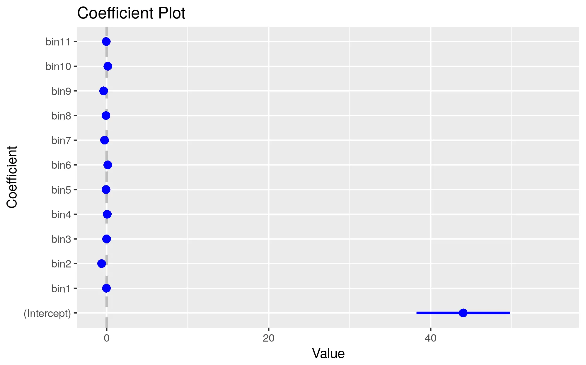
新更新 2:我的输出:
    > coeftest(model.b)

t test of coefficients:

         Estimate  Std. Error t value  Pr(>|t|)
bin1   1.7773e-04  4.8242e-04  0.3684 0.7125716
bin2   2.4031e-03  4.3999e-04  5.4617 4.823e-08 ***
bin3   7.9238e-04  3.9733e-04  1.9943 0.0461478 *
bin4  -2.0406e-05  3.7496e-04 -0.0544 0.9566001
bin5   9.9911e-04  3.6386e-04  2.7459 0.0060451 **
bin6   6.0026e-05  3.4915e-04  0.1719 0.8635032
bin7   2.5621e-04  3.0243e-04  0.8472 0.3969170
bin8  -9.5919e-04  2.7136e-04 -3.5347 0.0004099 ***
bin9  -1.8195e-04  2.5906e-04 -0.7023 0.4824958
bin10 -5.2064e-04  2.7006e-04 -1.9279 0.0538948 .
---
Signif. codes:
0 ‘***’ 0.001 ‘**’ 0.01 ‘*’ 0.05 ‘.’ 0.1 ‘ ’ 1
期望的散点图:
以下是我想要实现的散点图。它只是一个模拟的散点图,受到NBER工作论文第32页的启发,标题为温度对生产力和要素再配置的影响:来自中国半百万制造企业的证据 - 一个未被限制的版本可在这里找到,可以通过从命令行运行以下内容来固定整个文件的页面方向:
pdftk w23991.pdf cat 1-31 32-37east 38-40 41east 42-44 45east 46 output w23991-oriented.pdf
期望的散点图:
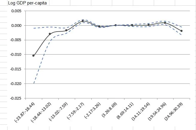
我刚刚联系了论文作者,他们只是简单地使用Excel来获得该图。基本上,他们只使用“Estimate”、“95%置信区间”的右侧和左侧数据来生成图形。我知道在Excel中制作这种图形非常容易,但我有兴趣在R中完成它。这可行吗?有什么好主意吗?
我想使用R而不是Excel更具程序化方法来呈现图形。有什么高招吗?
gamm代码而言,我认为语法是gamm(ln_gdp_percapita ~ temperature + precipitation + bin_1 + bin_2 + s(year) + s(region), random=list(region=~1), data=dat),但是您也可以使用gam进行拟合:gam(ln_gdp_percapita ~ temperature + precipitation + bin_1 + bin_2 + s(year) + s(region) + s(region, bs="re"), data=dat)。 - user20650R包ggplot2,它可以创建高度复杂的出版质量图形。以下是一个带置信区间的示例:https://dev59.com/b2Yr5IYBdhLWcg3wAFg0 - Adam Smith