使用Plotly创建多个箱线图

4

我想用plotly复制使用matplotlib绘制的以下箱线图:


我的数据非常简单,从Excel文件导入到一个简单的数据框中,如下所示:

你可以看到,我希望在x轴上有不同的条件,在y轴上覆盖从0到10,并且每个条件都有自己的均值、标准差等不同的箱线图。然而,当我尝试以下代码时,得到了一个非常奇怪的输出:

import plotly.express as px
conditions = df1.keys() #all conditions, df1 being my DataFrame
conditions=list(conditions)
fig = px.box(df1, x = conditions) 
fig.show()

输出:

有人知道我该怎么做才能得到一个类似于使用matplotlib得到的图,但是要用plotly吗?

2个回答

8
你可以使用plotly.expressplotly.graph_objects读取数据:
import pandas as pd

df = pd.read_csv(r'Documents\test.csv', sep=',')
print(df)
print(df.to_dict())

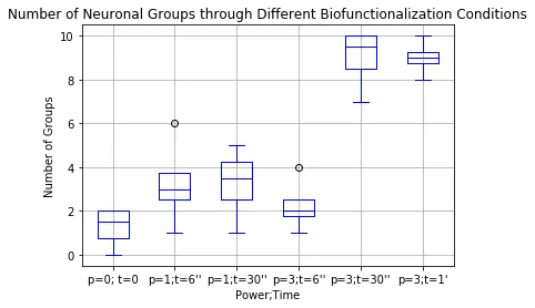
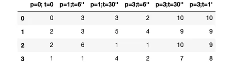
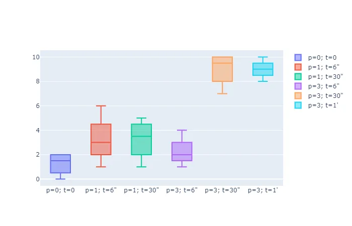
   p=0; t=0  p=1; t=6"  p=1; t=30"  p=3; t=6"  p=3; t=30"  p=3; t=1'
0         0          3           3          2          10         10
1         2          3           5          4           9          9
2         2          6           1          1          10          9
3         1          1           4          2           7          8

{'p=0; t=0': {0: 0, 1: 2, 2: 2, 3: 1}, 'p=1; t=6"': {0: 3, 1: 3, 2: 6, 3: 1}, 
 'p=1; t=30"': {0: 3, 1: 5, 2: 1, 3: 4}, 'p=3; t=6"': {0: 2, 1: 4, 2: 1, 3: 2}, 
 'p=3; t=30"': {0: 10, 1: 9, 2: 10, 3: 7}, "p=3; t=1'": {0: 10, 1: 9, 2: 9, 3: 8}}

plotly.graph_objects:

import plotly.graph_objects as go

fig = go.Figure()

for col in df:
  fig.add_trace(go.Box(y=df[col].values, name=df[col].name))
  
fig.show()

plotly.express:

import plotly.express as px

fig = px.box(pd.melt(df), x="variable", y="value", points="outliers")
fig.show()


1
import plotly.express as px

df = px.data.tips()

fig = px.box(df, x="day", y="total_bill", color="smoker")
fig.update_traces(quartilemethod="exclusive") # or "inclusive", or "linear" by default
fig.show()

enter image description here


网页内容由stack overflow 提供, 点击上面的
可以查看英文原文,
原文链接