我相信这应该很容易,但我在seaborn文档中找不到如何选择要显示的x标签分类变量的顺序。
我有每周工作小时数如下,但我想将它们按照0-10、11-20、21-30、31-40和超过40小时的顺序排列在我的x轴上。我该怎么做?
def hours_per_week (x):
if x < 11: return '0-10 hours'
elif x < 21: return '11-20 hours'
elif x < 31: return '21-30 hours'
elif x < 41: return '31-40 hours'
else: return 'More than 40 hours'
这是我用seaborn绘制图表的代码。注意 'income-cat' 是一个人们收入低于50K和高于50K的分类分组。
plot_income_cat_hours = sns.countplot(x='hours_per_week_grouping',
                                      hue='income-cat', data=data)
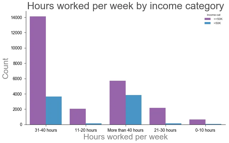
这是目前我的图表的样子(上面的代码中没有包含一些不相关的附加格式):
order参数吗?http://seaborn.pydata.org/generated/seaborn.countplot.html - mwaskomsort_values()。 - Andrew L