在同一轴上添加两个y轴标题

3
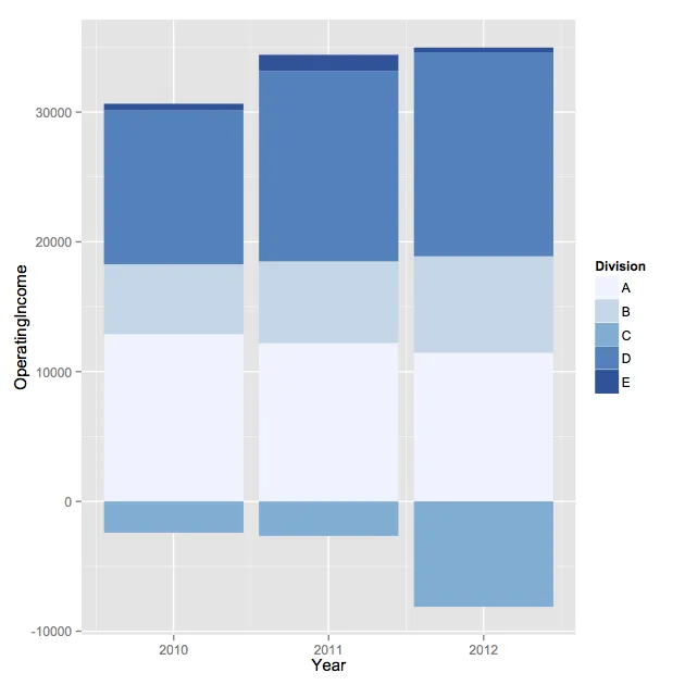
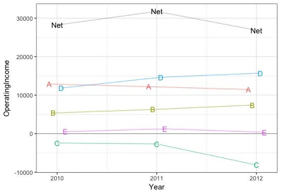
我将使用一个数据集和图表,这些来自之前的问题(在这里):
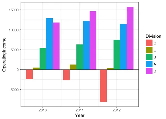
dat <- read.table(text = "   Division Year OperatingIncome
1  A  2012           11460
2  B  2012            7431
3  C  2012           -8121
4  D  2012           15719
5  E  2012             364
6  A  2011           12211
7  B  2011            6290
8  C  2011           -2657
9  D  2011           14657
10 E  2011            1257
11 A  2010           12895
12 B  2010            5381
13 C  2010           -2408
14 D  2010           11849
15 E  2010             517",header = TRUE,sep = "",row.names = 1)

dat1 <- subset(dat,OperatingIncome >= 0)
dat2 <- subset(dat,OperatingIncome < 0)
ggplot() + 
    geom_bar(data = dat1, aes(x=Year, y=OperatingIncome, fill=Division),stat = "identity") +
    geom_bar(data = dat2, aes(x=Year, y=OperatingIncome, fill=Division),stat = "identity") +
    scale_fill_brewer(type = "seq", palette = 1)

以下是相关图表,也是我提问的内容:

关注的绘图

我的问题:我能否更改y轴标签,让它在同一边分别显示两个不同的标签?其中一个标签应该写上“负收入”并位于y轴的下方,另一个标签应该写上“正收入”并位于同一y轴的上方。

我看到这个问题在不同刻度的双y轴方面已经有人问过了,但我特别想要在同一y轴上实现此功能。如果可以的话,我更喜欢使用ggplot2解决此问题。谢谢任何帮助。
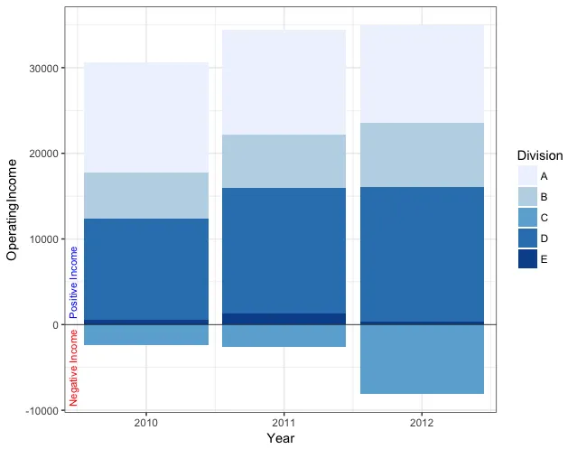
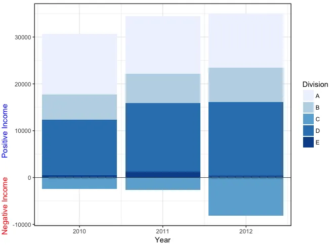
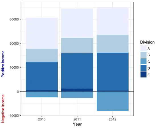

所以你想在 Y 轴的两个地方添加文本? - rawr
是的(但我也想控制每个y轴标题开始的位置)。 - EntryLevelR
1
我想补充一下,我希望每个y轴上的标题都是独立的。例如,也许我会把一个设为蓝色,另一个设为红色。 - EntryLevelR
我认为在ggplot2中没有这样做的方法,但是您可以使用cowplot通用绘图注释 - Gregor Thomas
1个回答

5
您可以使用annotate为负收入和正收入添加标签。如果要在绘图面板外添加文本,您需要关闭剪切。以下是在绘图面板内外添加文本的示例:
# Plot
p = ggplot() + 
  geom_bar(data = dat1, aes(x=Year, y=OperatingIncome, fill=Division),stat = "identity") +
  geom_bar(data = dat2, aes(x=Year, y=OperatingIncome, fill=Division),stat = "identity") +
  scale_fill_brewer(type = "seq", palette = 1) +
  geom_hline(yintercept=0, lwd=0.3, colour="grey20") +
  scale_x_continuous(breaks=sort(unique(dat$Year))) +
  theme_bw()

# Annotate inside plot area
p +  coord_cartesian(xlim=range(dat$Year) + c(-0.45,0.4)) + 
  annotate(min(dat$Year) - 0.53 , y=c(-5000,5000), label=c("Negative Income","Positive Income"), 
           geom="text", angle=90, hjust=0.5, size=3, colour=c("red","blue"))

enter image description here

# Annotate outside plot area by turning off clipping
pp = p + coord_cartesian(xlim=range(dat$Year) + c(-0.4,0.4)) + 
  annotate(min(dat$Year) - 0.9, y=c(-6000,10000), label=c("Negative Income","Positive Income"), 
           geom="text", angle=90, hjust=0.5, size=4, colour=c("red","blue")) +
  labs(y="")

pp <- ggplot_gtable(ggplot_build(pp))
pp$layout$clip <- "off"
grid.draw(pp)

enter image description here

你也可以像@Gregor建议的那样使用cowplot。我以前没有尝试过这个方法,所以可能有比我下面做的更好的方法,但是看起来你必须使用视口坐标而不是数据坐标来放置注释。
# Use cowplot
library(cowplot)

ggdraw() +
  draw_plot(p + labs(y=""), 0,0,1,1) +
  draw_label("Positive Income", x=0.01, y = 0.5, col="blue", size = 10, angle=90) +
  draw_label("Negative Income", x=0.01, y = 0.15, col="red", size = 10, angle=90) 

enter image description here

我知道问题中的数据只是为了举例说明,但对于这样的数据,折线图可能更容易理解:
library(dplyr)

ggplot(dat, aes(x=Year, y=OperatingIncome, color=Division)) + 
  geom_hline(yintercept=0, lwd=0.3, colour="grey50") +
  geom_line(position=position_dodge(0.2), alpha=0.5) +
  geom_text(aes(label=Division), position=position_dodge(0.2), show.legend=FALSE) +
  scale_x_continuous(breaks=sort(unique(dat$Year))) +
  theme_bw() +
  guides(colour=FALSE) +
  geom_line(data=dat %>% group_by(Year) %>% summarise(Net=sum(OperatingIncome), Division=NA),
            aes(x=Year, y=Net), alpha=0.4) +
  geom_text(data=dat %>% group_by(Year) %>% summarise(Net=sum(OperatingIncome), Division=NA),
            aes(x=Year, y=Net, label="Net"), colour="black") 

enter image description here

或者,如果需要条形图,可能会像这样:

ggplot() + 
  geom_bar(data = dat %>% arrange(OperatingIncome) %>% 
             mutate(Division=factor(Division,levels=unique(Division))), 
           aes(x=Year, y=OperatingIncome, fill=Division), 
           stat="identity", position="dodge") +
  geom_hline(yintercept=0, lwd=0.3, colour="grey20") +
  theme_bw()

enter image description here


一个非常好的概述!我真的很欣赏你的多个例子 - 思路清晰! - EntryLevelR

网页内容由stack overflow 提供, 点击上面的
可以查看英文原文,
原文链接