我需要应用一个从白色到透明的渐变,覆盖页面顶部约1/4的位置,并使背景图片在整个页面中可见。
我希望在CSS3中实现从渐变到纹理图像的无缝混合。
我推荐使用Ultimate CSS Gradient Generator - ColorZilla.com 这个工具。
它是一个设计良好的工具,并且有一个白色到透明的预设。
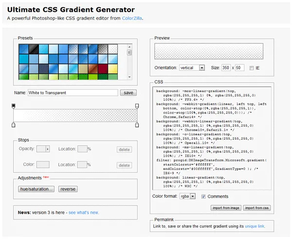
生成的白色到透明渐变的CSS代码如下:
background: -moz-linear-gradient(top, rgba(255,255,255,1) 0%, rgba(255,255,255,0) 100%); /* FF3.6-15 */
background: -webkit-linear-gradient(top, rgba(255,255,255,1) 0%,rgba(255,255,255,0) 100%); /* Chrome10-25,Safari5.1-6 */
background: linear-gradient(to bottom, rgba(255,255,255,1) 0%,rgba(255,255,255,0) 100%); /* W3C, IE10+, FF16+, Chrome26+, Opera12+, Safari7+ */
filter: progid:DXImageTransform.Microsoft.gradient( startColorstr='#ffffff', endColorstr='#00ffffff',GradientType=0 ); /* IE6-9 */
我更喜欢使用另一种生成渐变的工具 - EnjoyCSS。它还可以生成其他 CSS 特性,如背景、阴影、过渡等。
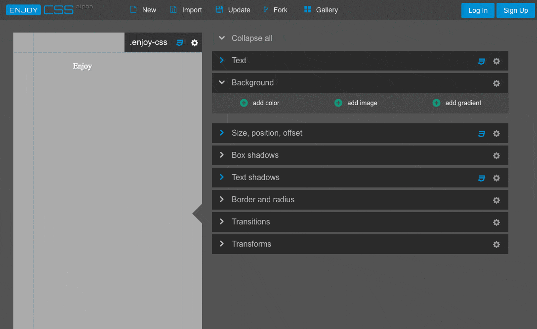 使用这个工具生成的白色到透明的渐变:
background-image: -webkit-linear-gradient(-90deg, rgba(255,255,255,0) 0, rgba(255,255,255,1) 100%);
background-image: -moz-linear-gradient(180deg, rgba(255,255,255,0) 0, rgba(255,255,255,1) 100%);
background-image: linear-gradient(180deg, rgba(255,255,255,0) 0, rgba(255,255,255,1) 100%);
background-position: 50% 50%;
-webkit-background-origin: padding-box;
background-origin: padding-box;
-webkit-background-clip: border-box;
background-clip: border-box;
-webkit-background-size: auto auto;
background-size: auto auto;