当X轴是日期时,如何在图表中放大X轴?

3
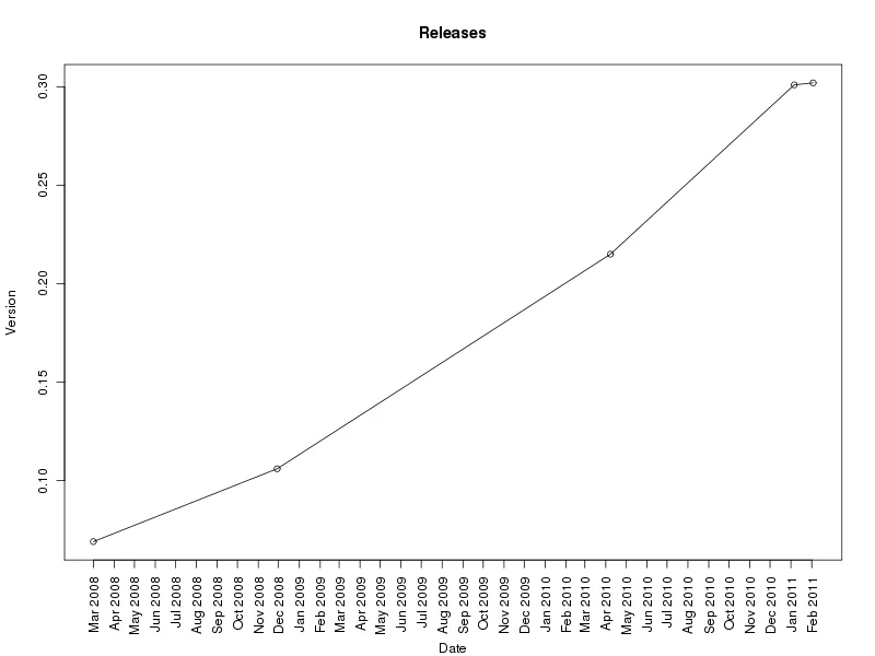
我正在制作一个将软件版本与发布日期对应的图表。例如:

test.cvs

Version,Date
0.302,23/2/2011
0.301,26/1/2011
0.215,28/4/2010
0.106,19/12/2008
0.069,21/3/2008

我使用以下方法来绘图:

tbl <- read.csv("test.csv")
dates <-strptime(as.character(tbl$Date), "%d/%m/%Y")
plot(dates,tbl$Version,type="o",main="Releases", xlab="Date",ylab="Version")

它按年份绘制,但我更希望按月/年份绘制,并垂直打印标签。我该如何实现这一点?我尝试设置xaxt="n"并使用axis()函数,标签=format(data,fmt),但我一直失败。
数据片段的dput:
structure(list(Version = c(0.302, 0.301, 0.215, 0.106, 0.069), 
    Date = structure(c(3L, 4L, 5L, 1L, 2L), .Label = c("19/12/2008", 
    "21/3/2008", "23/2/2011", "26/1/2011", "28/4/2010"), class = "factor")), .Names = c("Version", 
"Date"), class = "data.frame", row.names = c(NA, -5L))
3个回答

4

这是一个基础图形版本。首先,直接在原地操作 Date 列比生成一个额外的 dates 对象更容易:

tbl <- within(tbl, Date <- as.Date(Date, "%d/%m/%Y"))

这样就完成了绘图。请注意,我们需要在底部留出更多的边距空间来容纳日期标签。
op <- par(mar = c(6,4,4,2) + 0.1) ## larger bottom margin
## plot data but suppress axes and annotation
plot(Version ~ Date, data = tbl, type = "o", axes = FALSE, ann = FALSE)
## Use Axis to plot the Date axis, in 1 month increments
## format the sequence of dates `ds` as abbreviated month name and Year
with(tbl, Axis(Date, at = (ds <- seq(min(Date), max(Date), by = "months")),
               side = 1, labels = format(ds, format = "%b %Y"), las = 2))
## Add y-axis and plot frame
axis(2)
box()
## add on the axis labels
title(ylab = "Version", main = "Releases")
title(xlab = "Date", line = 5) ## pushing the x-axis label down a bit
par(op) ## reset the pars

这给我们带来了:

具有自定义日期轴的图表

通过更改所需日期的顺序,我们可以获得更多的灵活性,这里我们想要每2个月,并用2位数字世纪标记它们:
with(tbl, Axis(Date, at = (ds <- seq(min(Date), max(Date), by = "2 months")),
               side = 1, labels = format(ds, format = "%b %y"), las = 2))

只需将上面的调用替换现有的 with(....) 语句即可使用。


2
创建一个日期序列以作为您的轴标签。
start <- as.Date("01/01/2008", "%d/%m/%Y")
end <- as.Date("01/12/2011", "%d/%m/%Y")
x_breaks <- seq(start, end, by = "month")

创建 dates 作为一个 Date,以匹配上述序列。

dates <- as.Date(as.character(tbl$Date), "%d/%m/%Y")

设置一些图形参数,las = 3 会旋转您的x轴;mar 更改边缘宽度。

par(las = 3, mar = c(7, 5, 3, 1))

现在开始绘制,手动添加X轴,就如你所建议的那样。
plot(dates,tbl$Version,type="o",main="Releases", xlab="", ylab="Version", xaxt = "n")
axis(side = 1, at = as.numeric(x_breaks), labels = strftime(x_breaks, "%b %Y"))
title(xlab = "Date", line = 5)

1

您可以轻松使用ggplot2来完成此操作。以下是一些代码示例:

# generate data frame
df = data.frame(
       Version = rnorm(20),
       Date    = seq(as.Date('2010-01-01'), by = '1 month', length = 20)
     )

# create plot
p0 = qplot(Date, Version, data = df) +
     scale_x_date(major = '1 month') +
     opts(axis.text.x = theme_text(angle = 90))

这是输出结果

enter image description here


我喜欢这个答案,因为它提供了网格并且很简短,但是我选择了另一个,因为它有很多我不知道的有用信息。谢谢你。 - ForeverConfused

网页内容由stack overflow 提供, 点击上面的
可以查看英文原文,
原文链接