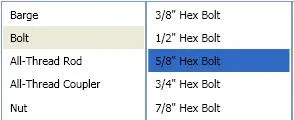
我正在创建一个WPF应用程序,其中需要连续进行多个ListView选择(类似于iTunes浏览器)。问题在于默认的非活动选择颜色太浅了(如下图所示)。
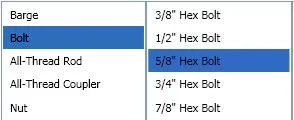
我该如何更改此颜色,使我的非活动列表视图看起来像这样?(如下图所示)
解决方案
使用Style覆盖默认的SystemColor,代码如下:
<Style TargetType="ListViewItem">
    <Style.Resources>
        <SolidColorBrush x:Key="{x:Static SystemColors.ControlBrushKey}" Color="{x:Static SystemColors.HighlightColor}"/>
    </Style.Resources>
</Style>
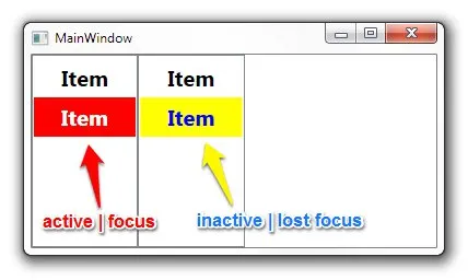
SystemColors.ControlBrushKey对我有用,谢谢。 - SkyDancerSystemColors.InactiveSelectionHighlightBrushKey和SystemColors.InactiveSelectionHighlightTextBrushKey。 - Viktor