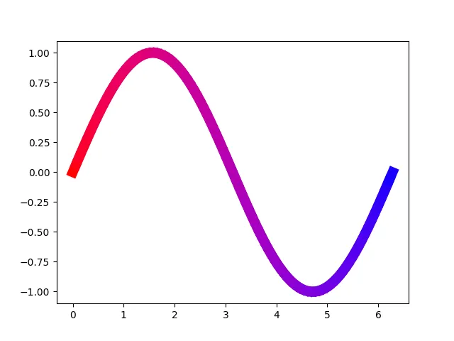
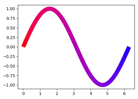
我想从一种颜色开始,逐渐混合到另一种颜色,直到结束。下面是我的MCVE中的函数,它可以工作,但肯定还有更好的方法我还没有发现吧?!
import numpy as np
import matplotlib.pyplot as plt
def colorlist(color1, color2, num):
"""Generate list of num colors blending from color1 to color2"""
result = [np.array(color1), np.array(color2)]
while len(result) < num:
temp = [result[0]]
for i in range(len(result)-1):
temp.append(np.sqrt((result[i]**2+result[i+1]**2)/2))
temp.append(result[i+1])
result = temp
indices = np.linspace(0, len(result)-1, num).round().astype(int)
return [result[i] for i in indices]
x = np.linspace(0, 2*np.pi, 100)
y = np.sin(x)
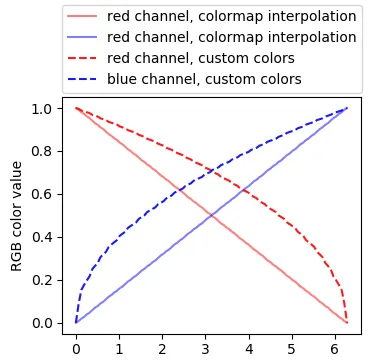
colors = colorlist((1, 0, 0), (0, 0, 1), len(x))
for i in range(len(x)-1):
xi = x[i:i+1+1]
yi = y[i:i+1+1]
ci = colors[i]
plt.plot(xi, yi, color=ci, linestyle='solid', linewidth='10')
plt.show()
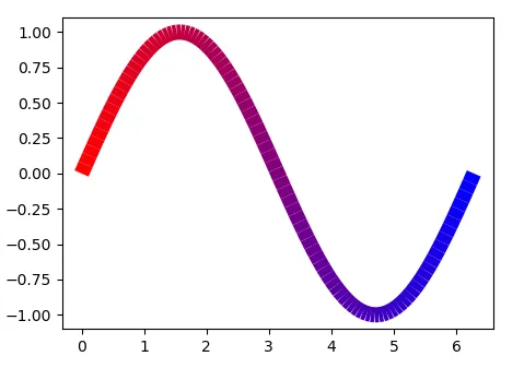
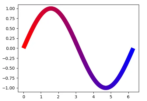
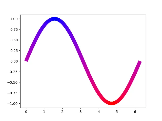
colors = [cmap(k) for k in y[:-1]]和lc = LineCollection(segments, colors=colors, linewidth=10)的东西。 - Not_a_programmer