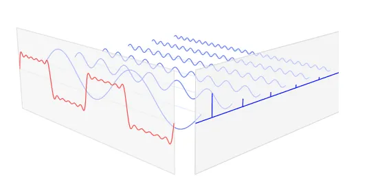
我通过使用Tikz看到了这个:
https://tikz.net/fourier_series/
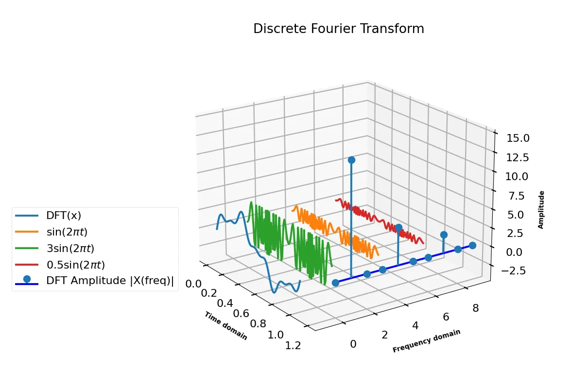
我想创建这个傅里叶级数的3D合成:
 使用Python 3D绘图,有一个能够实现这个的matplotlib。
我的MWE / 我已经实现的是:
使用Python 3D绘图,有一个能够实现这个的matplotlib。我的MWE / 我已经实现的是:
# https://pythonnumericalmethods.berkeley.edu/notebooks/chapter24.02-Discrete-Fourier-Transform.html

#  Generate 3 sine waves with frequencies 1 Hz, 4 Hz, and 7 Hz,
# amplitudes 3, 1 and 0.5, and phase all zeros.
# Add this 3 sine waves together with a sampling rate 100 Hz

import matplotlib.pyplot as plt
import numpy as np

plt.style.use('seaborn-poster')

# sampling rate
sr = 100
# sampling interval
ts = 1.0/sr
t = np.arange(0,1,ts)

freq = 1.
x = 3*np.sin(2*np.pi*freq*t)
x1 = 3*np.sin(2*np.pi*freq*t)

freq = 4
x += np.sin(2*np.pi*freq*t)
x2 = np.sin(2*np.pi*freq*t)

freq = 7
x += 0.5* np.sin(2*np.pi*freq*t)
x3 = 0.5* np.sin(2*np.pi*freq*t)

# Write a function DFT(x) which takes in one argument,
# x - input 1 dimensional real-valued signal.
# The function will calculate the DFT of the signal and return the DFT values.

def DFT(x):
    """
    Function to calculate the
    discrete Fourier Transform
    of a 1D real-valued signal x
    """

    N = len(x)
    n = np.arange(N)
    k = n.reshape((N, 1))
    e = np.exp(-2j * np.pi * k * n / N)

    X = np.dot(e, x)

    return X

X = DFT(x)

# calculate the frequency
N = len(X)
n = np.arange(N)
T = N/sr
freq = n/T

n_oneside = N//2
# get the one side frequency
f_oneside = freq[:n_oneside]

# normalize the amplitude
X_oneside =X[:n_oneside]/n_oneside

# subplot(2, 2, 3)), the axes will go to the third section of the 2x2 matrix
# i.e, to the bottom-left corner.
plt.figure(figsize = (12, 6))
plt.subplot(3, 1, 1)
plt.plot(t, x, 'r')
plt.ylabel('Amplitude')

plt.subplot(3, 1, 2)
plt.stem(f_oneside, abs(X_oneside), 'b', \
         markerfmt=" ", basefmt="-b")
plt.xlabel('Freq (Hz)')
plt.ylabel('DFT Amplitude |X(freq)|')
plt.xlim(0, 10)

plt.subplot(3, 2, 5)
plt.plot(t, x1, 'g')
plt.ylabel('Amplitude')

plt.subplot(3, 2, 6)
plt.plot(t, x2, 'g')
plt.ylabel('Amplitude')

plt.tight_layout()
plt.show()
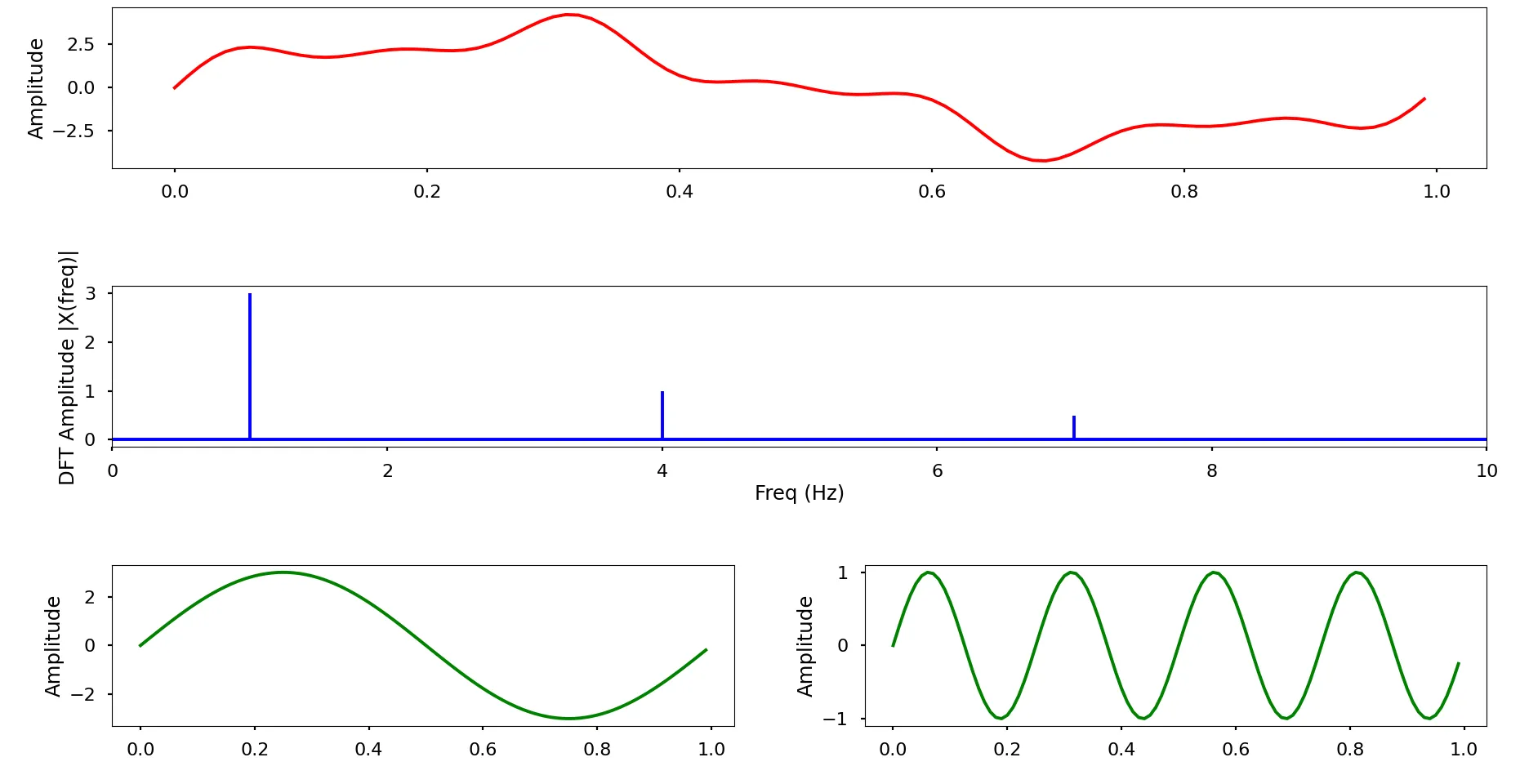
- 单一正弦波
- 傅里叶级数(由第一项开始的所有正弦波的总和)
- DFT图