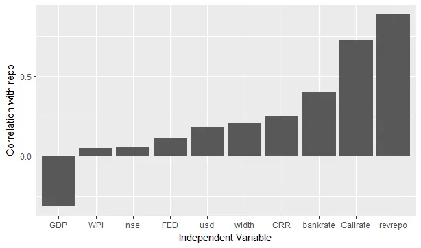
我有以下数据:
df
    rowname   repo
1   revrepo  0.888
2  bankrate  0.402
3       CRR  0.250
4  Callrate  0.723
5       WPI  0.049
6       GDP -0.318
7       FED  0.110
8     width  0.209
9       nse  0.059
10      usd  0.185
我正在绘制下面显示的条形图:
df %>% mutate(rowname = factor(rowname, levels = rowname[order(repo)])) %>%
ggplot(aes(x = rowname, y = repo)) +
geom_bar(stat = "identity") +
ylab("Correlation with repo") +
xlab("Independent Variable")
我得到了以下的图表:
 我希望将所有负数柱子颜色设为红色,所有正数柱子颜色设为灰色。
geom_bar(aes(fill = repo < 0), stat = "identity") + scale_fill_manual(guide = FALSE, breaks = c(TRUE, FALSE), values=c("gray", "red"))- Andrey Kolyadin