在ggplot中更改时间序列间隙的线型

4
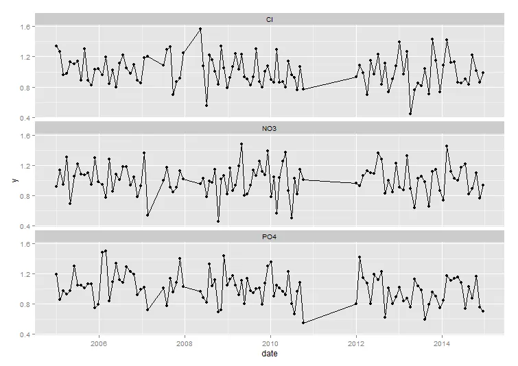
我拥有一组水质测量数据,时间序列不规则(通常每月进行一次测量,但不是每个月的同一天)。我已经使用下面的代码在神奇的ggplot中绘制了这些数据,并用一条线连接了所有测量点。
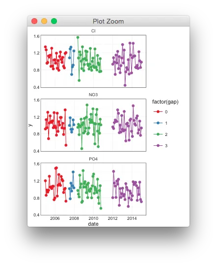
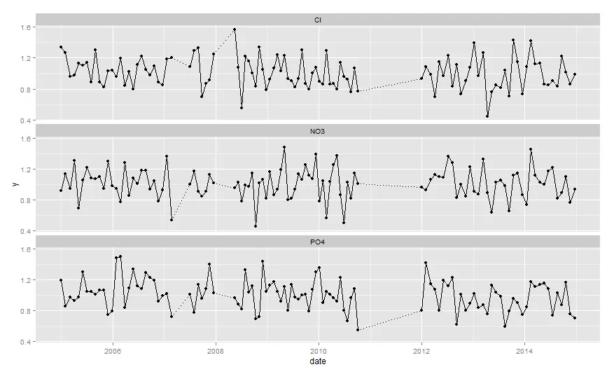
然而,有时会出现间隔期,几个月内没有进行测量。我想在这些间隔点之间用另一种线型或颜色绘制线条(例如,如果间隔大于60天,则使用虚线和灰色)。我需要为此拆分我的数据吗?我该如何处理?
library(ggplot2)
library(lubridate)

xdate <- as.Date(c(seq.POSIXt(ymd("2005-01-01"), ymd("2007-03-04"), by = "30 days"), 
           seq.POSIXt(ymd("2007-07-03"), ymd("2007-12-31"), by = "28 days"),
           seq.POSIXt(ymd("2008-05-15"), ymd("2010-10-10"), by = "25 days"),
           seq.POSIXt(ymd("2012-01-01"), ymd("2014-12-31"), by = "31 days")))

set.seed(321)                  
df <- data.frame(date = rep(xdate,3), par=rep(c("Cl","PO4","NO3")), y=rnorm(318,1,0.2))

ggplot(df, aes(x=date, y=y)) +
  geom_point(size=2) +
  geom_line() +
  facet_wrap(~par, nrow=3)

enter image description here


可能是重复的 https://dev59.com/nWUq5IYBdhLWcg3wEcRZ - Timo Kvamme
@user2673238 我认为不行,因为添加NA值对我没有用(因为我想保留这些行),而使用分组变量也不行,因为间隔周围的点必须包含在两个组中。或者我有什么遗漏吗? - RHA
@RHA,我相信你可以使用这个解决方案,但它会在空隙中留下空白。如果您在grp变量中创建元素,则可以通过geom_line()进行处理。分段函数的端点仍将位于该线上。只会有明显的间隙,但没有不同颜色的线来填充这些间隙。 - Shawn Mehan
@Shawn Mehan,那确实会留下空白,这不是问题的关键。我明确想要虚线。幸运的是,这是可能的,请参见下面的答案。 - RHA
2个回答

2
这应该能让你接近,
library(dplyr)
df <- df %>% group_by(par) %>% 
             arrange(date) %>% 
             mutate(gap = cumsum(c(0, diff(date) > 60)))
ggplot(df, aes(x=date, y=y, colour=factor(gap))) +
    geom_point(size=2) +
    geom_line() +
    facet_wrap(~par, nrow=3)

通过调整每个组的 ID 和起始/结束点,可以将变量映射到线条类型。

enter image description here


这不是解决方案,但确实让我接近了。谢谢!我将把这些端点复制到一个新的对象中,然后再添加另一个 geom_line。那应该就可以得到我想要的结果了。 - RHA

1

在Baptiste的帮助下,我找到了一个解决方案。也许数据处理可以更加简洁(欢迎提出建议),但它能够正常工作。

library(ggplot2)
library(lubridate)
library(dplyr)

#first some data
xdate <- as.Date(c(seq.POSIXt(ymd("2005-01-01"), ymd("2007-03-04"), by = "30 days"), 
           seq.POSIXt(ymd("2007-07-03"), ymd("2007-12-31"), by = "28 days"),
           seq.POSIXt(ymd("2008-05-15"), ymd("2010-10-10"), by = "25 days"),
           seq.POSIXt(ymd("2012-01-01"), ymd("2014-12-31"), by = "31 days")))
set.seed(321)                  
df <- data.frame(date = rep(xdate,3), par=rep(c("Cl","PO4","NO3")), y=rnorm(318,1,0.2))

# then calculate groups with dplyr (credits to @baptiste) 
df <- df %>% group_by(par) %>% 
  arrange(date) %>% 
  mutate(gap = cumsum(c(0, diff(date) > 60)))

# extract the first and the last of every group
thefirst <- 
  df %>% group_by(gap,par) %>% 
  arrange(date) %>% 
  summarise(first(date),first(y))
thelast <-
  df %>% group_by(gap,par) %>% 
  arrange(date) %>% 
  summarise(last(date),last(y))

# equalize colnames for rbind and ggplot
colnames(thefirst) <- colnames(thelast) <- colnames(df)[c(4,2,1,3)]

# add 1 to match with thelast of every group with the first of the next group
# and calculate max
thelast$gap <- thelast$gap+1
maxgap <- max(thelast$gap)

gaplines <- rbind(filter(thefirst, gap != 0), filter(thelast,gap != maxgap))

#ggplot the connected lines
(p <-
ggplot(df, aes(x=date, y=y)) +
  geom_point(size=2) +
  geom_line(aes(group=factor(gap))) +
  facet_wrap(~par, nrow=3))
# add the dotted lines
p +  geom_line(data=gaplines, aes(group = factor(gap)),linetype='dotted')

这给了我这个图表:enter image description here

网页内容由stack overflow 提供, 点击上面的
可以查看英文原文,
原文链接