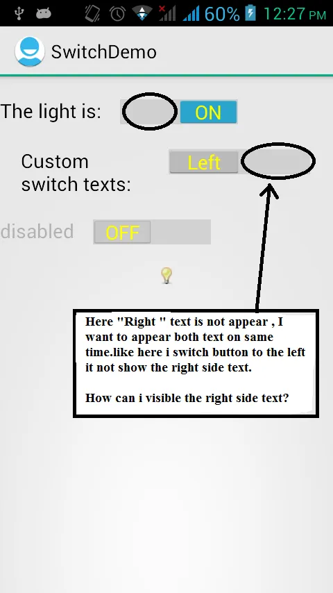
Android开关应该两侧都显示文本
23
- Mayur Raval
1
这个回答解决了你的问题吗?如何自定义开关按钮? - C.F.G
5个回答
11
在愉快的一天实现后,这是一个完整的、可行的解决方案。

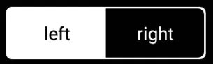
使用以下代码来设置开关轨道的可绘制图形。轨道是指拇指左右滑动的容器。
mMessengerSwitch.setTrackDrawable(new SwitchTrackTextDrawable(this,
        "LEFT", "RIGHT"));
这是SwitchTrackTextDrawable的实现,可以将文本准确地写在背景中(我只在Nexus 5上的API 23上测试过):
/**
 * Drawable that generates the two pieces of text in the track of the switch, one of each
 * side of the positions of the thumb.
 */
public class SwitchTrackTextDrawable extends Drawable {

    private final Context mContext;

    private final String mLeftText;

    private final String mRightText;

    private final Paint mTextPaint;

    public SwitchTrackTextDrawable(@NonNull Context context,
            @StringRes int leftTextId,
            @StringRes int rightTextId) {
        mContext = context;

        // Left text
        mLeftText = context.getString(leftTextId);
        mTextPaint = createTextPaint();

        // Right text
        mRightText = context.getString(rightTextId);
    }

    private Paint createTextPaint() {
        Paint textPaint = new Paint();
        //noinspection deprecation
        textPaint.setColor(mContext.getResources().getColor(android.R.color.white));
        textPaint.setAntiAlias(true);
        textPaint.setStyle(Paint.Style.FILL);
        textPaint.setTextAlign(Paint.Align.CENTER);
        // Set textSize, typeface, etc, as you wish
        return textPaint;
    }

    @Override
    public void draw(Canvas canvas) {
        final Rect textBounds = new Rect();
        mTextPaint.getTextBounds(mRightText, 0, mRightText.length(), textBounds);

        // The baseline for the text: centered, including the height of the text itself
        final int heightBaseline = canvas.getClipBounds().height() / 2 + textBounds.height() / 2;

        // This is one quarter of the full width, to measure the centers of the texts
        final int widthQuarter = canvas.getClipBounds().width() / 4;
        canvas.drawText(mLeftText, 0, mLeftText.length(),
                widthQuarter, heightBaseline,
                mTextPaint);
        canvas.drawText(mRightText, 0, mRightText.length(),
                widthQuarter * 3, heightBaseline,
                mTextPaint);
    }

    @Override
    public void setAlpha(int alpha) {
    }

    @Override
    public void setColorFilter(ColorFilter cf) {
    }

    @Override
    public int getOpacity() {
        return PixelFormat.TRANSLUCENT;
    }
}
- espinchi
6
尝试在KitKat上运行...但是没有成功。它只显示一个空白的白屏。 - Harshil Pansare
@espinchi,你有这方面的任何更新吗?我也在尝试做同样的事情,请让我知道如果你有任何更新或其他更好的解决方案。 - Nikunj Sakhrelia
@NikunjSakhrelia:这个drawable只是设置了文本。你可以创建一个背景drawable(可能仅在xml中,只需创建一个drawable并设置形状和颜色),并像这里指出的那样动态地组合它们:https://dev59.com/DnE85IYBdhLWcg3whD3j - tritop
@espinchi 你是如何绘制这张实际的图片的? - user1163234
1代码与图像不匹配。它只在一侧显示文本,而不是两侧都显示。 - Gulnaz Ghanchi
这个无法工作。 - Srishti Roy
3
在寻找正确的解决方案时,我找到了这个很棒的小库。您可以在这里查看它。我觉得这个库易于使用,并且完全符合我的需求。它甚至可以用于显示多个值。
 以下为xml代码:
这是我最终的样式,添加了更多样式,例如我给包装它的更新:与此同时,该库已停止维护,您可能需要尝试他们推荐的库。
FrameLayout加了一个白色边框(我需要让它看起来像这样,您不需要使用边框):
以下为xml代码:<FrameLayout
android:layout_width="wrap_content"
android:layout_height="wrap_content"
android:padding="1dp"
android:background="@drawable/white_border">
<belka.us.androidtoggleswitch.widgets.ToggleSwitch
android:layout_width="wrap_content"
android:layout_height="wrap_content"
custom:activeBgColor="@color/white"
custom:activeTextColor="@color/black"
custom:inactiveBgColor="@color/black"
custom:inactiveTextColor="@color/white"
custom:textToggleLeft="left"
custom:textToggleRight="right"/>
</FrameLayout>
而@drawable/white_border看起来像这样:
<shape xmlns:android="http://schemas.android.com/apk/res/android" android:shape="rectangle" >
<solid android:color="@android:color/transparent" />
<stroke android:width="2dip"
    android:color="@color/white" />
<corners
    android:radius="3dp"/>
- Vucko
2
感谢您提供好的库建议,但现在它已经过时了。如果您需要这种开关,请使用:https://github.com/llollox/Android-Toggle-Switch,它非常相似且运行良好。 - Hardik Kubavat
1是的,我注意到了。虽然我一直使用这个没有问题,但去使用维护好的可能是个明智的选择。我会编辑我的回答。 - Vucko
3
- MysticMagicϡ
3
2是的,我使用了
android:textOn和android:textOff,并且我得到了两个文本,但问题是,它只显示一个文本,另一个文本同时消失。我想要显示两个文本,无论它是开启还是关闭。这样用户就可以看到其他可用选项。 - Mayur Raval1检查一下那个链接。在这种情况下可能会有所帮助。@MayurRaval - MysticMagicϡ
你们有解决方案了吗? - Srishti Roy
2
我创建了一个自定义布局,其中包含一个线性布局(将用作开关的轨道)。在此布局中,我放置了两个文本来模拟“打开”/“关闭”文本的轨道,并在其上方放置了一个常规开关,但没有轨道,只有带透明轨道的滑块。
无论如何,以下是代码:
colors.xml
无论如何,以下是代码:
colors.xml
<color name="switch_selected_text_color">#FFFFFF</color>
<color name="switch_regular_text_color">#A8A8A8</color>
设置_切换颜色选择器
<?xml version="1.0" encoding="utf-8"?>
<selector xmlns:android="http://schemas.android.com/apk/res/android">
    <item android:color="@color/switch_selected_text_color" android:state_checked="true" />
    <item android:color="@color/switch_regular_text_color" />
</selector>
styles.xml
<style name="SwitchTextAppearance" parent="@android:style/TextAppearance.Holo.Small">
    <item name="android:textColor">@color/settings_switch_color_selector</item>
</style>
new_switch.xml - 用于自定义视图
<?xml version="1.0" encoding="utf-8"?>
<RelativeLayout xmlns:android="http://schemas.android.com/apk/res/android"
    android:layout_width="wrap_content"
    android:layout_height="wrap_content">

    <LinearLayout
        android:id="@+id/track_layout"
        android:layout_width="wrap_content"
        android:layout_height="wrap_content"
        android:background="@drawable/settings_track"
        android:weightSum="1">

        <TextView
            android:id="@+id/left_text"
            android:layout_width="0dp"
            android:layout_height="match_parent"
            android:textColor="@color/switch_regular_text_color"
            android:layout_weight="0.5"
            android:gravity="center"
            android:text="OFF" />

        <TextView
            android:id="@+id/right_text"
            android:layout_width="0dp"
            android:layout_height="match_parent"
            android:textColor="@color/switch_regular_text_color"
            android:layout_weight="0.5"
            android:gravity="center"
            android:text="ON" />
    </LinearLayout>

    <Switch
        android:layout_width="wrap_content"
        android:layout_height="wrap_content"
        android:thumb="@drawable/thumb_selector"
        android:switchTextAppearance="@style/SwitchTextAppearance"
        android:textOn="ON"
        android:textOff="OFF"
        android:checked="true"
        android:showText="true"
        android:track="@android:color/transparent"/>
</RelativeLayout>
这是自定义视图 - 它只是用于填充自定义视图布局
public class DoubleSidedSwitch extends RelativeLayout {

    private TextView _leftTextView;
    private TextView _rightTextView;
    private Switch   _switch;

    public DoubleSidedSwitch(Context context) {
        super(context);
        init(context);
    }

    public DoubleSidedSwitch(Context context, AttributeSet attrs) {
        super(context, attrs);
        init(context);
    }

    private void init(Context context) {
        View view = LayoutInflater.from(context).inflate(R.layout.new_switch, this, true);
        initViews(view);
        initListeners();
    }

    private void initListeners() {

    }

    private void initViews(View view) {

    }
}
- Anton Makov
0
这个开关是由两个标准按钮和一个LinearLayout组成的。有一堆xml文件需要导入,但它在所有版本上都能完美地工作,并且非常容易使用。请查看以下Github页面
用法
- 将res/drawable下的XML文件复制到您项目的res/drawable文件夹中。
- 从layout.xml中复制LinearLayout到您的布局文件中。
- 将values/colors.xml和values/dimens中的值复制到您自己的文件中。
- 使用以下代码初始化开关
SekizbitSwitch mySwitch = new SekizbitSwitch(findViewById(R.id.sekizbit_switch));
            mySwitch.setOnChangeListener(new SekizbitSwitch.OnSelectedChangeListener() {
                @Override
                public void OnSelectedChange(SekizbitSwitch sender) {
                    if(sender.getCheckedIndex() ==0 )
                    {
         System.out.println("Left Button Selected");
                    }
                    else if(sender.getCheckedIndex() ==1 )
                    {
                        System.out.println("Right Button Selected");
                    }
                }
            });
- Eren Demir
网页内容由stack overflow 提供, 点击上面的可以查看英文原文,
原文链接
原文链接