我是R包EnvStats的创建者。
有一个我经常使用的函数叫做stripChart。我刚开始学习ggplot2,已经花了过去几天的时间阅读Hadley的书、Winston的书、StackOverflow和其他资源,试图创建一个geom来近似stripChart的功能。我无法弄清楚如何在geom中计算摘要统计信息和测试结果,然后将它们放置在x轴刻度线下方以及绘图区域的顶部(绘图区域之外)。这里是一个使用内置数据集mtcars的简单示例:
library(EnvStats)
stripChart(mpg ~ cyl, data = mtcars, col = 1:3,
  xlab = "Number of Cylinders", ylab = "Miles per Gallon", p.value = TRUE)
这是一个早期的几何图形草稿,旨在尝试复制stripChart的大部分功能:
geom_stripchart <-
function(..., x.nudge = 0.3,
  jitter.params = list(width = 0.3, height = 0),
  mean.params = list(size = 2, position = position_nudge(x = x.nudge)),
  errorbar.params = list(size = 1, width = 0.1,
  position = position_nudge(x = x.nudge)),
  n.text = TRUE, mean.sd.text = TRUE, p.value = FALSE) {
    params <- list(...)
    jitter.params   <- modifyList(params, jitter.params)
    mean.params     <- modifyList(params, mean.params)
    errorbar.params <- modifyList(params, errorbar.params)

    jitter <- do.call("geom_jitter", jitter.params)
    mean   <- do.call("stat_summary", modifyList(
      list(fun.y = "mean", geom = "point"),
      mean.params)
    )
    errorbar <- do.call("stat_summary", modifyList(
      list(fun.data = "mean_cl_normal", geom = "errorbar"),
      errorbar.params)
    )

    stripchart.list <- list(
      jitter,
      theme(legend.position = "none"),
      mean,
      errorbar
    )

    if(n.text || mean.sd.text) {
# Compute summary statistics (sample size, mean, SD) here?
      if(n.text) {
# Add information to stripchart.list to
# compute sample size per group and add text below x-axis
      }
      if(mean.sd.text) {
# Add information to stripchart.list to
# compute mean and SD and add text above top of plotting region
      }
    }
    if(p.value) {
# Add information to stripchart.list to
# compute p-value (and 95% CI for difference if only 2 groups)
# and add text above top of plotting region
    }
    stripchart.list
}


library(ggplot2)
dev.new()
p <- ggplot(mtcars, aes(x = factor(cyl), y = mpg, color = factor(cyl)))
p + geom_stripchart() +
    xlab("Number of Cylinders") +
    ylab("Miles per Gallon")
您可以看到这些图基本上是相同的。我的问题是如何在每个组下面添加样本量,并在顶部添加均值和标准差,以及ANOVA测试结果(暂时忽略不均匀方差的问题)。我知道计算摘要统计信息然后将它们作为点或文本放置在绘图区域内很简单,但我不想这么做。 我已经找到了一些示例,展示了如何在绘图之外放置文本(例如使用
annotation_custom()):How can I add annotations below the x axis in ggplot2? Displaying text below the plot generated by ggplot2 问题是这些示例演示了如何预定义注释。我的问题是,在
geom_stripchart中,我必须根据调用ggplot()中定义的数据计算摘要统计信息和测试结果,然后将这些结果传递给annotation_custom()。我不知道如何获得在调用ggplot()中定义的x和y变量。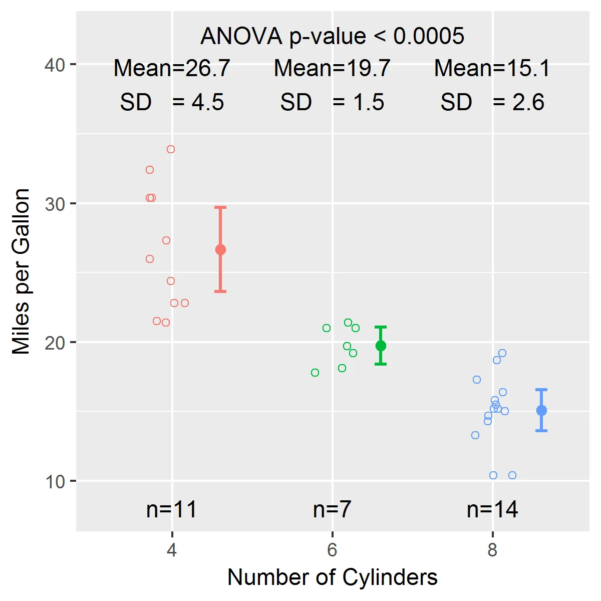
ggproto是你在这里使用的工具,可以参考这里的 "Creating a new geom" 部分:http://docs.ggplot2.org/dev/vignettes/extending-ggplot2.html。另外,PS:stripChart很不错,希望能把它作为一个几何对象! - m-dz