使用Python绘制2D核密度估计图

26

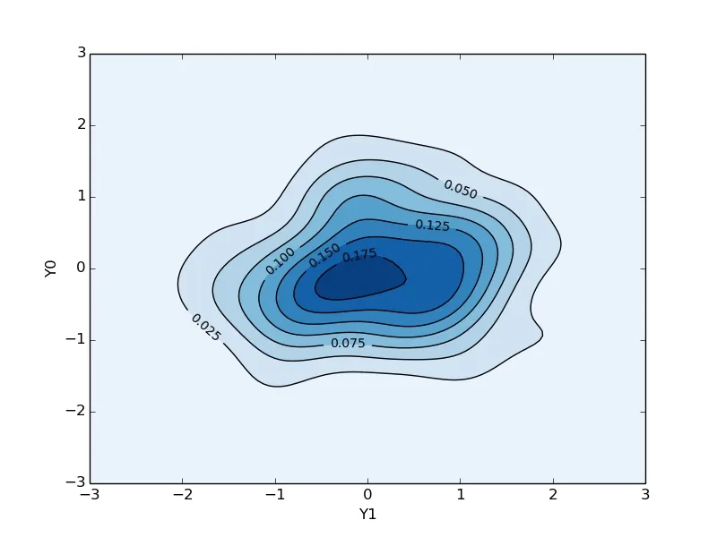
我想绘制一个2D核密度估计图。在这里,我发现seaborn包非常有用。然而,在长时间的搜索后,我仍然搞不清楚如何使y轴和x轴不透明,并显示等高线上的密度值。如果有人能够帮助我解决问题,我将不胜感激。请看下面我的代码和图表。
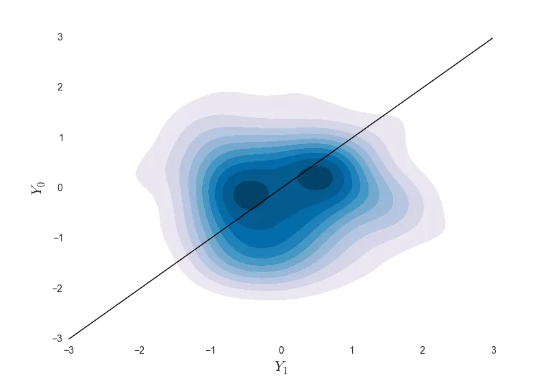
 enter image description here

import numpy as np
import seaborn as sns
import matplotlib.pyplot as pl

Y = np.random.multivariate_normal((0, 0), [[0.8, 0.05], [0.05, 0.7]], 100)
ax = sns.kdeplot(Y, shade = True, cmap = "PuBu")
ax.patch.set_facecolor('white')
ax.collections[0].set_alpha(0)
ax.set_xlabel('$Y_1$', fontsize = 15)
ax.set_ylabel('$Y_0$', fontsize = 15)
pl.xlim(-3, 3)
pl.ylim(-3, 3)
pl.plot([-3, 3], [-3, 3], color = "black", linewidth = 1)
pl.show()

1
我不确定你所说的“使y轴和x轴不透明”是什么意思; ax.collections[0].set_alpha(0) 这行代码会使最低的等高线变成透明的;如果你不想这样,就不要包含这行代码。 - mwaskom
2个回答

62

这里提供了一个仅使用 scipymatplotlib 的解决方案:

import numpy as np
import matplotlib.pyplot as pl
import scipy.stats as st

data = np.random.multivariate_normal((0, 0), [[0.8, 0.05], [0.05, 0.7]], 100)
x = data[:, 0]
y = data[:, 1]
xmin, xmax = -3, 3
ymin, ymax = -3, 3

# Peform the kernel density estimate
xx, yy = np.mgrid[xmin:xmax:100j, ymin:ymax:100j]
positions = np.vstack([xx.ravel(), yy.ravel()])
values = np.vstack([x, y])
kernel = st.gaussian_kde(values)
f = np.reshape(kernel(positions).T, xx.shape)

fig = pl.figure()
ax = fig.gca()
ax.set_xlim(xmin, xmax)
ax.set_ylim(ymin, ymax)
# Contourf plot
cfset = ax.contourf(xx, yy, f, cmap='Blues')
## Or kernel density estimate plot instead of the contourf plot
#ax.imshow(np.rot90(f), cmap='Blues', extent=[xmin, xmax, ymin, ymax])
# Contour plot
cset = ax.contour(xx, yy, f, colors='k')
# Label plot
ax.clabel(cset, inline=1, fontsize=10)
ax.set_xlabel('Y1')
ax.set_ylabel('Y0')

pl.show()

之前的代码会得到以下结果:

plot_kernel_density.jpg

这个图表有非透明的x轴和y轴,以及等高线上的密度值。这是预期的结果吗?


2
这非常有用!感谢详细的演示。我会使用你在这里做的东西。 - user3698176
如果我想在同一张图上绘制另一个数据集以比较两个数据,该怎么做呢?我希望它们处于相同的水平,这样我们才能进行正确的比较。 - John Singh

3

2
我点赞是因为这些都是很好的例子,回答了问题,但我建议您使用更友好的描述,以免人们继续给您投反对票。 - ldmtwo

网页内容由stack overflow 提供, 点击上面的
可以查看英文原文,
原文链接