我可以使用NumPy和SciPy,并想创建一个简单的数据集FFT。我有两个列表,一个是y值,另一个是这些y值的时间戳。
将这些列表馈入SciPy或NumPy方法并绘制结果FFT的最简单方法是什么?
我已经查看了一些示例,但它们都依赖于创建一组带有某些数据点数量、频率等的虚拟数据,并且不真正显示如何使用一组数据及其对应的时间戳进行操作。
我尝试了以下示例:
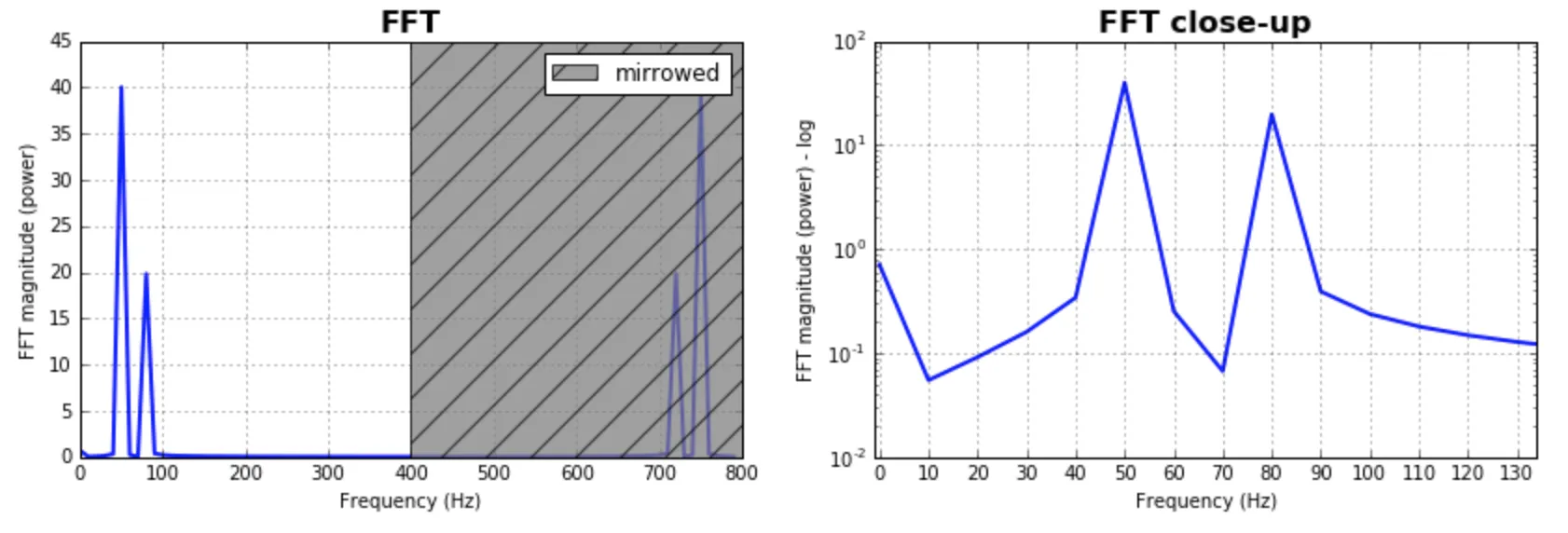
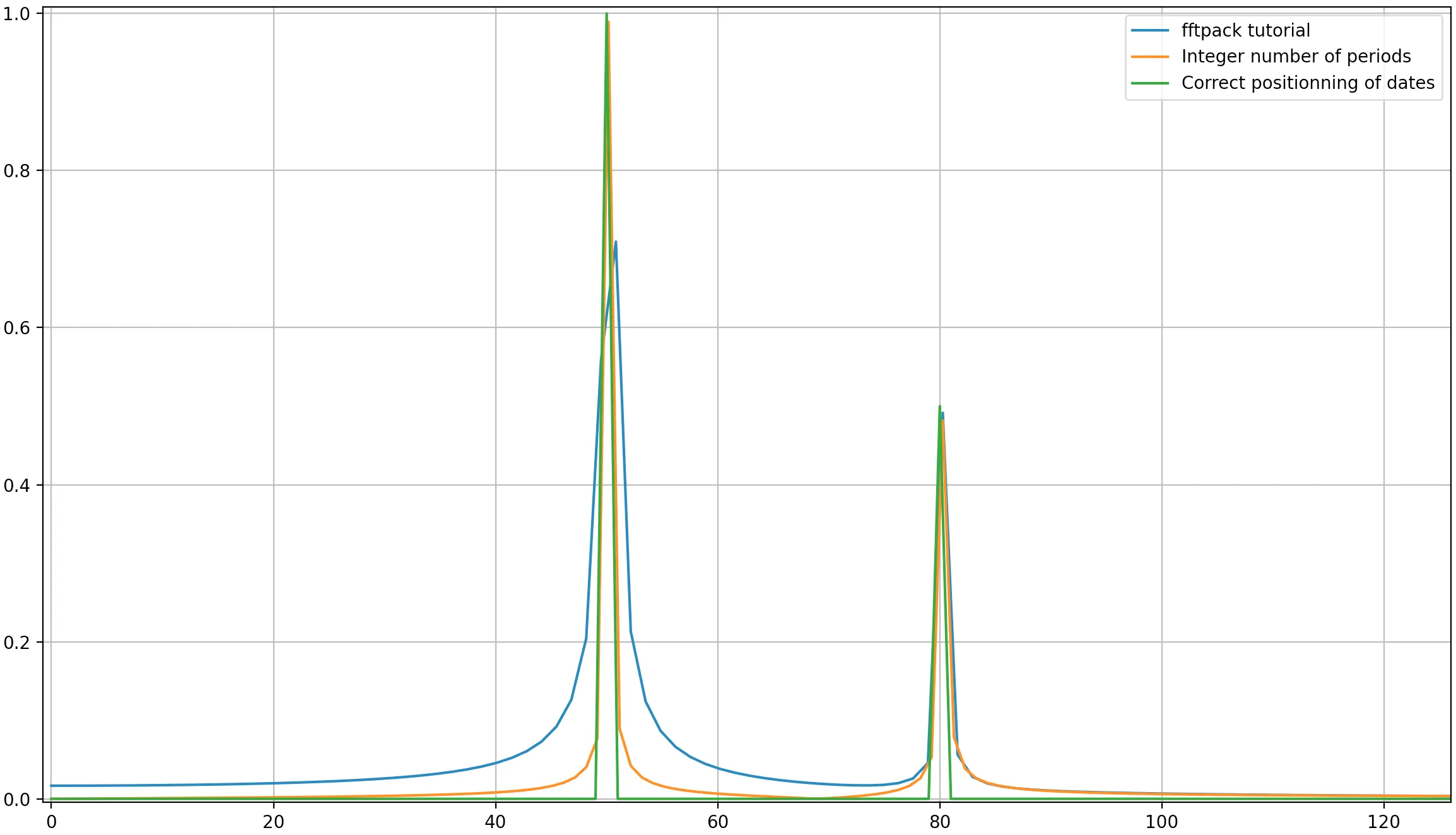
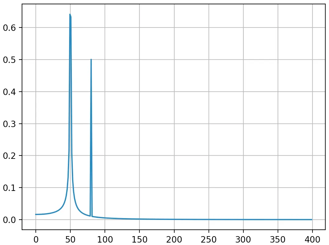
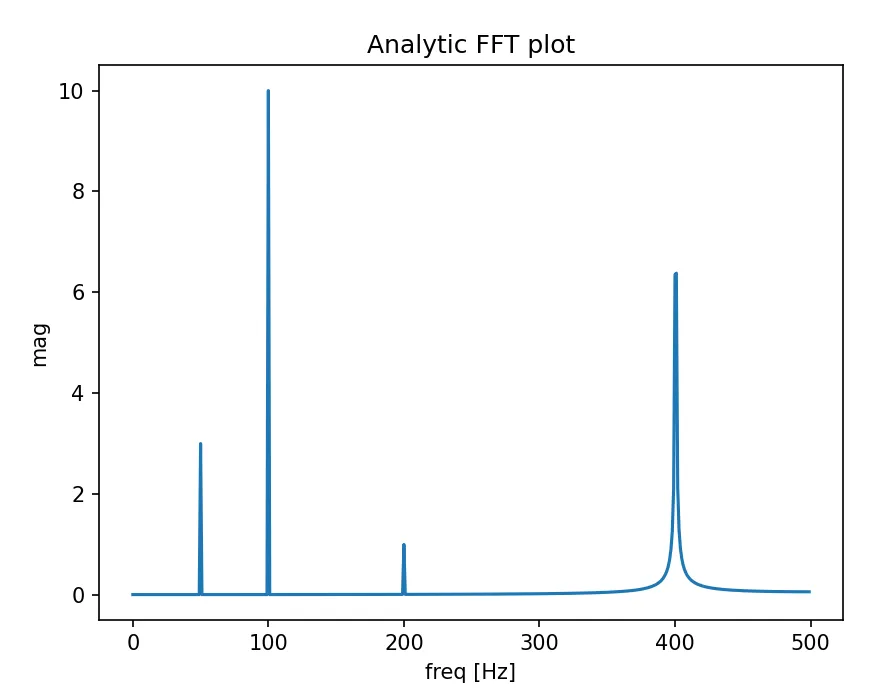
from scipy.fftpack import fft

# Number of samplepoints
N = 600

# Sample spacing
T = 1.0 / 800.0
x = np.linspace(0.0, N*T, N)
y = np.sin(50.0 * 2.0*np.pi*x) + 0.5*np.sin(80.0 * 2.0*np.pi*x)
yf = fft(y)
xf = np.linspace(0.0, 1.0/(2.0*T), N/2)
import matplotlib.pyplot as plt
plt.plot(xf, 2.0/N * np.abs(yf[0:N/2]))
plt.grid()
plt.show()
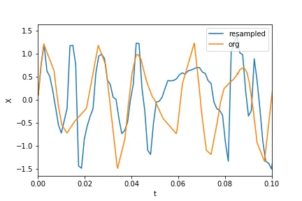
但是,当我将
fft 的参数更改为我的数据集并绘制它时,我得到非常奇怪的结果,似乎频率的缩放可能有误。我不确定。这是我正在尝试进行 FFT 的数据的 pastebin 链接。
http://pastebin.com/0WhjjMkb http://pastebin.com/ksM4FvZS
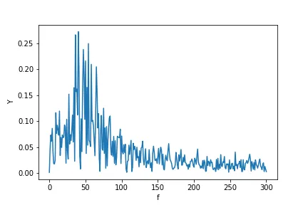
当我在整个东西上使用fft()时,它只有一个巨大的零点脉冲,没有其他东西。这是我的代码:
## Perform FFT with SciPy
signalFFT = fft(yInterp)

## Get power spectral density
signalPSD = np.abs(signalFFT) ** 2

## Get frequencies corresponding to signal PSD
fftFreq = fftfreq(len(signalPSD), spacing)

## Get positive half of frequencies
i = fftfreq>0

##
plt.figurefigsize = (8, 4)
plt.plot(fftFreq[i], 10*np.log10(signalPSD[i]));
#plt.xlim(0, 100);
plt.xlabel('Frequency [Hz]');
plt.ylabel('PSD [dB]')
间距就等于
xInterp[1]-xInterp[0]。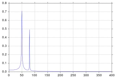
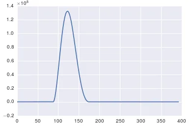
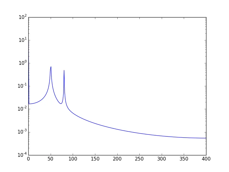
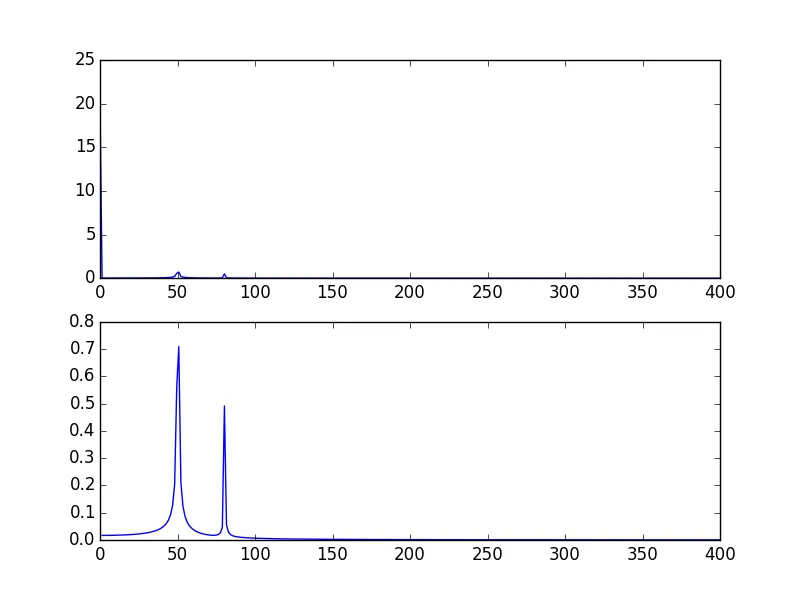 另一种方法是以对数刻度可视化数据: