x轴和y轴使用相同的刻度

41

我正在使用Python的Plotly,但无法设置xy轴,使它们具有相同的比例:

这是我的布局:

layout = Layout(
    xaxis=XAxis(
        range=[-150, 150],
        showgrid=True,
        zeroline=True,
        showline=True,
        gridcolor='#bdbdbd',
        gridwidth=2,
        zerolinecolor='#969696',
        zerolinewidth=4,
        linecolor='#636363',
        linewidth=6
    ),
    yaxis=YAxis(
        range=[-150,150],
        showgrid=True,
        zeroline=True,
        showline=True,
        gridcolor='#bdbdbd',
        gridwidth=2,
        zerolinecolor='#969696',
        zerolinewidth=4,
        linecolor='#636363',
        linewidth=6
    )
)

然后我会得到类似这样的东西!

enter image description here

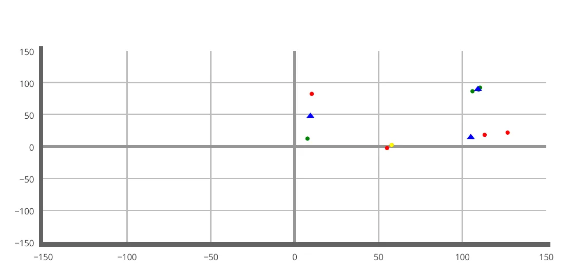
为什么x轴和y轴的比例不同?这会影响我的可视化效果。

如何获得一个具有正方形单元格的网格?

4个回答

78

最终,这个功能被实现了。

layout = go.Layout(yaxis=dict(scaleanchor="x", scaleratio=1))

更新:在新版本的plotly中,请使用以下内容:

fig.update_yaxes(
    scaleanchor="x",
    scaleratio=1,
  )

请在此处查看示例。


7
有没有一种方法可以用于3D图形? 我已经尝试了 go.Layout(zaxis=dict(scaleanchor="x", scaleratio=1)) 但是没有效果。 - Ray
4
@Ray,请看这个链接:https://community.plot.ly/t/creating-a-3d-scatterplot-with-equal-scale-along-all-axes/15108,以及这个链接:https://plot.ly/python/3d-axes/。 - ap21
然而,这也限制了缩放交互工具仅为正方形。 - nn0p
1
看起来已经更新了:fig.update_yaxes(scaleanchor="x", scaleratio=1) - Gunther Struyf
很遗憾,这对我来说不起作用 :( - undefined

9
您可以在布局中为 heightwidth 指定相同的长度。以下是一个示例:
layout = Layout(
    xaxis=XAxis(
       range=[-150, 150],
       showgrid=True,
       zeroline=True,
       showline=True,
       gridcolor='#bdbdbd',
       gridwidth=2,
       zerolinecolor='#969696',
       zerolinewidth=4,
       linecolor='#636363',
       linewidth=6
    ),
    yaxis=YAxis(
        range=[-150,150],
        showgrid=True,
        zeroline=True,
        showline=True,
        gridcolor='#bdbdbd',
        gridwidth=2,
        zerolinecolor='#969696',
        zerolinewidth=4,
        linecolor='#636363',
        linewidth=6
   ),
   height=600,
   width=600,
)

5
请注意,如果有图例存在,这种方法就不适用了,因为图例也会占用一些那600像素的位置。@Brut的答案更加健壮可靠。 - waterproof
@waterproof 是谁的答案? - undefined
看起来那个答案已经消失了。我会选择@Max的答案! - undefined

2
@neda的答案仅适用于x和y范围相等的情况,这种情况很少见。这似乎是很多人在寻求的东西,就像matplotlib的axis('equal')一样。请参见 https://github.com/plotly/plotly.py/issues/70
目前,我使用一个乘数分别调整两个范围-本质上定义了每个轴上的每个单位长度有多长。
height=(yMax - yMin) * mul
width= (xMax - xMin) * mul

即使这样做,网格也不是一个完美的100%正方形。

0
ml_mx = max(Curve)
ml_mn = min(Curve)
ap_mx = max(Curve2)
ap_mn = min(Curve2)

if ml_mx > ap_mx:
    mx = ml_mx
else:
    mx = ap_mx

if ml_mn < ap_mn:
    mn = ml_mn
else:
    mn = ap_mn

mx = mx + mx * 0.2
mn = mn - mn * 0.2

fig_graficas.update_yaxes(
    range = [mn,mx]
)
fig_graficas.update_xaxes(
    range = [mn,mx]
)

1
虽然这段代码可能回答了问题,但最好解释一下它是如何解决问题的,而不引入其他问题,并解释为什么要使用它。仅有代码的答案从长远来看并不有用。 - Tomer Shetah

网页内容由stack overflow 提供, 点击上面的
可以查看英文原文,
原文链接