我正在学习 Python,但在尝试绘制来自我的表格的数据时遇到了困难。
这是我的一部分代码:
    df1 = populationReport.loc[['Time','VIC','NSW','QLD']]

    df1 = df1.set_index('Time')

    print(df1)

    plt.plot(df1)
    plt.legend(df1.columns)
    plt.ylabel ('Population')
    plt.xlabel ('Timeline')


    plt.show()
我希望X轴显示“时间”列中的信息。但目前它只显示表格中的行号。
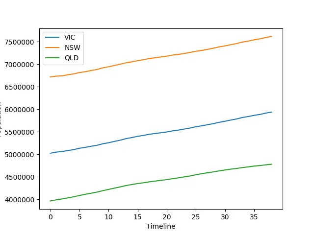
附图显示所需的图,但X轴应该显示“时间”列中的数据,而不是条目数。 我的草稿图
这是表格的样子:
           VIC        NSW        QLD
Time
1/12/05  5023203.0  6718023.0  3964175.0
1/3/06   5048207.0  6735528.0  3987653.0
1/6/06   5061266.0  6742690.0  4007992.0
1/9/06   5083593.0  6766133.0  4031580.0
1/12/06  5103965.0  6786160.0  4055845.0