如何在ggplot的每个分面行中添加y轴标题?

4

我正在使用facet_grid()创建散点图,就像这样:

library(ggplot2)
ggplot(df, aes(x, y)) +
  geom_point() +
  facet_grid(group1 ~ group2)

我希望 y 轴标题 y 位于每一行的中间,效果如下图所示 (绘画解决方案):

Desired plot

在这个例子中,由于 df$group2 具有两个不同的值,故 facet 行数为两行。在我的实际用例中,取决于使用的 facet 变量,可能会有更多的行;y 轴标题应位于每个facet行的中间。
到目前为止最好的解决方案是添加空格,但当使用不同长度的 y 轴标题时,文本会偏离行的中心,因此这种方法并不理想。 必须要使用 ggplot2,即不使用额外的软件包。我制作了一个软件包,不想依赖或包含太多软件包。 以下是所用数据:
df <- data.frame(x= rnorm(100), y= rnorm(100),
                 group1= rep(0:1, 50), group2= rep(2:3, each= 50))
4个回答

3

在不使用其他软件包的情况下,我认为最好的方法是在原始问题中链接的空格解决方案上进行构建。因此,我编写了一个函数来使标签间距更加健壮。

ylabel <- function(label1,label2){
  L1 <- nchar(label1)
  L2 <- nchar(label2)
  scaler <- ifelse(L1 + L2 > 8, 4, 0)
  space1 = paste0(rep("",27 - (L1/2)),collapse = " ")
  space2 = paste0(rep("",44 - (L1/2 + L2/2) - scaler), collapse = " ")
  space3 = paste0(rep("",22 - (L2/2)), collapse = " ")
  paste0(space1,label1,space2,label2,space3)
}

应用程序:

test <- ylabel("automobiles", "trucks")
ggplot(df, aes(x, y)) +
  geom_point() +
  facet_grid(group1 ~ group2) +
  ylab(test)

plot1

我还在调整scaler参数,它还不够完美:

test2 <- ylabel("super long label", "a")
ggplot(df, aes(x, y)) +
  geom_point() +
  facet_grid(group1 ~ group2) +
  ylab(test2)

plot2

我会继续完善功能/参数,但我认为这将使您接近您要寻找的内容。


我喜欢这个,但是在它目前的形式下,它不具有可扩展性 - 不能处理超过两行。此外,您应该努力避免将任何对象命名为基本的R函数,并且“c”可能是最糟糕的选择。 - tjebo
1
@tjebo 你的观点是正确的。我已经相应地调整了我的对象名称。此外,我承认我忽略了OP对于具有灵活行数的要求。这给这个棘手的问题增加了另一层。 - NovaEthos

3

您可以将轴标签复制到gtable中的新grobs中。请注意,尽管这使用了gridgtable包,但这些包已经由ggplot2导入,因此这不会添加任何新的依赖项,这些依赖项已经可用并在ggplot内部使用。

library(grid)
library(gtable)

g = ggplot(df, aes(x, y)) +
  geom_point() +
  facet_grid(group1 ~ group2)

gt = ggplot_gtable(ggplot_build(g))
which.ylab = grep('ylab-l', gt$layout$name)
gt = gtable_add_grob(gt, gt$grobs[which.ylab], 8, 3)
gt = gtable_add_grob(gt, gt$grobs[which.ylab], 10, 3)
gt = gtable_filter(gt, 'ylab-l', invert = TRUE) # remove the original axis title
grid.draw(gt)

以下内容适用于只有两个要素的示例,如果我们想将其推广到任意数量的要素上,可以通过搜索gtable来简单地找出包含y轴的行。请参考以下内容:

输入图片描述

gt = ggplot_gtable(ggplot_build(g))
which.ylab = grep('ylab-l', gt$layout$name)
which.axes = grep('axis-l', gt$layout$name)
axis.rows  = gt$layout$t[which.axes]
label.col  = gt$layout$l[which.ylab]
gt = gtable::gtable_add_grob(gt, rep(gt$grobs[which.ylab], length(axis.rows)), axis.rows, label.col)
gt = gtable::gtable_filter  (gt, 'ylab-l', invert = TRUE) 
grid::grid.draw(gt)

在上述版本中,我还使用了::来明确指定grid和gtable包中的函数的名称空间。这将使代码即使在没有将额外的包加载到搜索路径中的情况下也可以正常工作。
通过另一个具有四个facet行的例子来演示此代码:
df <- data.frame(x= rnorm(100), y= rnorm(100),
                 group1= rep(1:4, 25), group2= rep(1:2, each= 50))

enter image description here


1
真的很喜欢那个解决方案。关于依赖项-(我个人不介意添加更多的依赖项)-我认为即使ggplot2导入了这些包的整个命名空间,如果您明确使用这些函数,则仍然需要直接从这些包中导入,因此也将其添加到您的描述中的依赖项中。 - tjebo
3
是的,您仍然需要导入它们,但我不明白这可能会有什么不利影响,因为它们必须已经安装了。 - dww
这些已经被ggplot2导入了。这是否意味着任何安装了ggplot2的人在运行library(grid); library(gtable)之后都可以运行代码? - user11538509
是的,它确实可以。不过如果你想在一个包内使用这段代码,你需要稍微改一下。在包中,你不再使用 library 函数,而是在一个名为 DESCRIPTION 的文件中列出要导入的包(例如请参见 此处)。如果你正在你的包中使用 ggplot2,那么你应该已经在这样做以访问 ggplot 函数了。 - dww
1
哦不,我因为它显示在顶部而错误地将赏金给了其他答案。我期望被接受的答案在顶部。无法撤消... - user11538509
没关系。我相信你让@susanswitzer非常开心。 - dww

2

您可以考虑使用库(cowplot)来获得更多的控制权。

以下代码可以添加到函数中,但为了清晰起见,我将其保留得较长。创建4个数据框并将它们提供给四个图表。然后排列这些图表。

library(tidyverse)
df <- data.frame(x= rnorm(100), y= rnorm(100),
                 group1= rep(0:1, 50), group2= rep(2:3, each= 50))


library(cowplot)
df1 <- df %>% 
  filter(group2 == 2) %>% 
         filter(group1 == 0)

df2 <- df %>% 
  filter(group2 == 3) %>% 
  filter(group1 == 0)

df3 <- df %>% 
  filter(group2 == 2) %>% 
  filter(group1 == 1)

df4 <- df %>% 
  filter(group2 == 3) %>% 
  filter(group1 == 1)

plot1 <- ggplot(df1, aes(x, y)) +
  geom_point() +
  facet_grid(group1 ~ group2)+
  xlim(c(-3, 3))+
  ylim(c(-3, 2))+
  theme(strip.text.y = element_blank(), 
        axis.title.x = element_blank(), 
        axis.text.x = element_blank(), 
        axis.ticks.x = element_blank()
        )
plot1


plot2 <- ggplot(df2, aes(x, y)) +
  geom_point() +
  facet_grid(group1 ~ group2)+
  xlim(c(-3, 3))+
  ylim(c(-3, 2))+
  theme(axis.title.y = element_blank(), 
        axis.text.y = element_blank(), 
        axis.ticks.y = element_blank(), 
        axis.title.x = element_blank(), 
        axis.text.x = element_blank(), 
        axis.ticks.x = element_blank()
        )
plot2


plot3 <- ggplot(df3, aes(x, y)) +
  geom_point() +
  facet_grid(group1 ~ group2)+
  xlim(c(-3, 3))+
  ylim(c(-3, 2))+
  theme(strip.text.x = element_blank(),
        strip.text.y = element_blank())
plot3


plot4 <- ggplot(df4, aes(x, y)) +
  geom_point() +
  facet_grid(group1 ~ group2)+
  xlim(c(-3, 3))+
  ylim(c(-3, 2))+
  theme(axis.title.y = element_blank(), 
        strip.text.x = element_blank(),
        axis.text.y = element_blank(), 
        axis.ticks.y = element_blank())
plot4

plot_grid(plot1, plot2, plot3, plot4)

plotgrid


2
这里有一个版本,使用ggplot2进行注释。它应该是可扩展的。
不需要处理grobs。缺点是x轴定位和图形边距需要半手动定义,这可能不太稳健。
library(ggplot2)

df <- data.frame(x= rnorm(100), y= rnorm(100),
                 group1= rep(0:1, 50), group2= rep(2:3, each= 50))

## define a new data frame based on your groups, so this is scalable
annotate_ylab <- function(df, x, y, group1, group2, label = "label") {
  ## make group2 a factor, so you know which column will be to the left
  df[[group2]] <- factor(df[[group2]])
  lab_df <- data.frame( 
    ## x positioning is a bit tricky,
    ## I think a moderately robust method is to
    ## set it relativ to the range of your values
    x = min(df[[x]]) - 0.2 * diff(range(df[[x]])),
    y = mean(df[[y]]),
    g1 = unique(df[[group1]]),
    ## draw only on the left column
    g2 = levels(df[[group2]])[1],
    label = label
  )
  names(lab_df) <- c(x, y, group1, group2, "label")
  lab_df
}

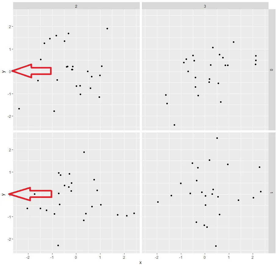
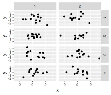
y_df <- annotate_ylab(df, "x", "y", "group1", "group2", "y")

ggplot(df, aes(x, y)) +
  geom_point() +
  geom_text(data = y_df, aes(x, y, label = label), angle = 90) +
  facet_grid(group1 ~ group2) +
  coord_cartesian(xlim = range(df$x), clip = "off") +
  theme(axis.title.y = element_blank(), 
        plot.margin = margin(5, 5, 5, 20))

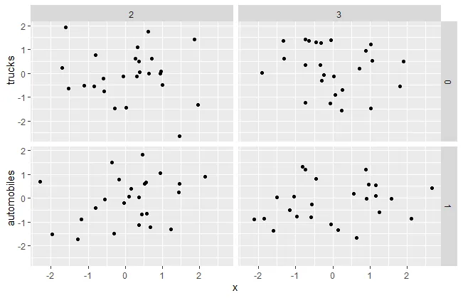
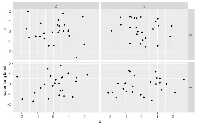
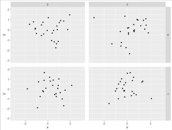
y_df_mtcars <- annotate_ylab(mtcars, "mpg", "disp", "carb", "vs", "y")

ggplot(mtcars, aes(mpg, disp)) +
  geom_point() +
  geom_text(data = y_df_mtcars, aes(mpg, disp, label = label), angle = 90) +
  facet_grid(carb ~ vs) +
  coord_cartesian(xlim = range(mtcars$mpg), clip = "off") +
  theme(axis.title.y = element_blank(), 
        plot.margin = margin(5, 5, 5, 20))

reprex package (v2.0.1)于2021年11月24日创建


1
这个想法很好(+1)。不幸的是,正如你所提到的,它并不健壮。我尝试了 df <- mtcars; df$x <- df$mpg; df$y <- df$disp; df$group1 <- as.factor(df$carb); df$group2 <- as.factor(df$vs) 作为新数据,在生成的图中,y标签被y值覆盖了。 - user11538509
@机器 我找到了几分钟 :) 我认为当相对于您的值范围定位时,它应该更加健壮-请查看我的更新。 - tjebo
我认为这几乎完成了。我注意到比例尺也必须根据列分面的数量进行调整。如果使用具有比vs更多级别的变量作为group2,则会再次将y标签移动到y值中。例如,尝试使用y_df_mtcars <- annotate_ylab(mtcars, "mpg", "disp", "carb", "cyl", "y") ... facet_grid(carb ~ cyl) + ...。我将x更改为min(df[[x]]) - 0.25 * diff(range(df[[x]])) * (length(levels(df[[group2]]))*.4),在这里似乎有效。还没有尝试其他数据。 - user11538509
1
我猜这个解决方案的缺陷就在于它总会有一种情况无法正常工作... 这取决于你对用户最可能使用它的期望。考虑到所有用例可能会很棘手。我认为dww的解决方案最为健壮,即使内部结构在过去发生了变化,也没有理由认为未来不会发生变化,即使如此,我猜更新您的软件包也不需要太多调整。 - tjebo

网页内容由stack overflow 提供, 点击上面的
可以查看英文原文,
原文链接