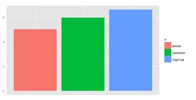
df2 <- iris[c(5,1)]
df3 <- aggregate(df2$Sepal.Length, list(df2$Species), mean)
names(df3) <- c("x","y")

ggplot(df3, aes(x,y)) +
  geom_bar(aes(fill=x),stat="identity") +
  theme(axis.ticks=element_blank(), axis.text.x=element_blank())
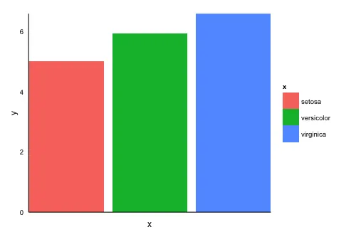
df2 <- iris[c(5,1)]
df3 <- aggregate(df2$Sepal.Length, list(df2$Species), mean)
names(df3) <- c("x","y")
ggplot(df3, aes(x,y)) +
geom_bar(aes(fill=x),stat="identity") +
theme(axis.ticks=element_blank(), axis.text.x=element_blank())
根据这个问题与回答的启示,将以下元素添加到您的代码中:
theme_classic()
scale_x_discrete(expand=c(0,0))
scale_y_continuous(expand=c(0,0))
除了使用theme_classic()之外,您还可以使用theme_bw(),它将在绘图中添加水平和垂直线。
您的代码应该如下所示:
ggplot(df3, aes(x,y)) +
  geom_bar(aes(fill=x),stat="identity") +
  scale_x_discrete(expand=c(0,0)) +
  scale_y_continuous(expand=c(0,0)) +
  theme_classic() +
  theme(axis.ticks=element_blank(), axis.text.x=element_blank())
scale_x_discrete(expand=c(0,0)) 更改为 scale_x_discrete(expand=c(0.1,0)),它确实起作用了,但我不确定这是否是最好的方法。 - Pablo Herreros Cantisgeom_bar 的 width 参数设置为小于 0.9 的值来实现。 - Jaap
print(p + scale_y_continuous(expand = c(0, 0)))) - NicE