我有一个直方图,其中包含一堆分组数据,我想知道是否可以在我选择直方图中的某个条形图时生成一张表格,并且它将按照原始数据框中的方式显示数据。
2个回答
4
您可以使用
mark_text创建表格的外观。这里是一个基于文档页面的示例:import altair as alt
from vega_datasets import data
source = data.cars()
# Brush for selection
brush = alt.selection(type='interval')
# Scatter Plot
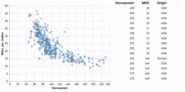
points = alt.Chart(source).mark_point().encode(
x='Horsepower:Q',
y='Miles_per_Gallon:Q',
color=alt.condition(brush, alt.value('steelblue'), alt.value('grey'))
).add_selection(brush)
# Base chart for data tables
ranked_text = alt.Chart(source).mark_text(align='right').encode(
y=alt.Y('row_number:O',axis=None)
).transform_filter(
brush
).transform_window(
row_number='row_number()'
).transform_filter(
'datum.row_number < 15'
)
# Data Tables
horsepower = ranked_text.encode(text='Horsepower:N').properties(title=alt.TitleParams(text='Horsepower', align='right'))
mpg = ranked_text.encode(text='Miles_per_Gallon:N').properties(title=alt.TitleParams(text='MPG', align='right'))
origin = ranked_text.encode(text='Origin:N').properties(title=alt.TitleParams(text='Origin', align='right'))
text = alt.hconcat(horsepower, mpg, origin) # Combine data tables
# Build chart
alt.hconcat(
points,
text
).resolve_legend(
color="independent"
).configure_view(strokeWidth=0)
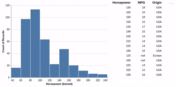
对于直方图,由于Vega-Lite目前的限制略有不同,您需要创建第二个过滤层来在直方图中视觉显示所选内容。
import altair as alt
from vega_datasets import data


source = data.cars()

# Brush for selection
brush = alt.selection(type='single', encodings=['x'])

# Histogram base
hist_base = alt.Chart(source).mark_bar(color='grey').encode(
    x=alt.X('Horsepower:Q', bin=True),
    y='count()',
).add_selection(brush)

# Histogram selection
hist_selection = alt.Chart(source).mark_bar().encode(
    x=alt.X('Horsepower:Q', bin=True),
    y='count()',
).transform_filter(brush)

# Base chart for data tables
ranked_text = alt.Chart(source).mark_text(align='right').encode(
    y=alt.Y('row_number:O',axis=None)
).transform_filter(
    brush
).transform_window(
    row_number='row_number()'
).transform_filter(
    'datum.row_number < 15'
)

# Data Tables
horsepower = ranked_text.encode(text='Horsepower:N').properties(title=alt.TitleParams(text='Horsepower', align='right'))
mpg = ranked_text.encode(text='Miles_per_Gallon:N').properties(title=alt.TitleParams(text='MPG', align='right'))
origin = ranked_text.encode(text='Origin:N').properties(title=alt.TitleParams(text='Origin', align='right'))
text = alt.hconcat(horsepower, mpg, origin) # Combine data tables

# Build chart
alt.hconcat(
    hist_base+hist_selection,
    text
).resolve_legend(
    color="independent"
).configure_view(strokeWidth=0)
- joelostblom
4
1
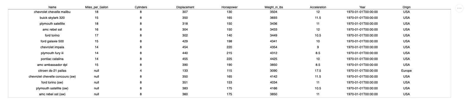
可以从这篇文章中得出更通用的解决方案。
from vega_datasets import data
import altair as alt

def table(df):
    return (
        alt.Chart(df.reset_index())
        .mark_text()
        .transform_fold(df.columns.tolist())
        .encode(
            alt.X(
                "key",
                type="nominal",
                axis=alt.Axis(
                    # flip x labels upside down
                    orient="top",
                    # put x labels into horizontal direction
                    labelAngle=0,
                    title=None,
                    ticks=False
                ),
                scale=alt.Scale(padding=10),
                sort=None,
            ),
            alt.Y("index", type="ordinal", axis=None),
            alt.Text("value", type="nominal"),
        )
    )

source = data.cars()

# display only 15 rows
table(source[:15]).properties(width=1500)
- Gompro
2
这很酷!想要提交一个 PR 作为 Altair 图库的示例吗? - joelostblom
再次阅读此内容,我注意到宽度是手动指定的。串联方法的优点之一是宽度针对每列进行了优化,如果画廊中的表函数也具有此属性,则会更好。在此处可以找到更多讨论 https://github.com/vega/vega-lite/issues/8063 - joelostblom
网页内容由stack overflow 提供, 点击上面的可以查看英文原文,
原文链接
原文链接
ranked_text图表的 y 编码设置为y=alt.Y('row_number:O', axis=None, sort=alt.EncodingSortField('Horsepower'))。 - joelostblom