我正在使用
gridExtra 包中的 grid.arrange() 函数绘制 4 个由 ggplot2 生成的图形。整体使用 RStudio 中的 RMarkdown 工作,并通过 knitr 包呈现为 HTML 格式。 g1 <- ggplot(); g2 <- ggplot(); g3 <- ggplot(); g4 <- ggplot()
grid.arrange(g1,g2,g3,g4,ncol=2,nrow=2)
在 RMarkdown/knitr 中,我使用了以下选项:
   output:
   html_document:
   keep_md: true

 ```r,figures, fig.align='center',fig.width=12,fig.height=10```
问题:这4个数字虽然按照需要绘制,但大小明显不成比例。
已尝试的解决方案:在此问题中提出,但效果不佳。
编辑:现在提供可重现的示例,并附带html输出屏幕截图。
```{r mtcars plots, fig.align='center',fig.width=9,fig.height=7}
   library(datasets)
   library(ggplot2)
   library(gridExtra)
   g1 <- ggplot(mtcars, aes(drat,carb*100)) + geom_point(color="blue")
   g2 <- ggplot(mtcars, aes(mpg,hp)) + geom_point(color="red")
   g3 <- ggplot(mtcars, aes(qsec,wt)) + geom_point(color="green")
   g4 <- ggplot(mtcars, aes(carb,disp*100)) + geom_point(color="orange")+
         labs(y="This is the lab for 'disp' fairly long until here")
   grid.arrange(g1,g2,g3,g4,ncol=2,nrow=2,
         top=textGrob("MTCARS: Everything about cars...!",
                      gp=gpar(fontsize=16,font=1)))
   ```
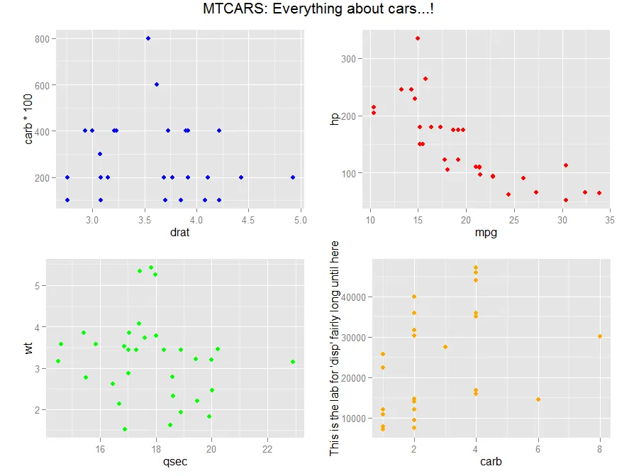
这里的效果比真实数据略微微妙。请注意“绿色”和“橙色”图形的对齐。
任何帮助将不胜感激。