我想在同一张图中绘制y1和y2。
x  <- seq(-2, 2, 0.05)
y1 <- pnorm(x)
y2 <- pnorm(x, 1, 1)
plot(x, y1, type = "l", col = "red")
plot(x, y2, type = "l", col = "green")
但是当我这样做时,它们没有在同一张图中绘制。
在Matlab中,可以使用hold on实现此功能,但是有人知道如何在R中实现吗?
使用ggplot2,可以将常见的Matlab用法plot(x1,y1,x2,y2)翻译成R语言,例如:
ggplot() + geom_line(aes(x = x1, y = y1)) + geom_line(aes(x = x2, y = y2))x1 <- seq(1,10,.2)
df1 <- data.frame(x=x1,y=log(x1),type="Log")
x2 <- seq(1,10)
df2 <- data.frame(x=x2,y=cumsum(1/x2),type="Harmonic")
df <- rbind(df1,df2)
library(ggplot2)
ggplot(df)+geom_line(aes(x,y,colour=type))
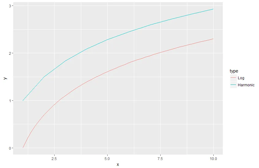
灵感来自Tingting Zhao的使用ggplot2创建具有不同x轴范围的双线图。
不要将要绘制的值存储在数组中,而是将它们存储在矩阵中。默认情况下,整个矩阵将被视为一个数据集。但是,如果您向绘图添加与矩阵行数相同的修饰符(例如col()),R将确定每一行应该独立处理。例如:
x = matrix( c(21,50,80,41), nrow=2 )
y = matrix( c(1,2,1,2), nrow=2 )
plot(x, y, col("red","blue")
除非你的数据集大小不同,否则这应该能够工作。
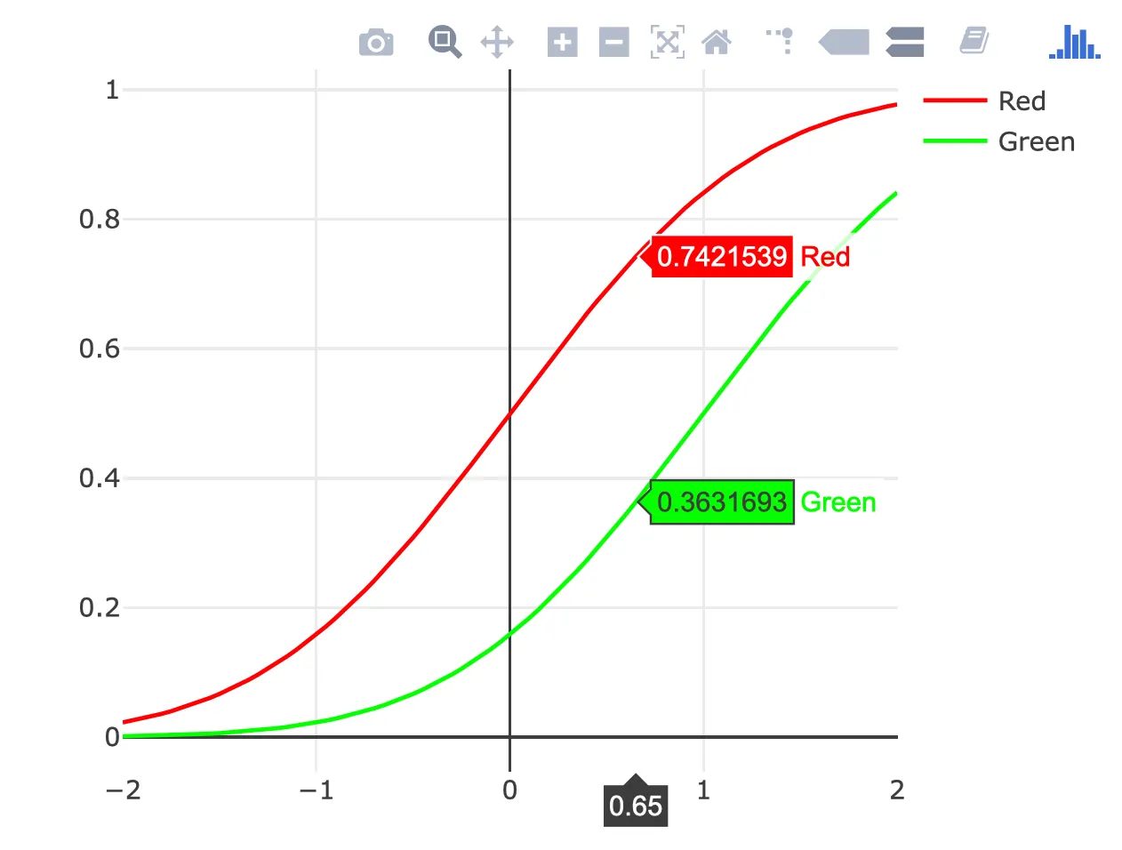
ggplotly() 函数来将这里的任何 gggplot2 示例转换为交互式图表,但我认为这种类型的图表不需要 ggplot2。# call Plotly and enter username and key
library(plotly)
x <- seq(-2, 2, 0.05)
y1 <- pnorm(x)
y2 <- pnorm(x, 1, 1)
plot_ly(x = x) %>%
add_lines(y = y1, color = I("red"), name = "Red") %>%
add_lines(y = y2, color = I("green"), name = "Green")
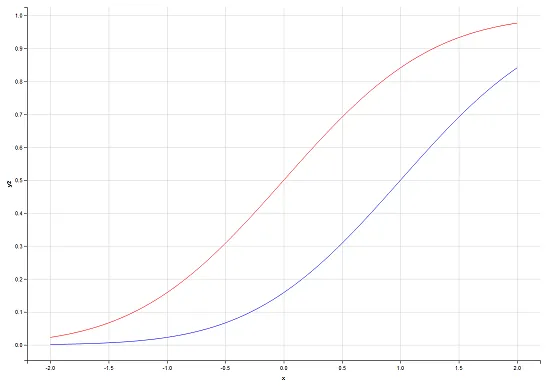
您也可以使用ggvis创建您的图表:
library(ggvis)

x  <- seq(-2, 2, 0.05)
y1 <- pnorm(x)
y2 <- pnorm(x,1,1)
df <- data.frame(x, y1, y2)

df %>%
  ggvis(~x, ~y1, stroke := 'red') %>%
  layer_paths() %>%
  layer_paths(data = df, x = ~x, y = ~y2, stroke := 'blue')
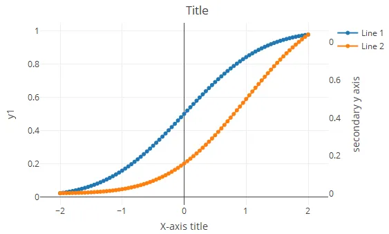
使用plotly(添加了来自plotly的解决方案,具有主要和次要y轴-似乎缺少):
library(plotly)
x  <- seq(-2, 2, 0.05)
y1 <- pnorm(x)
y2 <- pnorm(x, 1, 1)

df=cbind.data.frame(x,y1,y2)

  plot_ly(df) %>%
    add_trace(x=~x,y=~y1,name = 'Line 1',type = 'scatter',mode = 'lines+markers',connectgaps = TRUE) %>%
    add_trace(x=~x,y=~y2,name = 'Line 2',type = 'scatter',mode = 'lines+markers',connectgaps = TRUE,yaxis = "y2") %>%
    layout(title = 'Title',
       xaxis = list(title = "X-axis title"),
       yaxis2 = list(side = 'right', overlaying = "y", title = 'secondary y axis', showgrid = FALSE, zeroline = FALSE))
演示截图:
Error in library(plotly) : there is no package called ‘plotly’ 为什么? - user9802913plotly 包吗?你需要使用 install.packages("plotly") 命令来安装该包。 - Saurabh Chauhanlibrary(lattice)
x <- seq(-2,2,0.05)
y1 <- pnorm(x)
y2 <- pnorm(x,1,1)
xyplot(y1 + y2 ~ x, ylab = "y1 and y2", type = "l", auto.key = list(points = FALSE,lines = TRUE))
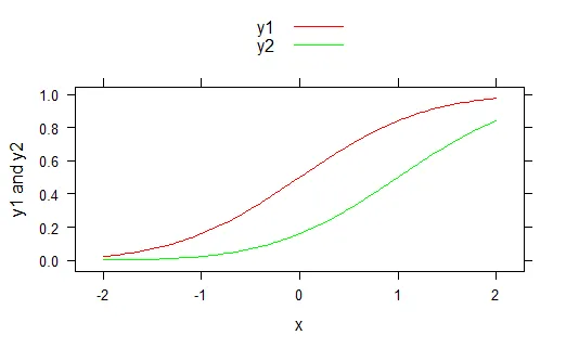
对于特定的颜色
xyplot(y1 + y2 ~ x,ylab = "y1 and y2", type = "l", auto.key = list(points = F,lines = T), par.settings = list(superpose.line = list(col = c("red","green"))))
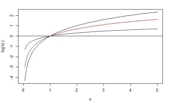
使用curve绘制数学函数。而使用add=TRUE则可以在同一图形和坐标轴上绘制多个函数。
curve( log2 , to=5     , col="black", ylab="log's(.)")
curve( log  , add=TRUE , col="red" )
curve( log10, add=TRUE , col="blue" )
abline( h=0 )
?curve。使用参数add=TRUE。 - isomorphismes