我的文件中有10个x和y的值。
是否有办法在matplotlib中外推图形,即将其转换为连续函数并增加其范围以适用于其他x值?
如果有人能告诉我是否有其他软件可用,我甚至会感激不尽。我基本上希望这10个值被近似为一个连续函数,以便我可以知道某些随机x点的y值。
我的文件中有10个x和y的值。
是否有办法在matplotlib中外推图形,即将其转换为连续函数并增加其范围以适用于其他x值?
如果有人能告诉我是否有其他软件可用,我甚至会感激不尽。我基本上希望这10个值被近似为一个连续函数,以便我可以知道某些随机x点的y值。
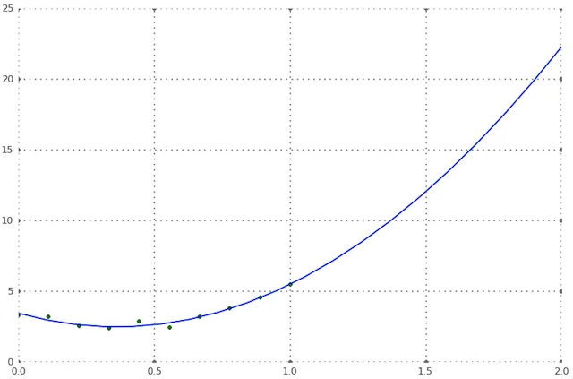
我在下面使用Scipy,但是相同的函数(polyval和polyfit)也在NumPy中; NumPy是Matplotlib的依赖库,因此如果您没有安装SciPy,可以从NumPy中导入这两个函数。
import numpy as NP
from scipy import polyval, polyfit
from matplotlib import pyplot as PLT

n=10   # 10 data points
# make up some data
x = NP.linspace(0, 1, n)
y = 7*x**2 - 5*x + 3
# add some noise
noise = NP.random.normal(.5, .3, 10)
y += noise

# the shape of the data suggests a 2d polynomial, so begin there
# a, b, c are the polynomial coefficients: ax^2 + bx + c
a, b, c = polyfit(x, y, 2)
y_pred = polyval([a, b, c], x)    # y_pred refers to predicted values of y

# how good is the fit?
# calculate MSE:
MSE = NP.sqrt( NP.sum((y_pred-y)**2)/10 )
# MSE = .2

# now use the model polynomial to generate y values based on x values outside
# the range of the original data:
x_out = NP.linspace(0, 2, 20)   # choose 20 points, 10 in, 10 outside original range
y_pred = polyval([a, b, c], x_out)

# now plot the original data points and the polynomial fit through them
fig = PLT.figure()
ax1 = fig.add_subplot(111)

ax1.plot(x, y, 'g.', x_out, y_pred, 'b-' )

PLT.show()
from scipy.interpolate import interp1d

# the available data points
x = [1, 2, 3]
y = [10, 20, 30]

# return a function f, such that f(x) is the interpolated value at 'x'
f = interp1d(x, y, kind='cubic')
x 计算函数 f(x)。例如,print f(2.5) 将返回 x=2.5 的插值值。你需要的大部分内容都可以在这里找到: http://docs.scipy.org/doc/scipy/reference/tutorial/interpolate.html
但是不要外推,除非你确信自己知道自己在做什么。