matplotlib:子图背景(轴面+标签)颜色 [或,图/轴坐标系]

3
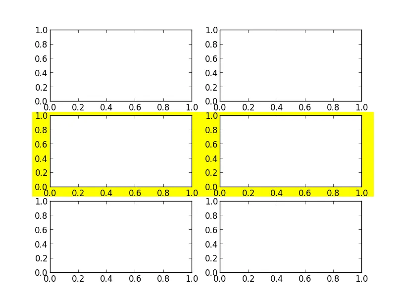
我有一个包含3x2个子图的图形,我想在中间一对子图上设置背景颜色,以便更清楚地显示哪个坐标轴标签属于哪个子图。
在构建子图时设置facecolor仅更改由轴定义的区域的颜色;刻度和轴标签仍然绘制在figure.patch上。 假设没有简单的方法来解决这个问题,我可以在figure.axes中的相关实例后面添加矩形补丁。
经过一些尝试,似乎figure.axes[x].get_position()返回轴坐标(标准化坐标[0.0-1.0]),但Rectangle()似乎需要显示坐标(像素)。 这段代码基本上有效(ED:交互式地,但在输出到png(使用Agg渲染器)时,矩形的定位完全不正确):
import matplotlib.pyplot as plt
import matplotlib

f = plt.figure()
plt.subplot( 121 )
plt.title( 'model' )
plt.plot( range(5), range(5) )
plt.xlabel( 'x axis' )
plt.ylabel( 'left graph' )
plt.subplot( 122 )
plt.title( 'residuals' )
plt.plot( range(5), range(5) )
plt.xlabel( 'x axis' )
plt.ylabel( 'right graph' )
plt.tight_layout(pad=4)

bb = f.axes[0].get_position().transformed( f.transFigure ).get_points()
bb_pad = (bb[1] - bb[0])*[.20, .10]
bb_offs = bb_pad * [-.25, -.20]
r = matplotlib.patches.Rectangle( bb[0]-bb_pad+bb_offs, *(bb[1] - bb[0] + 2*bb_pad),
                                  zorder=-10, facecolor='0.85', edgecolor='none' )
f.patches.extend( [r] )

这种做法似乎很hackish,而且感觉自己错过了重要的东西。是否有人可以解释一下,是否有更简单/更好的方法来实现这个目标?如果有,它是什么呢?

由于我确实需要写入文件,目前我还没有找到解决方案。


可能相关:https://dev59.com/M3I-5IYBdhLWcg3wEEHu - tacaswell
是的,类似。在那个例子中,他们正在将补丁添加到轴上(因此如果移动轴,它将移动),但这需要他们调整剪辑,因为对象位于轴的边界框之外。我想这证明了没有更直接的方法来做到这一点。问题变成了坐标系统出了什么问题? - strix
1个回答

7

只需使用transform参数传递Rectangle对象,就可以使用任何坐标系。

以下是一个简单的示例:

import matplotlib.pyplot as plt
from matplotlib.patches import Rectangle

fig, axes = plt.subplots(3, 2)

rect = Rectangle((0.08, 0.35), 0.85, 0.28, facecolor='yellow', edgecolor='none',
                 transform=fig.transFigure, zorder=-1)
fig.patches.append(rect)
plt.show()

输入图像描述

然而,如果您希望更加健壮地进行操作,并计算轴的范围,您可以这样做:

import matplotlib.pyplot as plt
from matplotlib.transforms import Bbox
from matplotlib.patches import Rectangle

def full_extent(ax, pad=0.0):
    """Get the full extent of an axes, including axes labels, tick labels, and
    titles."""
    # For text objects, we need to draw the figure first, otherwise the extents
    # are undefined.
    ax.figure.canvas.draw()
    items = ax.get_xticklabels() + ax.get_yticklabels() 
#    items += [ax, ax.title, ax.xaxis.label, ax.yaxis.label]
    items += [ax, ax.title]
    bbox = Bbox.union([item.get_window_extent() for item in items])
    return bbox.expanded(1.0 + pad, 1.0 + pad)


fig, axes = plt.subplots(3,2)

extent = Bbox.union([full_extent(ax) for ax in axes[1,:]])

# It's best to transform this back into figure coordinates. Otherwise, it won't
# behave correctly when the size of the plot is changed.
extent = extent.transformed(fig.transFigure.inverted())

# We can now make the rectangle in figure coords using the "transform" kwarg.
rect = Rectangle([extent.xmin, extent.ymin], extent.width, extent.height,
                 facecolor='yellow', edgecolor='none', zorder=-1, 
                 transform=fig.transFigure)
fig.patches.append(rect)

plt.show()

enter image description here


网页内容由stack overflow 提供, 点击上面的
可以查看英文原文,
原文链接