纯CSS滚动阴影

18
我希望在内容超出可用宽度时启用滚动阴影。我想通过纯CSS(无JS)实现这一目标。使用我在各种文章中找到的技巧,我可以通过多个CSS背景和background-attachment来实现我的目标。
如果内容只是文本,则下面的代码可以正常工作。但是,在按钮的情况下,阴影背景会显示在按钮后面。如何将这些阴影显示在按钮上方期望的行为:

three shadow scenarios

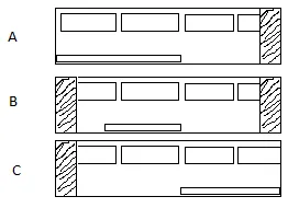
场景A:当滚动条在极左侧时,仅在右侧启用阴影。

场景B:当滚动条位于中间位置时,在左右两侧均启用阴影。

场景C:当滚动条在极右侧时,仅在左侧启用阴影。

示例:

/**
 * Scrolling shadows by @kizmarh and @leaverou
 * Only works in browsers supporting background-attachment: local; & CSS gradients
 * Degrades gracefully
 */

html {
  background: white;
  font: 120% sans-serif;
}
.scrollbox {
  overflow: auto;
  width: 200px;
  max-height: 160px;
  margin: 0 auto;
  background:
  /* Shadow covers */
  linear-gradient(white 30%, rgba(255, 255, 255, 0)), linear-gradient(rgba(255, 255, 255, 0), white 70%) 0 100%,
  /* Shadows */
  radial-gradient(50% 0, farthest-side, rgba(0, 0, 0, .2), rgba(0, 0, 0, 0)), radial-gradient(50% 100%, farthest-side, rgba(0, 0, 0, .2), rgba(0, 0, 0, 0)) 0 100%;
  background:
  /* Shadow covers */
  linear-gradient(white 30%, rgba(255, 255, 255, 0)), linear-gradient(rgba(255, 255, 255, 0), white 70%) 0 100%,
  /* Shadows */
  radial-gradient(farthest-side at 50% 0, rgba(0, 0, 0, .2), rgba(0, 0, 0, 0)), radial-gradient(farthest-side at 50% 100%, rgba(0, 0, 0, .2), rgba(0, 0, 0, 0)) 0 100%;
  background-repeat: no-repeat;
  background-color: white;
  background-size: 100% 40px, 100% 40px, 100% 14px, 100% 14px;
  /* Opera doesn't support this in the shorthand */
  background-attachment: local, local, scroll, scroll;
}
<div class="scrollbox">
  <ul>
    <li>Ah! Scroll below!</li>
    <li><button>Button</button></li>
    <li><button>Button</button></li>
    <li>1</li>
    <li>2</li>
    <li>3</li>
    <li>4</li>
    <li>5</li>
    <li><button>Button</button></li>
    <li><button>Button</button></li>
    <li>6</li>
    <li>7</li>
    <li>8</li>
    <li>9</li>
    <li>10</li>
    <li>The end!</li>
    <li>No shadow there.</li>
  </ul>
</div>


1
此外,查看此实现:https://codepen.io/matthewbeta/pen/fzoHI - The Onin
4个回答

2

这是一个有趣的问题,受到其他答案的启发,这里提供了一个水平滚动的滚动框,正如OP所要求的。

html {
  height: 100%;
}

body {
  display: flex;
  align-items: center;
  justify-content: center;
  height: 100%;
}

.scrollbox {
  display: flex;
  column-gap: 1rem;
  position: relative;
  width: 80vw;
  overflow-x: auto;
  overscroll-behavior: contain;
}

.item {
  height: 30vh;
  aspect-ratio: 1.41;
  background-color: silver;
}

.shadowHider {
  position: absolute;
  height: 30vh;
  width: 1rem;
  background-color: white;
  z-index: 2;
}
.shadowHider--end {
  position: sticky;
  margin-left: -2rem;
  flex: 0 0 1rem;
  left: calc(100% - 1rem);
}

.shadow {
  position: sticky;
  z-index: 1;
  height: 30vh;
  flex: 0 0 1rem;
}

.shadow--start {
  left: 0;
  margin-right: -1.5rem;
  background-image: linear-gradient(90deg, #0004, transparent);
}

.shadow--end {
  right: 0;
  margin-left: -1.5rem;
  background-image: linear-gradient(90deg, transparent, #0004);
  height: 30vh;
  width: 1rem;
  left: calc(100% - 2rem);
}
<div class="scrollbox">
  <div class="shadowHider shadowHider--start"></div>
  <div class="shadow shadow--start"></div>
  
  <div class="item"></div>
  <div class="item"></div>
  <div class="item"></div>
  <div class="item"></div>
  <div class="item"></div>
  <div class="item"></div>
  <div class="item"></div>
  <div class="item"></div>
  
  <div class="shadow shadow--end"></div>
  <div class="shadowHider shadowHider--end"></div>
</div>


0

这也会发生在文本中,但你看不到,因为它们是相同的颜色。解决方案是为子元素使用比父元素更低的z-index。为此,您需要两件其他事情:

  1. 对于子元素和父元素,需要使用static以外的position
  2. .scrollbox需要一个透明的背景

解决方案

.scrollbox li * {
  z-index:0;
  position:relative;
}
.scrollbox {
  z-index:1;
  position:relative;
  background-color:transparent;
}

/**
 * Scrolling shadows by @kizmarh and @leaverou
 * Only works in browsers supporting background-attachment: local; & CSS gradients
 * Degrades gracefully
 */

html {
  background: white;
  font: 120% sans-serif;
}
.scrollbox {
  overflow: auto;
  width: 200px;
  max-height: 160px;
  margin: 5px auto;
  background:
  /* Shadow covers */
  linear-gradient(white 30%, rgba(255, 255, 255, 0)), linear-gradient(rgba(255, 255, 255, 0), white 70%) 0 100%,
  /* Shadows */
  radial-gradient(50% 0, farthest-side, rgba(0, 0, 0, .2), rgba(0, 0, 0, 0)), radial-gradient(50% 100%, farthest-side, rgba(0, 0, 0, .2), rgba(0, 0, 0, 0)) 0 100%;
  background:
  /* Shadow covers */
  linear-gradient(white 30%, rgba(255, 255, 255, 0)), linear-gradient(rgba(255, 255, 255, 0), white 70%) 0 100%,
  /* Shadows */
  radial-gradient(farthest-side at 50% 0, rgba(0, 0, 0, .2), rgba(0, 0, 0, 0)), radial-gradient(farthest-side at 50% 100%, rgba(0, 0, 0, .2), rgba(0, 0, 0, 0)) 0 100%;
  background-repeat: no-repeat;
  background-color: transparent;
  background-size: 100% 40px, 100% 40px, 100% 14px, 100% 14px;
  /* Opera doesn't support this in the shorthand */
  background-attachment: local, local, scroll, scroll;
  z-index:1;
  position:relative;
}

.scrollbox li * {
  z-index:0;
  position:relative;
}
<div class="scrollbox">
  <ul>
    <li>Ah! Scroll below!</li>
    <li><button>Button</button></li>
    <li><button>Button</button></li>
    <li>1</li>
    <li>2</li>
    <li>3</li>
    <li>4</li>
    <li>5</li>
    <li><button>Button</button></li>
    <li><button>Button</button></li>
    <li>6</li>
    <li>7</li>
    <li>8</li>
    <li>9</li>
    <li>10</li>
    <li>The end!</li>
    <li>No shadow there.</li>
  </ul>
</div>

唯一剩下的问题是您需要一个坚实的背景颜色才能使其正常工作。

编辑:

子元素的z-index需要低于父元素,但如果您使用负z-index(如我建议的那样),则像点击和悬停之类的事件将停止工作。我已适当更改了代码。


2
Lea Verou的解决方案在Chrome上不再起作用。Roman Komarov的解决方案仍然有效http://kizu.ru/en/fun/shadowscroll/ - Denis
4
你确定这个能行吗?我尝试了一下,在这里代码片段的例子中,按钮在阴影上方显示。 - tomhermans
这个没有起作用。 - Co ti

0

这适用于每个内容,滚动阴影始终位于顶部。

我使用标签以便易于理解。我们也可以使用伪元素。

       
    :root{
        --scroll-height : 160px
    }

    html {
        background: white;
        font: 120% sans-serif;
    }

    .parent {
        overflow: scroll;
        width: 200px;
        max-height: var(--scroll-height );
        margin: 0 auto;
        position: relative;
    }


    .top-hider {
        position: absolute;
        top: 0;
        left: 0;
        background: white;
        height: 10px;
        width: 200px;
        z-index: 5;
    }

    .bottom-shadow {
        position: sticky;
        top: calc(var(--scroll-height ) - 23px);
        left: 0;
        background: radial-gradient(#c8c8c8, #ffffff94 77%);
        height: 10px;
        width: 200px;
        z-index: 3;
    }

    .top-shadow {
        position: sticky;
        top: -2px;
        left: 0;
        background: radial-gradient(#c8c8c8, #ffffff94 77%);
        height: 10px;
        width: 200px;
        z-index: 4;
    }

    .bottom-hider {
        background: white;
        height: 10px;
        width: 200px;
        position: relative;
        z-index: 5
    }

    .container {
        position: relative;
        z-index: 2
    }
<div class="parent">
    <div class="top-shadow"></div>
    <div class="top-hider"></div>
    <div class="bottom-shadow"></div>
    <ul class="container">
        <li>Ah! Scroll below!</li>
        <li>
            <button>Button</button>
        </li>
        <li>
            <button>Button</button>
        </li>
        <li>1</li>
        <li>2</li>
        <li>3</li>
        <li>4</li>
        <li>5</li>
        <li>
            <button>Button</button>
        </li>
        <li>
            <button>Button</button>
        </li>
        <li>6</li>
        <li>7</li>
        <li>8</li>
        <li>9</li>
        <li>10</li>
        <li>The end!</li>
        <li>No shadow there.</li>

    </ul>
    <div class="bottom-hider"></div>
</div>


-2
.scrollGradient {
  background: 
    linear-gradient(#f429b7 33%, rgba(244,41,183,0)),
    linear-gradient(rgba(244,41,183, 0), #f429b7 66%) 0 100%,
    radial-gradient(farthest-side at 50% 0, rgba(34,34,34, 0.5), rgba(0,0,0,0)),
    radial-gradient(farthest-side at 50% 100%, rgba(34,34,34,0.5), rgba(0,0,0,0)) 0 100%;
  background-color: #f429b7;
  background-repeat: no-repeat;
  background-attachment: local, local, scroll, scroll;
  background-size: 100% 45px, 100% 45px, 100% 15px, 100% 15px;
}

你的回答可以通过提供更多支持信息来改进。请编辑以添加进一步的细节,例如引用或文档,以便他人可以确认你的答案是正确的。您可以在帮助中心找到有关如何编写良好答案的更多信息。 - Community

网页内容由stack overflow 提供, 点击上面的
可以查看英文原文,
原文链接