我想要实现多重下划线效果,发现使用盒阴影是最好的方法。具体来说,我尝试了以下方法并取得了成功:

我使用了以下CSS进行操作:
h1{
    box-shadow: 0 2px 0px 0px #F03A47, 0 4px 0px 0px #FFF, 0 6px 0px #276FBF, 0 8px 0px 0px #FFF, 0 10px 0px #AF5B5B;
    float: left;
}
但是,我希望能够根据需要打开或关闭特定的下划线效果。因此,我想出了以下方法,并将类添加到我的HTML中:
然而,我希望实现一种效果,可以根据需要打开或关闭特定的下划线。因此,我想到了这个方法,并将类添加到我的HTML中:
h1{
    float: left;
}
.red{
    box-shadow: 0 2px 0px 0px #F03A47, 0 4px 0px 0px #FFF;
}
.blue{
    box-shadow: 0 6px 0px #276FBF, 0 8px 0px 0px #FFF;
}
.brown{
    box-shadow: 0 10px 0px #AF5B5B, 0 12px 0px 0px #FFF;
}
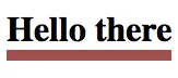
然而它产生的效果是这样的:
我尝试按不同顺序添加类,并使用JavaScript动态添加它们,但我仍然得到相同的结果。 我做错了什么吗,还是有其他方法可以实现开关效果?
#fff)不是一个选项...对吧? - Roko C. Buljan.red.blue、.red.blue.brown、.red.brown、.blue.brown等。此外,我还没有尝试过在box-shadow中使用它,但你可以看看CSS变量是否允许你缩写每个类的值。 - Patrick RobertsaddUnderlines(['red', 'blue'])。 - Ethan