我希望使用CSS仅滚动表格主体。我找到了一些例子,但如果表格行的长度不同,则它们效果不佳。
我从这个例子开始:
更新: 其他解决方案未能奏效的原因是我使用的是旧版Mozilla Firefox-57。这就是为什么我测试的几乎所有内容都无法正常工作的原因。我将问题标记为重复。
我从这个例子开始:
https://codepen.io/pdg/pen/MayBJK
HTML代码:
<div class="container">
  <h1>CSS only scrollable table body</h1>
  <p>by PDG</p>
<table class="table-scroll small-first-col">
  <thead>
    <tr>
    <th>Head 1</th>
    <th>Head 2</th>
    <th>Head 3</th>
    <th>Head 4</th>
    </tr>
  </thead>
  <tbody class="body-half-screen">
    <tr>
      <td>1</td>
      <td>First row</td>
      <td>3 dsad sad sad sad sad sadsadsad sadasd asdsa</td>
      <td>4 dasd sad asdsad sad sadsa dasdsad</td>
    </tr>
    <tr>
      <td>1 dasd asd sadsadsad sadsad</td>
      <td>2dsadsadsa dsad sadasd sad sad sa</td>
      <td>A very long cell content comes here, just to test it all!!!</td>
      <td>4</td>
    </tr>
    <tr>
      <td>1</td>
      <td>2 dsad asd asd sad sad sad asdsadsad</td>
      <td>3</td>
      <td></td>
    </tr>
    <tr>
      <td>1</td>
      <td>2</td>
      <td>3</td>
      <td>There is an empty cell above!</td>
    </tr><tr>
      <td>1</td>
      <td>2</td>
      <td>3</td>
      <td>4</td>
    </tr><tr>
      <td>1</td>
      <td>2</td>
      <td>3</td>
      <td>4</td>
    </tr>
    <tr>
      <td>1</td>
      <td>2</td>
      <td>3</td>
      <td>4</td>
    </tr><tr>
      <td>1</td>
      <td>2</td>
      <td>3</td>
      <td>4</td>
    </tr><tr>
      <td>1</td>
      <td>2</td>
      <td>3</td>
      <td>4</td>
    </tr><tr>
      <td>1</td>
      <td>2</td>
      <td>3</td>
      <td>4</td>
    </tr><tr>
      <td>1</td>
      <td>2</td>
      <td>3</td>
      <td>4</td>
    </tr><tr>
      <td>1</td>
      <td>2</td>
      <td>3</td>
      <td>4</td>
    </tr><tr>
      <td>1</td>
      <td>2</td>
      <td>3</td>
      <td>4</td>
    </tr><tr>
      <td>1</td>
      <td>2</td>
      <td>3</td>
      <td> Last row</td>
    </tr>
  </tbody>
</table>
  <h3>Notes</h3>
  <p>The table uses flex properties to arrange the cell sizes, however, this tends to make them the same as "fixed width". To fix that, you need to create additional classes that target the <strong>td:nth-child()</strong> and <strong>th:nth-child()</strong> with a specific <strong>flex-basis</strong> property.</p>
  <p>The <strong>height</strong> of the body also must be fixed and cannot be percentages (in the example above I use "vh")</p>
</div>
CSS代码:
.container{
  padding: 1rem;
  margin: 1rem;
}
.table-scroll{
  /*width:100%; */
  display: block;
  empty-cells: show;

  /* Decoration */
  border-spacing: 0;
  border: 1px solid;
}

.table-scroll thead{
  background-color: #f1f1f1;
  position:relative;
  display: block;
  width:100%;
  overflow-y: scroll;
}

.table-scroll tbody{
  /* Position */
  display: block; position:relative;
  width:100%; overflow-y:scroll;
  /* Decoration */
  border-top: 1px solid rgba(0,0,0,0.2);
}

.table-scroll tr{
  width: 100%;
  display:flex;
}

.table-scroll td,.table-scroll th{
  flex-basis:100%;
  flex-grow:2;
  display: block;
  padding: 1rem;
  text-align:left;
}

/* Other options */

.table-scroll.small-first-col td:first-child,
.table-scroll.small-first-col th:first-child{
  flex-basis:20%;
  flex-grow:1;
}

.table-scroll tbody tr:nth-child(2n){
  background-color: rgba(130,130,170,0.1);
}

.body-half-screen{
  max-height: 50vh;
}

.small-col{flex-basis:10%;}
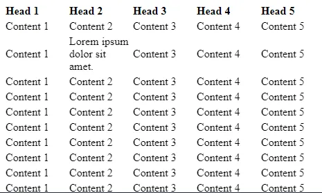
这似乎是一个好主意,在他们的演示中一切看起来都很好,但在更复杂的示例中,你可以看到列没有垂直对齐得很好。请参见下面的示例:
https://jsfiddle.net/pnfu321g/
我还尝试了另一个例子:http://jsfiddle.net/hashem/CrSpu/555/。但是在我的情况下,对于具有不同宽度的行的复杂表格,这也无法很好地工作。请建议一种只使用CSS(无JavaScript)的解决方案,使任何大小的行的表格看起来很好。更新: 其他解决方案未能奏效的原因是我使用的是旧版Mozilla Firefox-57。这就是为什么我测试的几乎所有内容都无法正常工作的原因。我将问题标记为重复。