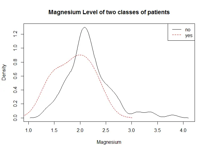
我有一个包含两个类别(死亡和存活)的数据库,我想为每个类别的一个特定功能绘制一个分布图。
像这样: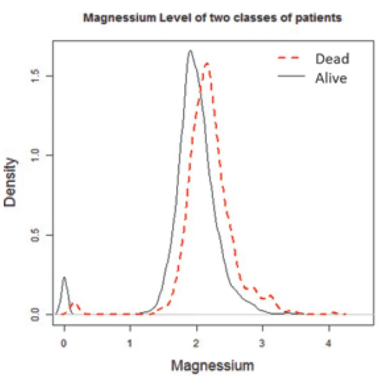 能帮助吗?
能帮助吗?
可重现数据集:
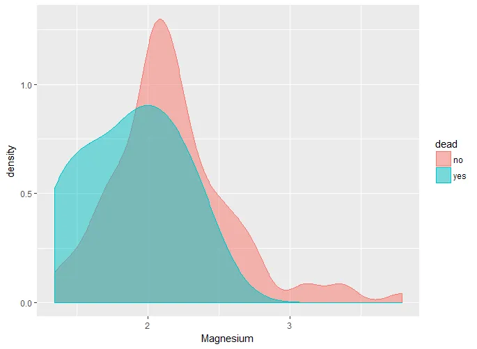
像这样:
能帮助吗?可重现数据集:
dput(data[1:100,])
structure(list(`dead` = structure(c(1L, 1L, 1L,
1L, 1L, 1L, 2L, 1L, 1L, 1L, 1L, 1L, 1L, 1L, 1L, 1L, 1L, 1L, 1L,
1L, 1L, 1L, 1L, 1L, 1L, 1L, 1L, 1L, 1L, 1L, 1L, 1L, 1L, 1L, 1L,
1L, 1L, 1L, 1L, 1L, 1L, 1L, 2L, 2L, 1L, 1L, 1L, 1L, 1L, 1L, 1L,
1L, 2L, 1L, 1L, 1L, 1L, 1L, 1L, 1L, 1L, 1L, 1L, 1L, 1L, 1L, 1L,
1L, 1L, 1L, 1L, 1L, 1L, 1L, 1L, 1L, 1L, 1L, 2L, 1L, 1L, 1L, 1L,
1L, 1L, 1L, 1L, 1L, 1L, 1L, 2L, 1L, 1L, 1L, 1L, 1L, 1L, 1L, 1L,
1L), .Label = c("no", "yes"), class = "factor"), `Magnesium` = c(2.17,
2.31, 2.14, 2.28, 2.17, 1.83, 1.9, 1.94, 2.68, 1.66, 2.14, 2.64,
2.41, 2.19, 1.46, 2.34, 1.57, 2.52, 1.97, 1.8, 2.36, 1.6, 2.02,
2.07, 1.44, 2.09, 2.08, 2.02, 2.52, 1.87, 2.72, 2.52, 1.58, 2.52,
1.75, 2.81, 2, 1.83, 3.35, 1.74, 2.19, 2.44, 1.91, 2.33, 2.23,
2.03, 2.13, 2.19, 2.02, 1.96, 2.52, 2.77, 2.17, 1.67, 2.04, 2.32,
1.34, 1.75, 2.07, 2.23, 1.78, 2.69, 2.02, 3.1, 2.18, 1.61, 2.2,
2.02, 2.3, 2, 2.45, 2.13, 1.96, 1.98, 2.1, 3.38, 1.36, 2.04,
1.52, 3.12, 2.07, 2.68, 2.18, 2.59, 2.07, 1.77, 2.02, 2.31, 2.23,
3.79, 1.41, 2.3, 1.97, 1.84, 1.95, 2.43, 2.17, 1.79, 1.7, 2.18
)), .Names = c("dead", "Magnesium"
), row.names = c(NA, 100L), class = "data.frame")