我正在使用 R 中的密度函数并计算一些从获得的密度中得出的结果。之后,我使用 ggplot2 显示相同数据的概率密度函数。
然而,结果与相应图形中显示的结果略有不同 - 这通过直接绘制密度输出(使用 plot {graphics})得到确认。
你有什么想法吗?我该如何进行更正,以使结果和 ggplot2 中的图形匹配 / 来自完全相同的数据?
以下是代码和图片的示例:
srcdata = data.frame("Value" = c(4.6228, 1.7942, 4.2738, 2.1502, 2.2665, 5.1717, 4.1015, 2.5126, 4.4270, 4.4729, 2.5112, 2.3493, 2.2787, 2.0114, 4.6931, 4.6582, 3.3162, 2.2995, 4.3954, 1.8488), "Type" = c("Positive", "Negative", "Positive", "Negative", "Negative", "Positive", "Positive", "Negative", "Positive", "Positive", "Negative", "Negative", "Negative", "Negative", "Positive", "Positive", "Positive", "Negative", "Positive", "Negative"))
bwidth <- ( density ( srcdata$Value ))$bw
sample <- split ( srcdata$Value, srcdata$Type )[ 1:2 ]
xmin = min(srcdata$Value) - 0.2 * abs(min(srcdata$Value))
xmax = max(srcdata$Value) + 0.2 * abs(max(srcdata$Value))
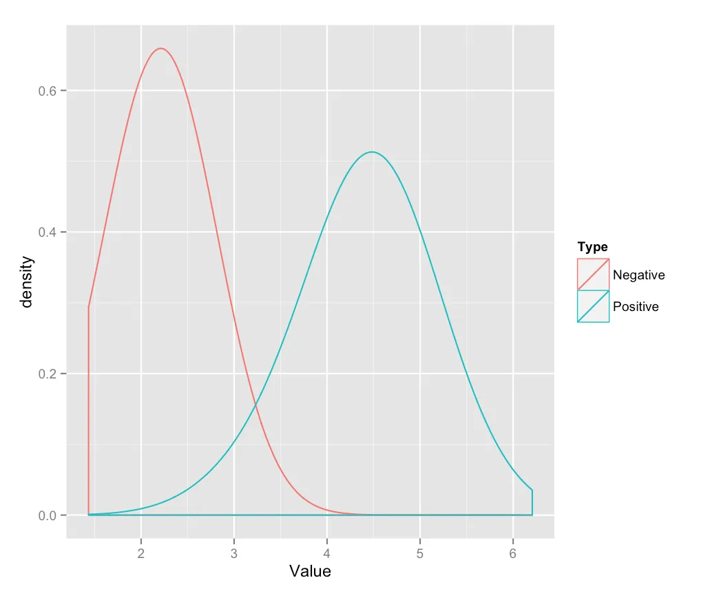
densities <- lapply ( sample, density, bw = bwidth, n = 512, from = xmin, to = xmax )
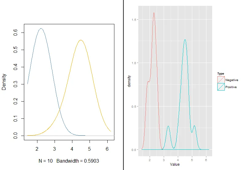
#plotting densities result
plot( densities [[ 1 ]], xlim = c(xmin,xmax), col = "steelblue", main = "" )
lines ( densities [[ 2 ]], col = "orange" )
#plot using ggplot2
ggplot(data = srcdata, aes(x=Value)) + geom_density(aes(group=Type, colour=Type)) + xlim(xmin, xmax)
#or with ggplot2 (using easyGgplot2)
ggplot2.density(data=srcdata, xName='Value', groupName='Type', alpha=0.5, xlim=c(xmin,xmax))
图片:
这是一个关于IT技术的图片。