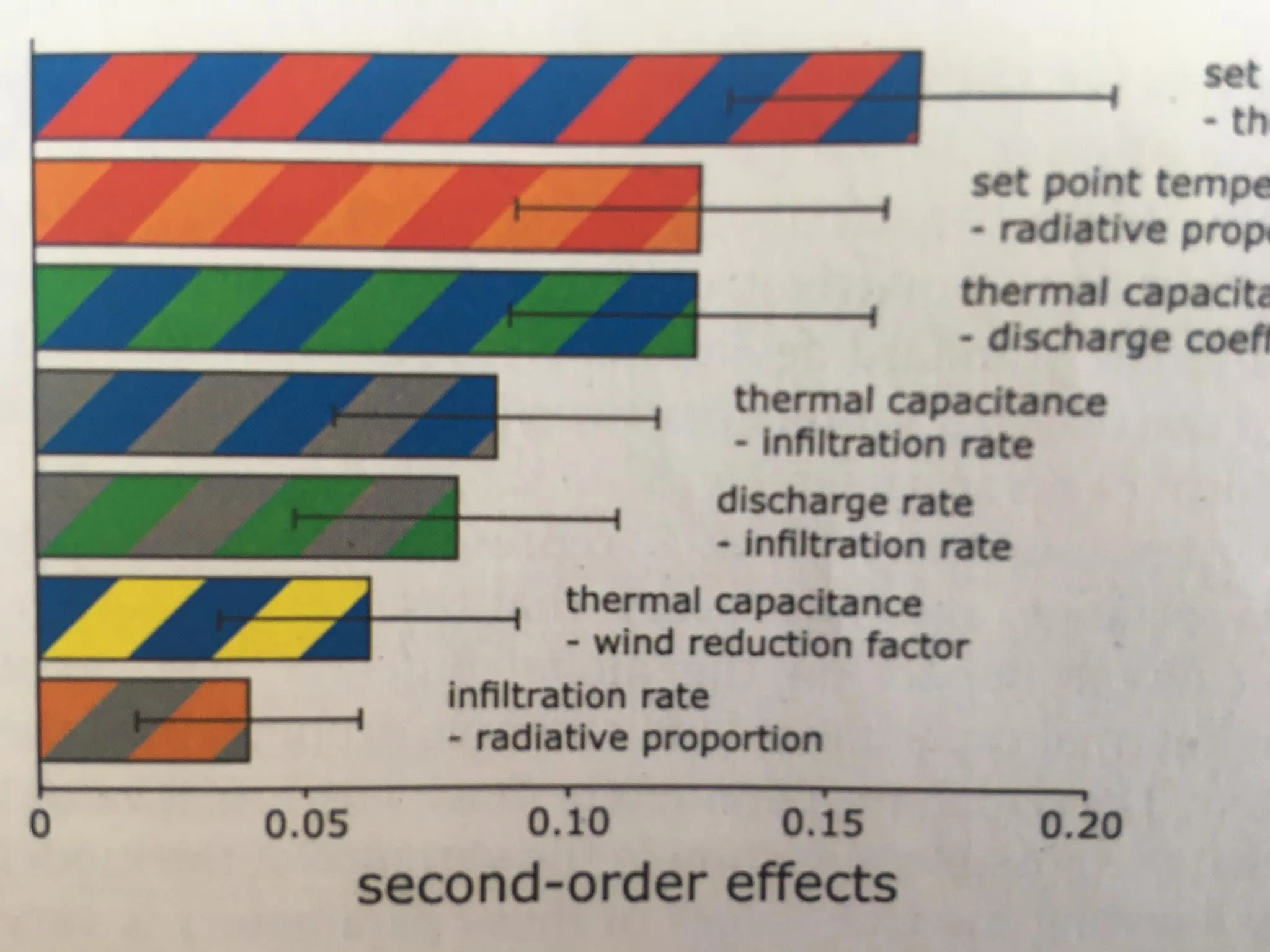
我想创建一个水平条形图,每个条形都有自定义的条纹颜色方案(类似于下面的图)。我熟悉创建普通的barhplot,但我不知道如何使用双色方案。
import pandas as pd
import numpy as np
import matplotlib.pyplot as plt
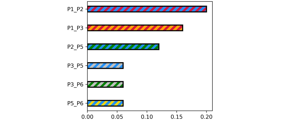
df = pd.DataFrame({"P1_P2": [0.20],
"P1_P3": [0.16],
"P2_P5": [0.12],
"P3_P5": [0.06],
"P3_P6": [0.06],
"P5_P6": [0.06]})
df=df.T
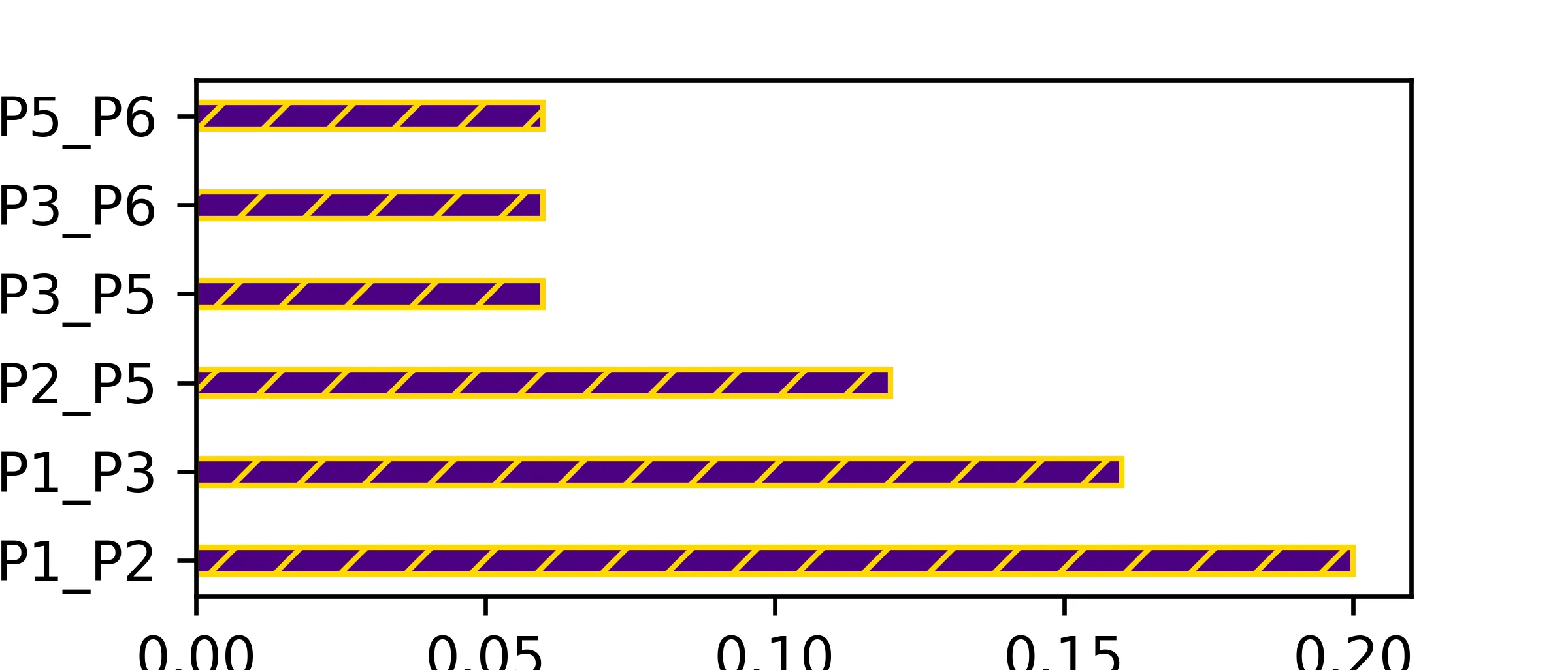
fig, ax = plt.subplots(dpi=600, figsize=(4, 4), nrows=1, ncols=1, facecolor=None, edgecolor='black')
df.plot.barh(ax=ax, position=0.50, width=0.3, color=(245/255, 153/255, 145/255, 1.0))
ax.get_legend().remove()
plt.show()