在分类变量的图表中显示百分比%而不是计数

206

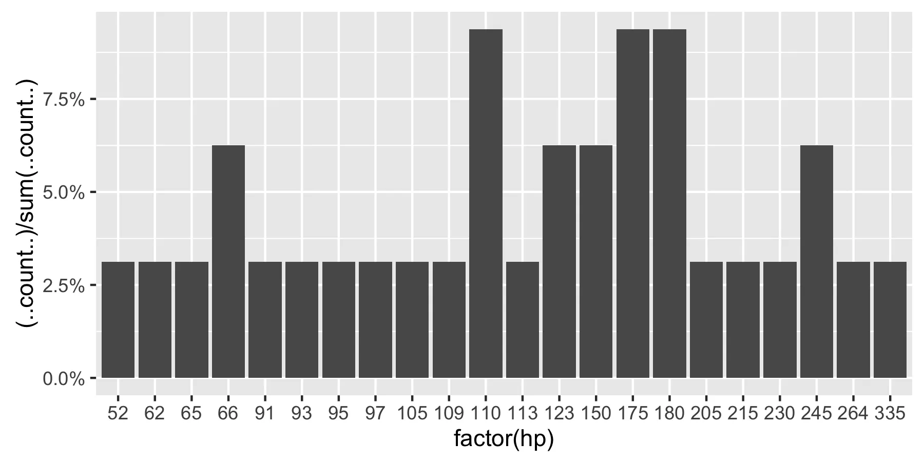
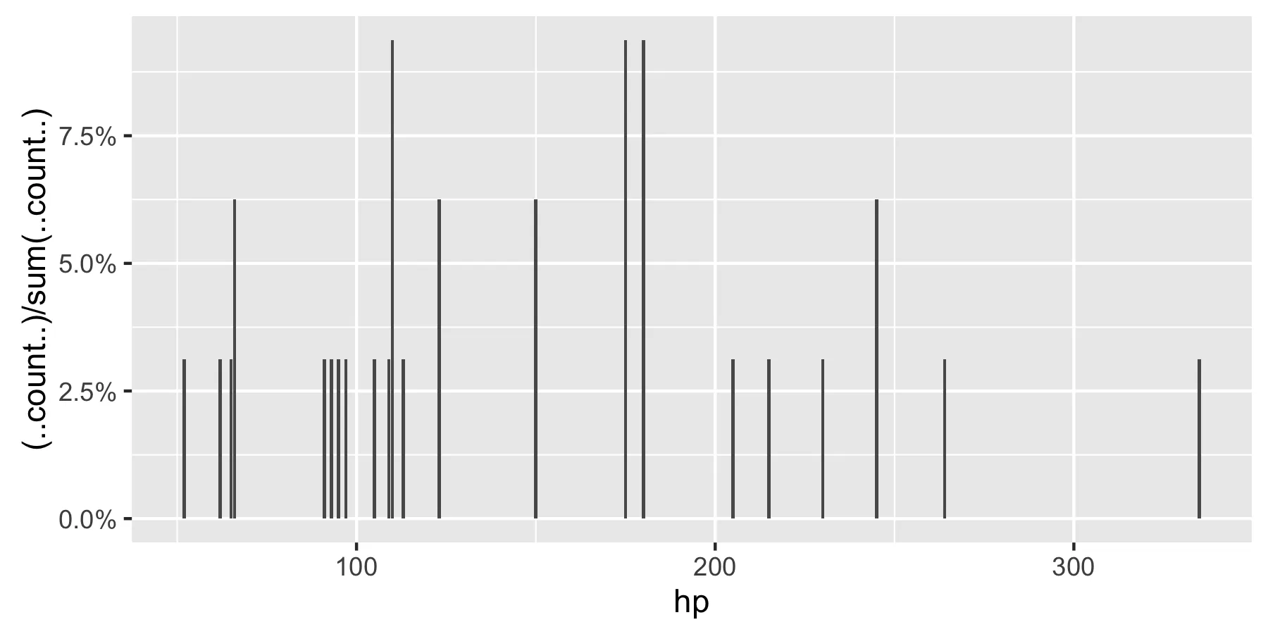
我正在绘制一个分类变量,而不是显示每个类别值的计数。

我正在寻找一种方法让 ggplot 显示该类别中值的百分比。当然,可以创建另一个变量来计算百分比并绘制该变量,但我需要这样做几十次,希望能在一个命令中完成。

我正在尝试使用以下内容进行实验:

qplot(mydataf) +
  stat_bin(aes(n = nrow(mydataf), y = ..count../n)) +
  scale_y_continuous(formatter = "percent")

但我可能使用不正确,因为我得到了错误。

为了轻松地复制这个设置,这里是一个简化的例子:

mydata <- c ("aa", "bb", NULL, "bb", "cc", "aa", "aa", "aa", "ee", NULL, "cc");
mydataf <- factor(mydata);
qplot (mydataf); #this shows the count, I'm looking to see % displayed.

在实际情况下,我可能会使用ggplot而不是qplot,但正确使用stat_bin仍然使我困扰。
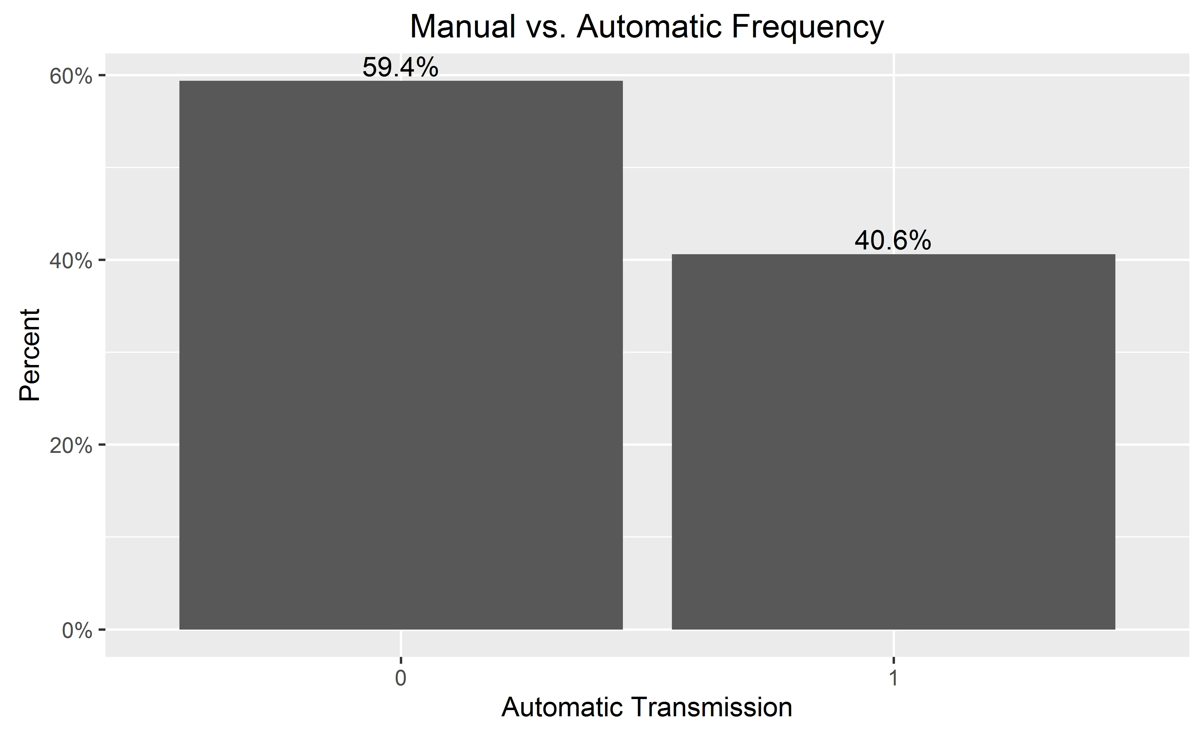
我还尝试了以下四种方法:

ggplot(mydataf, aes(y = (..count..)/sum(..count..))) + 
  scale_y_continuous(formatter = 'percent');

ggplot(mydataf, aes(y = (..count..)/sum(..count..))) + 
  scale_y_continuous(formatter = 'percent') + geom_bar();

ggplot(mydataf, aes(x = levels(mydataf), y = (..count..)/sum(..count..))) + 
  scale_y_continuous(formatter = 'percent');

ggplot(mydataf, aes(x = levels(mydataf), y = (..count..)/sum(..count..))) + 
  scale_y_continuous(formatter = 'percent') + geom_bar();

但是所有4个都会给出以下结果:
Error: ggplot2 doesn't know how to deal with data of class factor
相同的错误也会出现在简单情况下的代码中。
ggplot (data=mydataf, aes(levels(mydataf))) +
  geom_bar()

很明显,这是关于ggplot如何与单个向量交互的问题。我正在思考,谷歌搜索该错误只返回了一个结果


2
数据应该是一个数据框,而不是一个裸因子。 - hadley
1
补充Hadley的评论,将您的数据转换为数据框,使用mydataf = data.frame(mydataf),然后将其重命名为names(mydataf) = foo即可解决问题。 - Ramnath
9个回答

255
自从这个问题被回答以来,ggplot 语法已经发生了一些有意义的变化。总结以上评论中的讨论:
 require(ggplot2)
 require(scales)

 p <- ggplot(mydataf, aes(x = foo)) +  
        geom_bar(aes(y = (..count..)/sum(..count..))) + 
        ## version 3.0.0
        scale_y_continuous(labels=percent)

这里有一个使用mtcars的可重现示例:
 ggplot(mtcars, aes(x = factor(hp))) +  
        geom_bar(aes(y = (..count..)/sum(..count..))) + 
        scale_y_continuous(labels = percent) ## version 3.0.0

在这里输入图片描述

这个问题目前是谷歌搜索“ggplot count vs percentage histogram”的排名第一,因此希望这可以帮助梳理当前已经存在于接受答案评论中的所有信息。

备注:如果hp没有被设置为一个因子,ggplot将返回:

在这里输入图片描述


14
谢谢您的问题。有没有按课程进行操作的想法? - WAF
4
正如@WAF所建议的那样,这个答案对于分面数据无效。请参见@Erwan在https://dev59.com/HmEh5IYBdhLWcg3wpE3w?lq=1中的评论。 - LeeZamparo
4
你可能需要在百分数前加上它所属的包名才能使上述代码正常工作(我是这样做的)。ggplot(mtcars, aes(x = factor(hp))) + geom_bar(aes(y = (..count..)/sum(..count..))) + scale_y_continuous(labels = scales::percent) - mammykins
4
为了避免使用facets,可以使用geom_bar(aes(y = (..count..)/tapply(..count..,..PANEL..,sum)[..PANEL..]))代替。每个facet应该加起来等于100%。 - JWilliman
@Magnus,看看我的新答案,使用更新的after_stat()函数。 - stragu
显示剩余5条评论

58

这个修改过的代码应该可以工作。

p = ggplot(mydataf, aes(x = foo)) + 
    geom_bar(aes(y = (..count..)/sum(..count..))) + 
    scale_y_continuous(formatter = 'percent')

如果你的数据中有缺失值,而且你不想把它们包含在图表里,那么将na.omit(mydataf)作为参数传递给ggplot即可。

希望这可以帮到你。


37
请注意,在ggplot2版本0.9.0中,formatter参数将不再起作用。相反,你需要使用labels = percent_format()之类的内容。 - joran
25
在使用percent_format()之前,需要加载scales库,否则它将无法工作。0.9.0不再自动加载支持包。 - Andrew
1
aes(y = (..count..)/sum(..count..))替换为aes(y = ..density..)是否有意义?从视觉上看,它给出了非常相似(但仍然不同)的图像。 - Alexander Kosenkov
7
在ggplot 0.9.3.1.0中,您需要先加载scales库,然后按照文档中所述使用scale_y_continuous(labels=percent)。这将使y轴标签以百分比格式显示。 - adilapapaya
1
请注意,如果您实际上想要百分比而不是分数,您需要使用类似于 geom_bar(aes(y = ((..count..)/sum(..count..))*100)) 的内容。 - CoderGuy123
显示剩余8条评论

53

使用ggplot2版本2.1.0,它是

+ scale_y_continuous(labels = scales::percent)

不显示正确的百分比与facet。 - Julien

47

截至2017年3月,使用ggplot2 2.2.1版本,我认为最好的解决方法在Hadley Wickham的《R数据科学》一书中有所阐述:

ggplot(mydataf) + stat_count(mapping = aes(x=foo, y=..prop.., group=1))

stat_count计算两个变量:count是默认使用的,但您可以选择使用prop,它显示比例。


3
截至2017年6月,这是最佳答案,适用于按组填充和分面绘图。 - Skumin
3
由于某种原因,这不允许我使用“fill”映射(没有错误被抛出,但是没有添加填充颜色)。 - Max Candocia
1
@MaxCandocia,我不得不删除 group = 1 才能获得填充映射。也许这会有所帮助。 - tjebo
3
如果我删除group参数,它将无法显示正确的百分比,因为每个唯一的x值都属于自己的组。 - Max Candocia

27
如果您想在y轴上显示百分比并且在条形图上进行标注:
library(ggplot2)
library(scales)
ggplot(mtcars, aes(x = as.factor(am))) +
  geom_bar(aes(y = (..count..)/sum(..count..))) +
  geom_text(aes(y = ((..count..)/sum(..count..)), label = scales::percent((..count..)/sum(..count..))), stat = "count", vjust = -0.25) +
  scale_y_continuous(labels = percent) +
  labs(title = "Manual vs. Automatic Frequency", y = "Percent", x = "Automatic Transmission")

图片描述

在添加条形图标签时,您可能希望省略y轴以获得更干净的图表,可以在最后添加:

  theme(
        axis.text.y=element_blank(), axis.ticks=element_blank(),
        axis.title.y=element_blank()
  )

在此输入图像描述


9
请注意,如果你的变量是连续型的,你需要使用geom_histogram()函数,因为该函数会按照“区间”来分组变量。
df <- data.frame(V1 = rnorm(100))

ggplot(df, aes(x = V1)) +  
  geom_histogram(aes(y = 100*(..count..)/sum(..count..))) 

# if you use geom_bar(), with factor(V1), each value of V1 will be treated as a
# different category. In this case this does not make sense, as the variable is 
# really continuous. With the hp variable of the mtcars (see previous answer), it 
# worked well since hp was not really continuous (check unique(mtcars$hp)), and one 
# can want to see each value of this variable, and not to group it in bins.
ggplot(df, aes(x = factor(V1))) +  
  geom_bar(aes(y = (..count..)/sum(..count..))) 

1
很棒的解决方案。但是你忘记了乘以100来得到百分比,即geom_histogram(aes(y = 100*(..count..)/sum(..count..))) - drT
+scale_y_continuous(labels = scales::percent_format()) 可以显示漂亮的百分比格式。 - Waldi

8
自从 ggplot2版本3.3发布以来,我们可以使用方便的after_stat()函数。
我们可以做类似于@Andrew答案的事情,但是不使用..语法:
# original example data
mydata <- c("aa", "bb", NULL, "bb", "cc", "aa", "aa", "aa", "ee", NULL, "cc")

# display percentages
library(ggplot2)
ggplot(mapping = aes(x = mydata,
                     y = after_stat(count/sum(count)))) +
  geom_bar() +
  scale_y_continuous(labels = scales::percent)

你可以在geom_stat_函数的文档中找到所有可用的“计算变量”。例如,对于geom_bar(),您可以访问countprop变量。 (请参见计算变量文档。)
关于你的NULL值,有一点需要说明:在创建向量时,它们会被忽略(即,您最终得到的向量长度为9,而不是11)。如果您真的想跟踪缺失的数据,您将不得不使用NA代替(ggplot2将把NA放在绘图的右侧)。
# use NA instead of NULL
mydata <- c("aa", "bb", NA, "bb", "cc", "aa", "aa", "aa", "ee", NA, "cc")
length(mydata)
#> [1] 11

# display percentages
library(ggplot2)
ggplot(mapping = aes(x = mydata,
                     y = after_stat(count/sum(count)))) +
  geom_bar() +
  scale_y_continuous(labels = scales::percent)

reprex包(v1.0.0)于2021-02-09创建

(请注意,在您的示例中使用chrfct数据不会有任何区别。)


8

这里有一个解决分面数据的方法。(@Andrew提供的被接受的答案在这种情况下不起作用。)想法是使用dplyr计算百分比值,然后使用geom_col创建图表。

library(ggplot2)
library(scales)
library(magrittr)
library(dplyr)

binwidth <- 30

mtcars.stats <- mtcars %>%
  group_by(cyl) %>%
  mutate(bin = cut(hp, breaks=seq(0,400, binwidth), 
               labels= seq(0+binwidth,400, binwidth)-(binwidth/2)),
         n = n()) %>%
  group_by(cyl, bin) %>%
  summarise(p = n()/n[1]) %>%
  ungroup() %>%
  mutate(bin = as.numeric(as.character(bin)))

ggplot(mtcars.stats, aes(x = bin, y= p)) +  
  geom_col() + 
  scale_y_continuous(labels = percent) +
  facet_grid(cyl~.)

这是一个情节简述:

enter image description here

它与IT技术无关。

6
如果您想要百分比标签,但在y轴上显示实际的Ns,请尝试以下方法:
    library(scales)
perbar=function(xx){
      q=ggplot(data=data.frame(xx),aes(x=xx))+
      geom_bar(aes(y = (..count..)),fill="orange")
       q=q+    geom_text(aes(y = (..count..),label = scales::percent((..count..)/sum(..count..))), stat="bin",colour="darkgreen") 
      q
    }
    perbar(mtcars$disp)

网页内容由stack overflow 提供, 点击上面的
可以查看英文原文,
原文链接