我希望使用matplotlib创建一个类似下面展示的热图。从轴标记可以看出,数据不是均匀分布的。
所以假设我们有:
x = [1, 1.5, 2, 2.5, 3, 3.5, 4, 5, 7]
y = [.5, 1, 1.5, 2, 2.5, 3, 3.5, 4, 4.5]
vals = np.random.rand(len(x), len(y))
如何在matplotlib中创建这样的插值图?
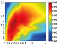
我希望使用matplotlib创建一个类似下面展示的热图。从轴标记可以看出,数据不是均匀分布的。
所以假设我们有:
x = [1, 1.5, 2, 2.5, 3, 3.5, 4, 5, 7]
y = [.5, 1, 1.5, 2, 2.5, 3, 3.5, 4, 4.5]
vals = np.random.rand(len(x), len(y))
您应该插值缺失的数据,我在我的一个项目中使用了以下方法:
#create regular grid
xi, yi = np.linspace(x.min(), x.max(), 100), np.linspace(y.min(), y.max(), 100)
xi, yi = np.meshgrid(xi, yi)

#interpolate missing data
rbf = scipy.interpolate.Rbf(x, y, z, function='linear')
zi = rbf(xi, yi)
稍微更详细地说明:
import matplotlib.pyplot as plt
import numpy as np
import scipy
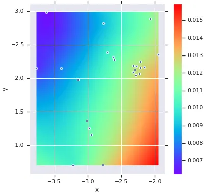
def nonuniform_imshow(x, y, z, aspect=1, cmap=plt.cm.rainbow):
# Create regular grid
xi, yi = np.linspace(x.min(), x.max(), 100), np.linspace(y.min(), y.max(), 100)
xi, yi = np.meshgrid(xi, yi)
# Interpolate missing data
rbf = scipy.interpolate.Rbf(x, y, z, function='linear')
zi = rbf(xi, yi)
_, ax = plt.subplots(figsize=(6, 6))
hm = ax.imshow(zi, interpolation='nearest', cmap=cmap,
extent=[x.min(), x.max(), y.max(), y.min()])
ax.scatter(x, y)
ax.set_aspect(aspect)
return hm
heatmap = nonuniform_imshow(x, y, z)
plt.colorbar(heatmap)
plt.show()