是否可能只使用HTML和CSS创建像这样的L形边框?
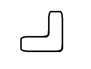
编辑:目前我拥有的是这个:http://jsfiddle.net/cBwh8/
编辑2:我想要复制上面的图片-适当弯曲的圆角。这是我在这里遇到困难的主要原因:http://jsfiddle.net/cBwh8/1/
是否可能只使用HTML和CSS创建像这样的L形边框?
编辑:目前我拥有的是这个:http://jsfiddle.net/cBwh8/
编辑2:我想要复制上面的图片-适当弯曲的圆角。这是我在这里遇到困难的主要原因:http://jsfiddle.net/cBwh8/1/
Yes.
<div id="one">
<div id="two"> </div>
</div>
#one {
margin:10px;
width:45px;
height:75px;
border:2px solid #333; }
#two{
float:left;
width:35px;
height:65px;
border-width:2px;
border-style:solid;
margin:-2px 0 0 -2px;
border-color:#FFF #333 #333 #FFF;
}
div.outer {
    margin: 10px;
    width: 200px;
    height: 200px;
    border: 1px solid blue;
    border-radius: 10px;
}

div.inner {
    width: 160px;
    height: 160px;
    border-right: 1px solid blue;
    border-bottom: 1px solid blue;
    margin-top:-1px;
    margin-left:-1px;
    background:#FFF;
}
对于任何有兴趣的人,这里有一组L形的字段集:
HTML:
    <div>
        <fieldset class="topPortion">
            <legend>Some legend</legend>
            <input type="text" value="Foo" />
            <input type="submit" value="Submit" />
        </fieldset>
        <fieldset class="bottomPortion">
            <input type="text" value="Foo" />
            <input type="submit" value="Submit" />
        </fieldset>
     </div>
CSS:
fieldset.topPortion
{
border: 1px solid red;
border-bottom: 0;
/*top: 20px;*/
padding: 5px 5px;
position: relative;
width: 250px;
z-index: 100;
background-color: yellow;
top: 1px;
border-radius: 5px 5px 0 0;
}

fieldset.bottomPortion
{
border: 1px solid red;
width: 500px;
height: 100px;
position: absolute;
z-index: 1;
margin-top: -10;
padding: 5px 10px;
background-color: yellow;
border-radius: 0 5px 5px 5px;
}
有点棘手,但做这件事很开心
.left{float:left}
.right{float:right}
#container{border-right:1px solid #000;border-bottom:1px solid #000;width:300px;height:300px;margin:100px auto;}
#leftBox{width:70%;height:69%;border-right:1px solid #000;border-bottom:1px solid #000;}
#leftBox2{border-left:1px solid #000;width:100%;height:29%;}
#rightBox{width:29%;height:70%;border-top:1px solid #000;}
以及标记语言
<div id="container">
<div id="leftBox" class="left"></div>
<div id="rightBox" class="right"></div>
<div id="leftBox2" class="left"></div>
稍微复杂一些,但很有用的选项:
http://dabblet.com/gist/2884899
这是两个兄弟元素,绝对和相对定位,z-index覆盖彼此。 顶部div隐藏了底部div的上边框。
这对于下拉菜单非常有用。(具有带边框的框,可通过上下文菜单扩展)
编辑(从链接中粘贴的代码):
HTML:
<div class="holder">
  <div class="top"></div>
  <div class="bottom"></div>
</div>
CSS:
.holder{
  position:relative;
}

.top{
  width: 50px;
  height:50px;
  background:red;
  border:blue solid 2px;
  border-bottom:none;
  position:relative;
  z-index:4;
}

.bottom{
  z-index:2;
  width: 100px;
  height: 100px;
  position:absolute;
  top:50px;
  left:0;
  border: blue solid 2px;
  background:red;
}
NECRO,实际上我刚遇到了这个问题,这是我找到的第一篇文章,所以我想稍微添加一些内容,以防其他人遇到同样的问题或者该问题仍在发生。使用您链接的edit2,将“border-radius”更改为“border-bottom-right-radius”,这样只有右下角会被圆角化,从而修复奇怪的圆角/淡化边缘。
您还可以添加以下内容: -moz-border-radius-bottomleft:10px; -webkit-border-bottom-left-radius:10px; 如果您想要更好地支持旧浏览器。