我正在使用matplotlib创建图表。我需要用Python自动生成不同的颜色来识别每个图表。
请给我一个方法,在同一张图片中为不同的图表放置不同的颜色。
我正在使用matplotlib创建图表。我需要用Python自动生成不同的颜色来识别每个图表。
请给我一个方法,在同一张图片中为不同的图表放置不同的颜色。
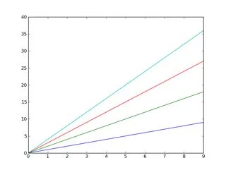
Matplotlib默认就可以实现这一点。
例如:
import matplotlib.pyplot as plt
import numpy as np

x = np.arange(10)

plt.plot(x, x)
plt.plot(x, 2 * x)
plt.plot(x, 3 * x)
plt.plot(x, 4 * x)
plt.show()
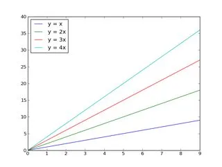
而且,正如你可能已经知道的那样,你可以轻松地添加一个图例:
import matplotlib.pyplot as plt
import numpy as np

x = np.arange(10)

plt.plot(x, x)
plt.plot(x, 2 * x)
plt.plot(x, 3 * x)
plt.plot(x, 4 * x)

plt.legend(['y = x', 'y = 2x', 'y = 3x', 'y = 4x'], loc='upper left')

plt.show()
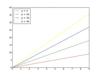
如果您想控制要循环显示的颜色:
import matplotlib.pyplot as plt
import numpy as np

x = np.arange(10)

plt.gca().set_color_cycle(['red', 'green', 'blue', 'yellow'])

plt.plot(x, x)
plt.plot(x, 2 * x)
plt.plot(x, 3 * x)
plt.plot(x, 4 * x)

plt.legend(['y = x', 'y = 2x', 'y = 3x', 'y = 4x'], loc='upper left')

plt.show()
如果你对matplotlib不熟悉,教程是一个好的开始。
编辑:
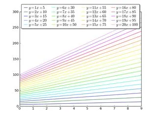
首先,如果你想在一个图上绘制很多(>5)个东西,可以考虑将它们放在不同的图中(可以使用一个图中的几个子图),或者使用其他东西(如标记样式或线条粗细)来区分它们。
否则,你会得到一个非常混乱的图!对于任何阅读你所做的内容的人,请礼貌地并不要试图将15个不同的事物塞进一个图中!
此外,许多人有不同程度的色盲,对许多微妙的不同颜色进行区分对更多的人来说都是困难的。
话虽如此,如果你真的想在一个坐标轴上放置20条相对独立的线,每条线有20种相对明显的颜色,这里有一种方法:
import matplotlib.pyplot as plt
import numpy as np

num_plots = 20

# Have a look at the colormaps here and decide which one you'd like:
# http://matplotlib.org/1.2.1/examples/pylab_examples/show_colormaps.html
colormap = plt.cm.gist_ncar
plt.gca().set_prop_cycle(plt.cycler('color', plt.cm.jet(np.linspace(0, 1, num_plots))))

# Plot several different functions...
x = np.arange(10)
labels = []
for i in range(1, num_plots + 1):
    plt.plot(x, i * x + 5 * i)
    labels.append(r'$y = %ix + %i$' % (i, 5*i))

# I'm basically just demonstrating several different legend options here...
plt.legend(labels, ncol=4, loc='upper center',
           bbox_to_anchor=[0.5, 1.1],
           columnspacing=1.0, labelspacing=0.0,
           handletextpad=0.0, handlelength=1.5,
           fancybox=True, shadow=True)

plt.show()
如果您不知道要绘制的图形数量,可以在绘制它们后通过直接从图形中检索编号来更改颜色,使用.lines,我使用这个解决方案:
import matplotlib.pyplot as plt
import numpy as np

fig1 = plt.figure()
ax1 = fig1.add_subplot(111)


for i in range(1,15):
    ax1.plot(np.array([1,5])*i,label=i)
colormap = plt.cm.gist_ncar #nipy_spectral, Set1,Paired
colors = [colormap(i) for i in np.linspace(0, 1,len(ax1.lines))]
for i,j in enumerate(ax1.lines):
    j.set_color(colors[i])


ax1.legend(loc=2)
结果如下: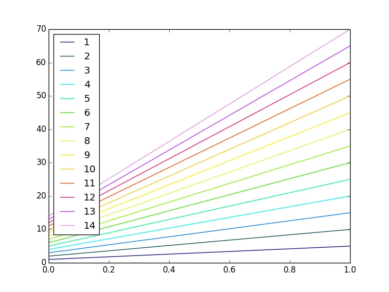
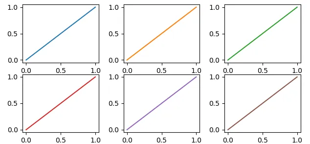
简而言之 不,它不能被自动地完成。是的,它是可能的。
import matplotlib.pyplot as plt
#                                    _____ VV______
my_colors = plt.rcParams['axes.prop_cycle']()
# note that we CALLED the prop_cycle ‾‾‾‾‾‾ΛΛ‾‾‾‾‾‾

fig, axes = plt.subplots(2,3)
for ax in axes.flatten(): ax.plot((0,1), (0,1), **next(my_colors))
原帖作者写道:
[...] 我需要用 [Matplotlib] 自动为每个图表分配不同的颜色。
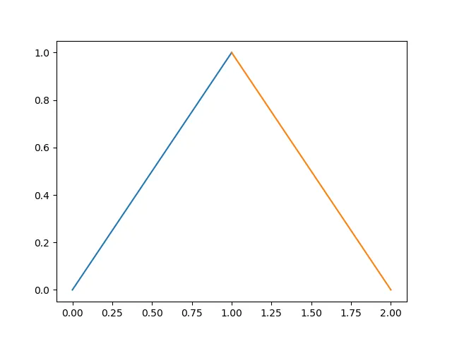
然而... Matplotlib 会自动生成不同曲线对应的不同颜色。
In [10]: import numpy as np
    ...: import matplotlib.pyplot as plt

In [11]: plt.plot((0,1), (0,1), (1,2), (1,0));
Out[11]:
那么为什么会有 OP 的请求呢?如果我们继续阅读,可以看到:
请问有没有一种方法可以在同一个图中为不同的绘图设置不同的颜色?
这是有道理的,因为每个绘图(Matplotlib 中的每个 axes)都有自己的 color_cycle(或者更确切地说,在 2018 年之后,是 prop_cycle),每个绘图(axes)都会按照相同的顺序重复使用相同的颜色。
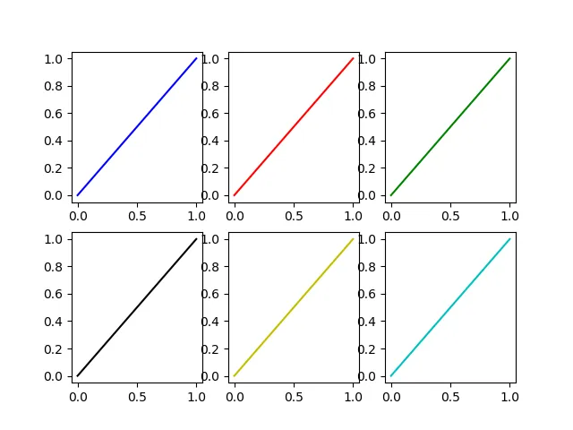
In [12]: fig, axes = plt.subplots(2,3)

In [13]: for ax in axes.flatten():
    ...:     ax.plot((0,1), (0,1))
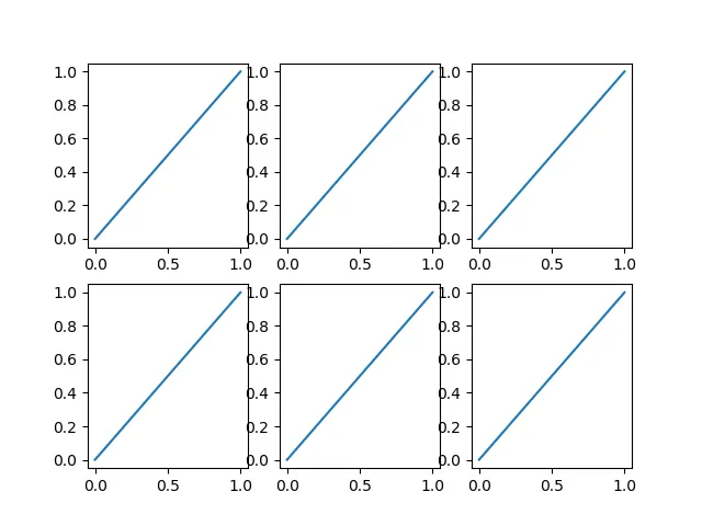
如果这是原始问题的意思,一种可能性是显式地为每个图命名不同的颜色。
如果图表(通常情况下)是在循环中生成的,我们必须有一个额外的循环变量来覆盖Matplotlib自动选择的颜色。
In [14]: fig, axes = plt.subplots(2,3)

In [15]: for ax, short_color_name in zip(axes.flatten(), 'brgkyc'):
    ...:     ax.plot((0,1), (0,1), short_color_name)
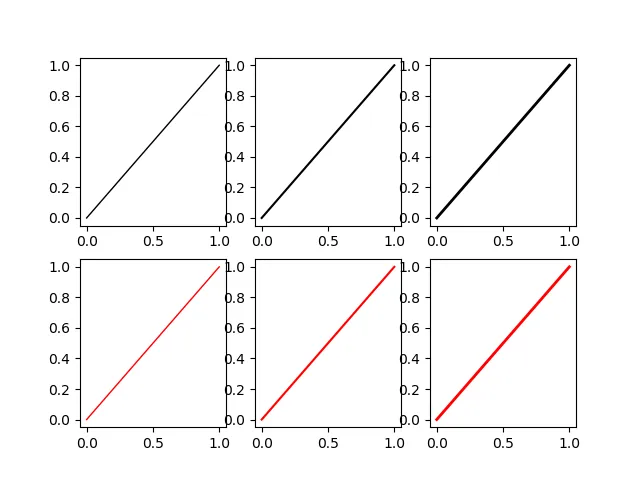
from cycler import cycler
my_cycler = cycler('color', ['k', 'r']) * cycler('linewidth', [1., 1.5, 2.])
actual_cycler = my_cycler()

fig, axes = plt.subplots(2,3)
for ax in axes.flat:
    ax.plot((0,1), (0,1), **next(actual_cycler))
type(my_cycler) 是 cycler.Cycler,但 type(actual_cycler) 是 itertools.cycle。plt.label(LIST)将标签号码X放入LIST中,该行对应于第X次调用plot。我之前遇到过这种方法的问题。按照matplotlib文档的建议方式构建图例并自定义其标签(http://matplotlib.org/users/legend_guide.html#adjusting-the-order-of-legend-item),要确保标签与您认为的确切绘图相匹配:...
# Plot several different functions...
labels = []
plotHandles = []
for i in range(1, num_plots + 1):
x, = plt.plot(some x vector, some y vector) #need the ',' per ** below
plotHandles.append(x)
labels.append(some label)
plt.legend(plotHandles, labels, 'upper left',ncol=1)
    import matplotlib.pyplot as plt
    import numpy as np

    x = np.arange(10)

    plt.plot(x, x)
    plt.plot(x, 2 * x,color='blue')
    plt.plot(x, 3 * x,color='red')
    plt.plot(x, 4 * x,color='green')
    plt.show()
from random import choice

import matplotlib.pyplot as plt
from matplotlib.colors import mcolors

# Get full named colour map from matplotlib
colours = mcolors._colors_full_map # This is a dictionary of all named colours
# Turn the dictionary into a list
color_lst = list(colours.values())

# Plot using these random colours
for n, plot in enumerate(plots):
    plt.scatter(plot[x], plot[y], color=choice(color_lst), label=n)
from mpl_toolkits.mplot3d import Axes3D
import matplotlib.pyplot as plt
import numpy as np
from skspatial.objects import Line, Vector

for count in range(0,len(LineList),1):
        Line_Color = np.random.rand(3,)
        Line(StartPoint,EndPoint)).plot_3d(ax,c="Line"+str(count),label="Line"+str(count))


plt.legend(loc='lower left')
plt.show(block=True)
set_color_cycle函数,所以该行代码应更改为plt.gca().set_prop_cycle(plt.cycler('color', plt.cm.jet(np.linspace(0, 1, num_plots)))),只需将plt.cm.YOUR_PREFERED_COLOR_MAP更改为您需要的颜色地图即可。 - Nate