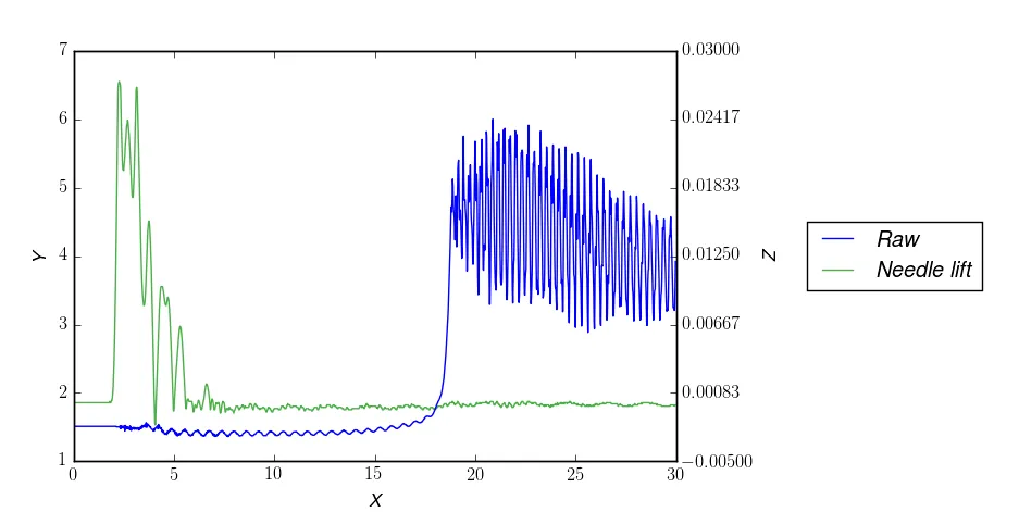
我正在尝试在两个y轴上绘制两条曲线,如图所示。红色曲线(压力)是主轴,绿色曲线(针升程)是次轴。我试图将这些曲线标签添加到同一图例中,但无法成功。如图所示,它们重叠在一起,Raw被放置在Needle lift上面。
我使用的代码:
import numpy as np
import matplotlib.pyplot as plt
from matplotlib import ticker as mtick
data = np.genfromtxt("secondary_axis.dat", skiprows = 2, delimiter = ',')
time = data[:, 0]
pressure = data[:, 1] * 0.006894759086775369
pressure_charge = data[0, 0]
needle_lift = data[:, 2]
figure = plt.figure(figsize=(5.15, 5.15))
figure.clf()
plot = plt.subplot(111)
plot.plot(time, pressure, label = r'\textit{Raw}')
plot.set_xlabel(r'\textit{X}', labelpad=6)
plot.set_ylabel(r'\textit{Y}', labelpad=6)
primary_ticks = len(plot.yaxis.get_major_ticks())
ax2 = plot.twinx()
ax2.plot(time, needle_lift, label = r'\textit{Needle lift}', color='#4DAF4A')
plot.set_zorder(ax2.get_zorder()+2)
plot.patch.set_visible(False)
ax2.grid(False)
ax2.set_ylabel(r'\textit{Z}', labelpad=6)
ax2.yaxis.set_major_locator(mtick.LinearLocator(primary_ticks))
plot.legend(loc = 'center left', bbox_to_anchor = (1.2, 0.5))
ax2.legend(loc = 'center left', bbox_to_anchor = (1.2, 0.5))
plt.show()
数据可以在这里找到。
如何将不同轴的图例标签添加到同一图例中? 当在主轴上绘制多条线时,我希望它们按照下面给出的顺序排列: