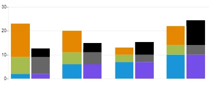
我想制作一个柱状图,其中有两组堆叠的条形图,这些条形图被分组在一起以比较这两组堆叠的条形图。应该按以下方式显示:
我已经阅读了这个link
但是它并没有帮助我绘制如上图所示的内容。我甚至尝试发送两个数据集[[s1, s2, s3], [s4, s5, s6]] 但是它没有帮助我绘制图表。
有人知道怎么做吗?
任何帮助将不胜感激。 提前致谢。
设置选项stackSeries:true将为条形图创建所需的显示。
官方来源:
src/jqplot.core.js的2499、2563和2649行。jqPlot文档已经过时,所以我查看了源代码。不幸的是,在堆叠条形图中没有直接显示两组柱形图的方法。 jqPlot.stackSeries属性仅为布尔值。它的唯一功能是告诉jqPlot将每个系列堆叠在一起,对于不同系列中的值,有多少个条形图就有多少个。每个系列每个条形图只绘制一个值,第一个系列位于底部。换句话说,所有[0]的值都绘制在第一个条形图中,[1]的值在第二个条形图中,依此类推。在条形图内显示的数量是当前系列和所有先前系列的[n]值之和。无法指定存在两个或更多分组系列的方式。在jqPlot中不存在实现所需功能的方法。
但您可以实现您想要的:
虽然jqPlot本身不支持您想要的功能,但这并不意味着您不能实现它,只是需要有创意。您所需的图表可以看作是两个分开的图表,它们重叠在一起,并且各自的条形图之间留有足够的空间(seriesDefaults.rendererOptions.barMargin),以便来自另一个图表的条形图可以与它们相邻重叠。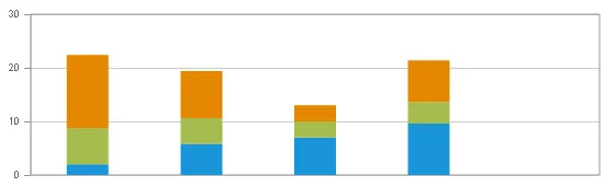 该图表具有所需的比例尺、背景和网格线设置为可见。请注意,该图表中有一个额外的条形图。这是必要的,以提供足够的背景和网格线,以适应另一个图表提供的最后一个条形图。
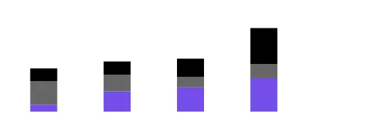 此图表中,jqPlot设置了比例尺和网格线不可见。
seriesDefaults.axes.xaxis.tickOptions.show = false;
seriesDefaults.axes.yaxis.tickOptions.show = false;
etc.
透明。请注意,在将<div>相对于第一个图形定位时,您需要将此图形的位置向右偏移一些。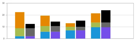 然后,您使用一个空白的
<div>,其背景颜色与网页的背景颜色相同,并覆盖第一个图形上的额外条形,但保留第一个图形的足够背景和网格线,以延伸到第二个图形的最后一条柱之外。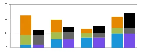
您可以在JSFiddle上查看使用jqPlot 1.0.8r1250的可行解决方案。
比较使用此方法生成的图表的原始请求和最终版本,您会发现它们非常接近:
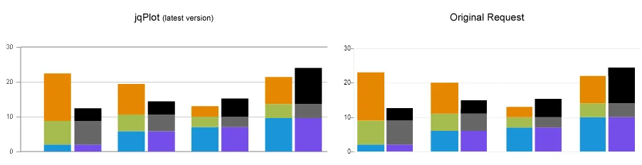 两者之间最明显的区别是jqPlot版本中Y轴之间的间距更大。不幸的是,在堆积条形图中似乎没有减少该量的选项。
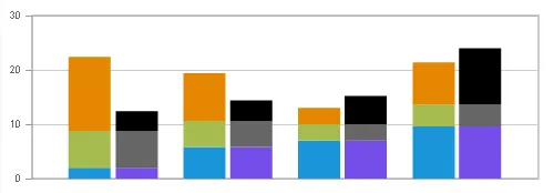
请注意,此代码生成的图表右侧缺少边框是有意的,因为它在原始请求中不存在。个人而言,我更喜欢图表右侧有边框。如果您稍微更改一下CSS,就很容易实现:
我的首选图表版本在左侧包括边框并平衡空白处:
$(document).ready(function () {
    //Numbers derived from desired image
    //var s1 = [10, 29, 35, 48, 0];
    //var s2 = [34, 24, 15, 20, 0];
    //var s3 = [18, 19, 26, 52, 0];
    //Scale to get 30 max on plot
    var s1 = [2, 5.8, 7, 9.6, 0];
    var s2 = [6.8, 4.8, 3, 4, 0];
    var s3 = [13.6, 8.8, 3, 7.8, 0];
    plot4 = $.jqplot('chart4', [s1, s2, s3], {
        // Tell the plot to stack the bars.
        stackSeries: true,
        captureRightClick: true,
        seriesColors: ["#1B95D9", "#A5BC4E", "#E48701"],
        seriesDefaults: {
            shadow: false,
            renderer: $.jqplot.BarRenderer,
            rendererOptions: {
                // jqPlot does not actually obey these except barWidth.
                barPadding: 0,
                barMargin: 66,
                barWidth: 38,
                // Highlight bars when mouse button pressed.
                // Disables default highlighting on mouse over.
                highlightMouseDown: false
            },
            title: {
                text: '', // title for the plot,
                show: false,
            },
            markerOptions: {
                show: false, // wether to show data point markers.
            },
            pointLabels: {
                show: false
            }
        },
        axes: {
            xaxis: {
                renderer: $.jqplot.CategoryAxisRenderer,
                tickOptions: {
                    show: false
                },
                lastPropertyConvenience: 0
            },
            yaxis: {
                // Don't pad out the bottom of the data range.  By default,
                // axes scaled as if data extended 10% above and below the
                // actual range to prevent data points right on grid boundaries.
                // Don't want to do that here.
                padMin: 0
            }
        },
        legend: {
            show: false,
            location: 'e',
            placement: 'outside'
        },
        grid: {
            drawGridLines: true, // wether to draw lines across the grid or not.
            shadow: false, // no shadow
            borderWidth: 1,
            background: 'white', // CSS color spec for background color of grid.
            lastPropertyConvenience: 0
        },
        lastPropertyConvenience: 0
    });
});

    $(document).ready(function () {
        //Numbers derived from desired image
        //var s1 = [10, 29, 35, 48, 0];
        //var s2 = [34, 24, 15, 20, 0];
        //var s3 = [18, 19, 26, 52, 0];
        //Scale to get 30 max on plot
        var s1 = [2, 5.8, 7, 9.6, 0];
        var s2 = [6.8, 4.8, 3, 4, 0];
        var s3 = [3.6, 3.8, 5.2, 10.4, 0];
        plot4 = $.jqplot('chart5', [s1, s2, s3], {
            // Tell the plot to stack the bars.
            stackSeries: true,
            captureRightClick: true,
            seriesColors: ["#754DE9", "#666666", "#000000"],
            seriesDefaults: {
                shadow: false,
                renderer: $.jqplot.BarRenderer,
                rendererOptions: {
                    // jqPlot does not obey these options except barWidth.
                    show: true,
                    barPadding: 0,
                    barMargin: 66,
                    barWidth: 38,
                    // Highlight bars when mouse button pressed.
                    // Disables default highlighting on mouse over.
                    highlightMouseDown: false
                },
                title: {
                    text: '', // title for the plot,
                    show: false,
                },
                markerOptions: {
                    show: false, // wether to show data point markers.
                },
                pointLabels: {
                    show: false
                }
            },
            axesDefaults: {
                //show: false
            },
            axes: {
                xaxis: {
                    renderer: $.jqplot.CategoryAxisRenderer,
                    tickOptions: {
                        show: false
                    },
                    lastPropertyConvenience: 0
                },
                yaxis: {
                    show: false,
                    // Don't pad out the bottom of the data range.  By default,
                    // axes scaled as if data extended 10% above and below the
                    // actual range to prevent data points right on grid boundaries.
                    // Don't want to do that here.
                    padMin: 0,
                    tickOptions: {
                        show: false
                    },
                }
            },
            legend: {
                show: false,
                location: 'e',
                placement: 'outside'
            },
            grid: {
                drawGridLines: false, // wether to draw lines across the grid or not.
                shadow: false, // no shadow
                borderWidth: 10,
                background: 'transparent', // CSS color for background color of grid.
                gridLineColor: 'transparent', // *Color of the grid lines.
                borderColor: 'transparent', // CSS color for border around grid.
                lastPropertyConvenience: 0
            },
            lastPropertyConvenience: 0
        });
    });
#cover1 {
padding:0;
margin: 0;
background-color: white;
left: 451px;
width: 88px;
/* Uncomment the next three lines to have a border on the right of the graph and
balanced whitespace:*/
/*
border-left: 2px solid #CCCCCC;
left:476px;
width: 62px;
*/
}
#chart4 .jqplot-xaxis-tick {
visibility: hidden;
}
#chart5 .jqplot-xaxis-tick {
visibility: hidden;
}
#chart4 .jqplot-yaxis-tick {
font: 9px arial
}<link class="include" rel="stylesheet" type="text/css" href="http://cdn.jsdelivr.net/jqplot/1.0.8/jquery.jqplot.css" />
<!--[if lt IE 9]><script language="javascript" type="text/javascript" src="http://cdn.jsdelivr.net/excanvas/r3/excanvas.js"></script><![endif]-->
<script class="include" type="text/javascript" src="http://ajax.googleapis.com/ajax/libs/jquery/1.9.1/jquery.min.js"></script>
<!-- Main jqPlot -->
<script class="include" type="text/javascript" src="http://cdn.jsdelivr.net/jqplot/1.0.8/jquery.jqplot.js"></script>
<!-- Additional jqPlot plugins -->
<script class="include" type="text/javascript" src="http://cdn.jsdelivr.net/jqplot/1.0.8/plugins/jqplot.barRenderer.min.js"></script>
<script class="include" type="text/javascript" src="http://cdn.jsdelivr.net/jqplot/1.0.8/plugins/jqplot.categoryAxisRenderer.min.js"></script>
<div style="position:absolute; left:10px; top:10px;">
<div id="chart4" style="width:548px; height:185px;"></div>
<div id="chart5" style="width:536px; height:185px; top:-185px; left:53px;"></div>
<div id="cover1" style="position: relative; height: 152px; top:-361px;"></div>
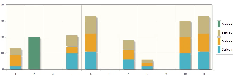
</div>实用解决方案...
    $(document).ready(function(){
  var s1 = [2, 0, 0, 10,11,0, 6, 2, 0,10,11];
  var s2 = [7, 0, 0, 4,11,0, 6, 2, 0,10,11];
  var s3 = [4, 0, 0, 7,11,0, 6, 2, 0,10,11];
  var s4 = [0, 20, 0, 0,0,0, 0, 0, 0,0,0];
  plot3 = $.jqplot('chart3', [s1, s2, s3,s4], {
    stackSeries: true,
    captureRightClick: true,
    seriesDefaults:{
      renderer:$.jqplot.BarRenderer,
      rendererOptions: {
          barMargin: 30,
          highlightMouseDown: true
      },
      pointLabels: {show: true}
    },
    axes: {
      xaxis: {
          renderer: $.jqplot.CategoryAxisRenderer
      },
      yaxis: {
        padMin: 0
      }
    },
    legend: {
      show: true,
      location: 'e',
      placement: 'outside'
    }
  });
  $('#chart3').bind('jqplotDataClick',
    function (ev, seriesIndex, pointIndex, data) {
      $('#info3').html('series: '+seriesIndex+', point: '+pointIndex+', data: '+data);
    }
  );
});
图片: