如何控制Seaborn柱状图中的条形之间的空白?

5

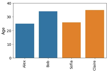
I have following simple example dataframe:

import pandas as pd
data = [['Alex',25],['Bob',34],['Sofia',26],["Claire",35]]
df = pd.DataFrame(data,columns=['Name','Age'])
df["sex"]=["male","male","female","female"]

我使用以下代码绘制条形图:
import matplotlib.pyplot as plt

import seaborn as sns

age_plot=sns.barplot(data=df,x="Name",y="Age", hue="sex",dodge=False)
age_plot.get_legend().remove()
plt.setp(age_plot.get_xticklabels(), rotation=90)
plt.ylim(0,40)
age_plot.tick_params(labelsize=14)
age_plot.set_ylabel("Age",fontsize=15)
age_plot.set_xlabel("",fontsize=1)
plt.tight_layout()

生成以下条形图:

enter image description here

我的问题:如何控制条之间的空白?我想在男性(蓝色)和女性(橙色)条之间增加一些额外的空白。

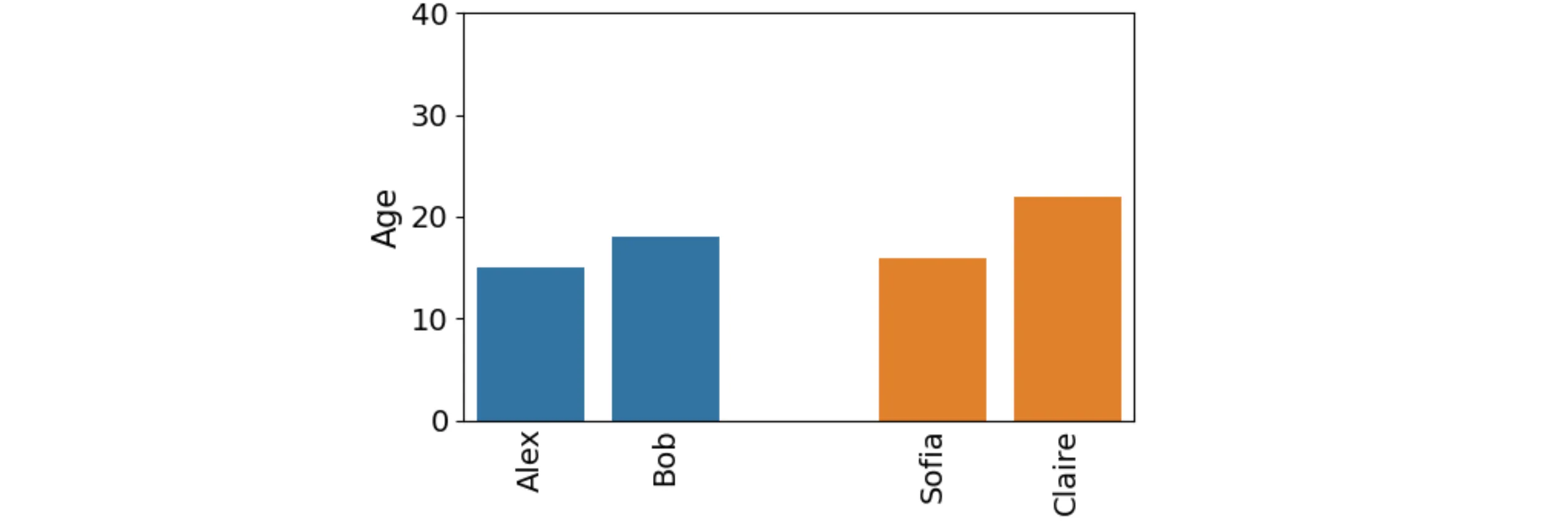
输出应该像这样(在MS PPT中编辑的不好看):

enter image description here

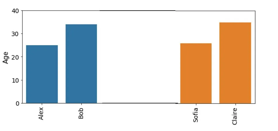
我发现了一些关于matplotplib的主题(例如 https://python-graph-gallery.com/5-control-width-and-space-in-barplots/),但没有关于seaborn的。 我更喜欢使用seaborn,因为它可以很容易地通过hue进行颜色功能。

谢谢。

1个回答

3
一种可能性是在中间插入空白的条形图:
import matplotlib.pyplot as plt
import seaborn as sns
import pandas as pd

df = pd.DataFrame({'Name': ['Alex', 'Bob', 'Sofia', 'Claire'], 'Age': [15, 18, 16, 22], 'Gender': ['M', 'M', 'F', 'F']})
df = pd.concat([df[df.Gender == 'M'], pd.DataFrame({'Name': [''], 'Age': [0], 'Gender': ['M']}), df[df.Gender == 'F']])

age_plot = sns.barplot(data=df, x="Name", y="Age", hue="Gender", dodge=False)
age_plot.get_legend().remove()
plt.setp(age_plot.get_xticklabels(), rotation=90)
plt.ylim(0, 40)
age_plot.tick_params(labelsize=14)
age_plot.tick_params(length=0, axis='x')
age_plot.set_ylabel("Age", fontsize=15)
age_plot.set_xlabel("", fontsize=1)
plt.tight_layout()
plt.show()

example plot


嗨JohanC,我在工作中很忙,所以还没有回复。虽然我猜可能有更Pythonic的方法来做这件事,但你的解决方案有效。谢谢! - Robvh

网页内容由stack overflow 提供, 点击上面的
可以查看英文原文,
原文链接