ggplot时间序列绘图:按日期分组

3

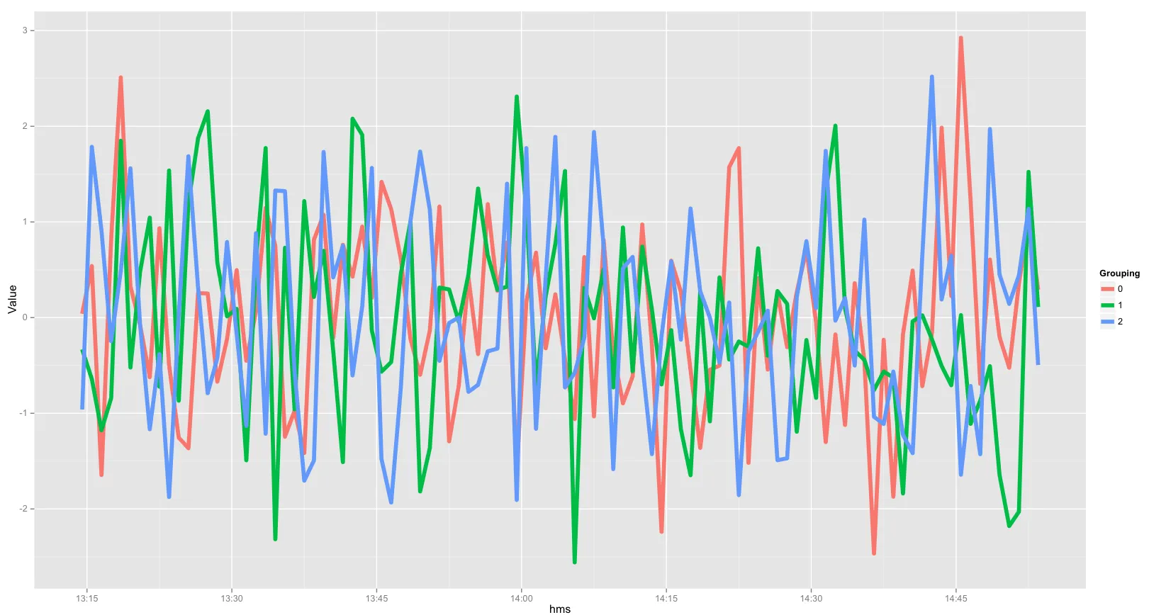
我希望在同一面板图上绘制几个时间序列,而不是在单独的面板中绘制。 我从另一个stackoverflow文章中获取了以下R代码。

请注意,3个时间序列位于3个不同的面板中。 我该如何将3个时间序列叠加在1个面板上,并且每条线的颜色可以不同。

Time = Sys.time()+(seq(1,100)*60+c(rep(1,100)*3600*24, rep(2, 100)*3600*24, rep(3, 100)*3600*24))
Value = rnorm(length(Time))
Group = c(0, cumsum(diff(Time) > 1))

library(ggplot2)
g <- ggplot(data.frame(Time, Value, Group)) + 
 geom_line (aes(x=Time, y=Value, color=Group)) +
 facet_grid(~ Group, scales = "free_x")

如果您运行上述代码,将得到下面的结果:

enter image description here

当消除
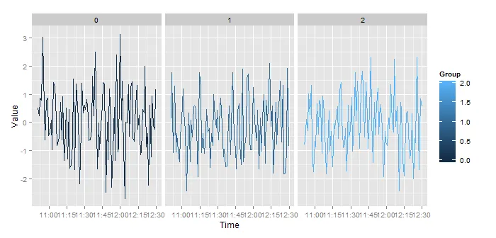
facet_grid()部分时,我得到了这样的图形:
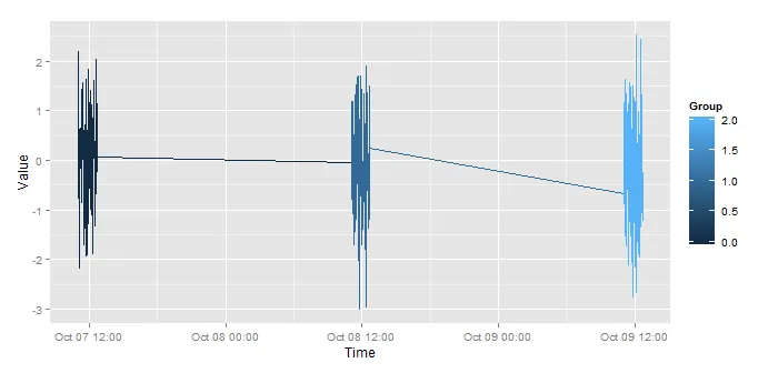
ggplot bad graph

基本上,我希望ggplot忽略日期的差异,只考虑时间。然后使用 group 来标识不同的日期。
这个问题可能可以通过创建一个仅包含时间(例如 22:01format="%H:%M")的新列来解决。但是,当使用 as.POSIXct() 函数时,我得到一个同时包含日期和时间的变量。我似乎无法摆脱日期部分。
1个回答

4

由于数据文件中每个组的时间不同,将所有组放在同一个图中的一种方法是创建一个新变量,给所有组相同的“虚拟”日期,但使用实际收集的时间。

experiment <- data.frame(Time, Value, Group)  #creates a data frame
experiment$hms <- as.POSIXct(paste("2015-01-01", substr(experiment$Time, 12, 19)))  # pastes dummy date 2015-01-01 onto the HMS of Time

现在您已经拥有了所有日期相同的时间,因此可以轻松地将它们绘制出来。
experiment$Grouping <- as.factor(experiment$Group)  # gglot needed Group to be a factor, to give the lines color according to Group
ggplot(experiment, aes(x=hms, y=Value, color=Grouping)) + geom_line(size=2)

以下是生成的图片(您可以根据需要更改/修改基本绘图):输入图像描述

网页内容由stack overflow 提供, 点击上面的
可以查看英文原文,
原文链接