Android:在TextInputLayout出现错误状态时更改浮动标签(提示)颜色

3
我希望TextInputLayout的浮动标签在出现错误时能够改变颜色(例如变为红色)。我可以改变错误文本的颜色,但它对浮动标签的外观没有影响(不像其他帖子中有人所说的那样)。我也不能使用选择器来解决这个问题,因为似乎没有定义错误状态。有人有什么想法可以在不必手动编写错误事件更改/创建带有EditText父类的新Java类的情况下完成这个操作吗?
以下是我定义的样式:
<style name="EditTextFloatingLabel" parent="@android:style/TextAppearance">
    <item name="android:textSize">@dimen/textsize_caption_small</item>
    <item name="android:layout_marginBottom">8dp</item>
    <item name="android:textColor">@color/input_text_color</item>
</style>

<style name="EditTextErrorText" parent="@android:style/TextAppearance">
    <item name="android:textColor">@color/error_color</item>
</style>

<style name="EditTextLayout">
    <item name="android:textColorHint">@color/placeholder_color</item>
    <item name="android:background">@drawable/input_field_background</item>
    <item name="android:paddingBottom">@dimen/default_margin_bottom</item>
    <item name="android:paddingStart">@dimen/default_margin_left</item>
    <item name="android:paddingEnd">@dimen/default_margin_right</item>
</style>

<style name="EditTextTheme">
    <item name="android:imeOptions">actionDone</item>
    <item name="android:maxLines">1</item>
    <item name="colorControlNormal">@color/primary_line_color</item>
    <item name="colorControlActivated">@color/nordea_blue</item>
    <item name="android:colorControlHighlight">@color/error_color</item>
    <item name="android:textColorPrimary">@color/input_field_text</item>
    <item name="android:textSize">@dimen/textsize_caption</item>
    <item name="android:textColorHint">@color/placeholder_color</item>

</style>

<style name="EditText">
    <item name="android:theme">@style/EditTextTheme</item>
    <item name="android:textCursorDrawable">@drawable/cursor_blue</item>
    <item name="android:paddingTop">@dimen/default_padding_top</item>
    <item name="android:paddingStart">@dimen/payment_text_input_padding</item>
</style>

使用方法:

        <android.support.design.widget.TextInputLayout
            android:id="@+id/input_field_error_wrapper_light"
            style="@style/EditTextLayout"
            android:layout_width="match_parent"
            android:layout_height="wrap_content"
            android:layout_marginEnd="@dimen/testlogin_text_input_end_padding"
            android:layout_marginStart="@dimen/testlogin_text_input_start_padding"
            android:paddingTop="@dimen/default_padding_top"
            app:hintTextAppearance="@style/EditTextFloatingLabel"
            app:errorTextAppearance="@style/EditTextErrorText"
            app:errorEnabled="true">

            <EditText
                android:id="@+id/input_field_light_error"
                style="@style/EditText"
                android:layout_width="match_parent"
                android:layout_height="wrap_content"
                android:hint="#Input Field Disabled Light"
                android:imeOptions="actionDone"
                />
        </android.support.design.widget.TextInputLayout>
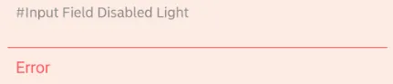
我看到的内容如下:

在此输入图片描述


尝试更新我的答案。 - Arjun saini
2个回答

3

因为当布局处于错误状态时,我需要执行其他一些操作,所以我决定采用创建自定义错误状态和自定义TextInputLayout的解决方案来解决问题。

代码:

在res/values/attrs.xml中定义新的错误状态:

<?xml version="1.0" encoding="utf-8"?>
<resources>

    ...

    <!-- custom states -->
    <declare-styleable name="ErrorState">
        <attr name="state_error" format="boolean" />
    </declare-styleable>
</resources>

ErrorStateTextInputLayout class:

public class ErrorStateTextInputLayout extends TextInputLayout {
    private boolean hasError = false;
    private static final int[] ERROR_STATE = new int[]{R.attr.state_error};

    public ErrorStateTextInputLayout(Context context) {
        super(context);
    }

    public ErrorStateTextInputLayout(Context context, AttributeSet attrs) {
        super(context, attrs);
    }

    public ErrorStateTextInputLayout(Context context, AttributeSet attrs, int defStyleAttr) {
        super(context, attrs, defStyleAttr);
    }

    @Override
    protected int[] onCreateDrawableState(int extraSpace) {
        int[] state = super.onCreateDrawableState(extraSpace + 1);
        if (hasError) {
            mergeDrawableStates(state, ERROR_STATE);
        }
        return state;
    }

    @Override
    public void setError(@Nullable CharSequence error) {
        if (error == null) {
            setHasError(false);
        } else {
            setHasError(true);
        }
        super.setError(error);
    }


    public void setHasError(boolean error) {
        this.hasError = error;
        refreshDrawableState();
    }
}

设置提示文本颜色的选择器:

<?xml version="1.0" encoding="utf-8"?>
<selector xmlns:android="http://schemas.android.com/apk/res/android" xmlns:app="http://schemas.android.com/apk/res-auto">
    <item android:color="@color/disabled_text_color" android:state_enabled="false" />
    <item android:color="@color/error_color" app:state_error="true" />
    <item android:color="@color/input_text_color" android:state_focused="true" />
    <item android:color="@color/placeholder_color" />
</selector>

这篇博客文章对我帮助很大:http://code.neenbedankt.com/example-of-custom-states-in-android-components/

此文讲述了Android组件中自定义状态的示例。

你是怎么让它工作的?调用setHasError(true)对我没用。我已经将选择器设置为error_appearance的textColor。 - NightFury
@NightFury 我在错误文本中使用单一颜色,所以我不确定选择器是否适用(但我认为它也应该可以工作)。对我来说,只需定义一个自定义状态属性并在适当的位置设置其状态即可解决问题,正如上面的代码片段所示。也许如果您也发布一些代码部分,我就能更好地理解您的问题所在了。 - hildegard

0

试试这个...红色实心浮动颜色...

<style name="TextLabelInput" parent="TextAppearance.AppCompat">
<!-- Hint color and label color in FALSE state -->
<item name="android:textColorHint">@color/solid_red</item>
<item name="android:textSize">16sp</item>
<item name="android:textStyle">bold</item>
<item name="android:textColor">@color/solid_red</item>
<item name="android:duration">200</item>
<item name="android:textColorHighlight">@color/solid_red</item>

<!-- Label color in TRUE state and bar color FALSE and TRUE State -->
<item name="colorAccent">@color/solid_red</item>
<item name="colorControlNormal">@color/solid_red</item>
<item name="colorControlActivated">@color/solid_red</item>
<item name="colorPrimary">@color/solid_red</item>
<item name="colorPrimaryDark">@color/solid_red</item>

   <android.support.design.widget.TextInputLayout
        android:id="@+id/input_layout"
        android:layout_width="match_parent"
        android:layout_height="wrap_content"
        android:textAppearance="?android:attr/textAppearanceLarge"
        app:errorTextAppearance="@style/TextLabelInput"

        >

提示文本颜色管理主题

这些颜色是colorPrimary和colorAccent

<style name="AppTheme" parent="Theme.AppCompat.Light.NoActionBar">
    <!-- Customize your theme here. -->
    <item name="colorPrimary">@color/colorPrimary</item>
    <item name="colorPrimaryDark">@color/colorPrimaryDark</item>
    <item name="colorAccent">@color/colorAccent</item>

</style>

这对我没用。下划线和错误消息是红色的,但浮动文本仍然是强调颜色。 - Laranjeiro

网页内容由stack overflow 提供, 点击上面的
可以查看英文原文,
原文链接