更新: 已更新的PLUNKER, 使用box-shadow进行animation
@Component({
selector: 'my-app',
template: `
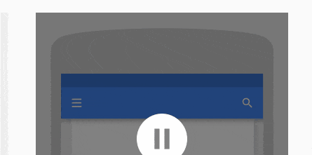
<div class="head" [@mtSlide]="activeSlide == 1 ? 'active': 'inactive'">
<input id="searchBar" type="search" [@mtTranslate]="activeSlide == 2 ? 'active': 'inactive'">
<i class="fa fa-bars" [@mtRotate]="activeSlide == 1 ? 'active': 'inactive'" (click)="menuOpen()" [style.z-index]="activeSlide == 1 ? 1 : 0"></i>
<i class="fa fa-arrow-left" [@mtRotate]="activeSlide == 2 ? 'active': 'inactive'" (click)="activeSlide = 1" [style.z-index]="activeSlide == 2 ? 1 : 0"></i>
<i class="fa fa-search" [@mtScale]="activeSlide == 1 ? 'active': 'inactive'" style="right:10px; left: initial;" (click)="activeSlide = 2"></i>
</div>
`,
animations: [
trigger('mtSlide', [
state('inactive', style({
'box-shadow': 'rgb(0, 102, 255) 0px 0px 0px 0px inset, rgb(0, 0, 0) 0px 2px 8px -3px'
})),
state('active', style({
'box-shadow': 'rgb(0, 102, 255) 100vw 0px 0px 0px inset, rgb(0, 0, 0) 0px 2px 8px -3px'
})),
transition('inactive <=> active', animate('200ms ease-out'))
]),
trigger('mtTranslate', [
state('inactive', style({
transform: 'translateX(100%)'
})),
state('active', style({
transform: 'translateX(0)'
})),
transition('inactive <=> active', animate('200ms ease-out'))
]),
trigger('mtRotate', [
state('inactive', style({
transform: 'rotateZ(-90deg)'
opacity: 0;
})),
state('active', style({
transform: 'rotateZ(0)';
opacity: 1;
})),
transition('inactive <=> active', animate('300ms ease-out'))
]),
trigger('mtScale', [
state('inactive', style({
transform: 'scale(0)'
})),
state('active', style({
transform: 'scale(1)';
})),
transition('inactive <=> active', animate('400ms ease-out'))
])],
styles: [`
* {
box-sizing: border-box;
}
.head {
position: relative;
font-size: 18px;
}
.head, .color-bar, .head > input {
width: 100%;
height: 50px;
}
.head i, .head > input{
position: absolute;
}
.head i {
line-height: 50px;
cursor: pointer;
color: white;
padding: 0 10px;
width: 50px;
text-align: center;
left: 10px;
}
.head i.fa-arrow-left {
color: #111;
}
.head > input {
border: 0;
outline: 0;
padding-left: 50px;
}
`]
})
export class App {
activeSlide = 1;
menuOpen() {
alert('Menu Clicked');
}
}
box-shadow: inset来实现这个效果,直接应用于.head div,然后调整阴影区域即可。 - Ankit Singh