您可以采用不同的渐变方式并动画化其位置。诀窍是将渐变的大小加倍,并使颜色停止值为其实际值的一半,以便保持相同的视觉渐变,然后您可以将其从左到右动画化。
由于farthest-corner的计算,它与在动画中定义的渐变看起来可能不完全相同。
#shine-div {
height: 30vh;
width: 60vw;
margin-right: auto;
margin-left: auto;
border-radius: 10px;
background: radial-gradient(farthest-corner at top, #FFFFFF 0%, #ffb3ff 4%, #ff33ff 12.25%, #800080 31.25%, #b300b3 50%) top right/200% 200%;
display: flex;
justify-content: center;
align-items: center;
color: white;
font-weight: bold;
animation: colorChange 5s infinite alternate;
}
@keyframes colorChange {
to {
background-position:top left;
}
}
<div id="shine-div">
  Shine
</div>
为了更接近您的渐变,您还需要动画化
background-size (有关计算细节,请参见下文)。
#shine-div {
height: 30vh;
width: 60vw;
margin-right: auto;
margin-left: auto;
border-radius: 10px;
background: radial-gradient(farthest-corner at top, #FFFFFF 0%, #ffb3ff 8%, #ff33ff 24.5%, #800080 62.5%, #b300b3 100%);
display: flex;
justify-content: center;
align-items: center;
color: white;
font-weight: bold;
animation: colorChange 5s infinite alternate linear;
}
@keyframes colorChange {
from {
background-position:left top;
background-size:200% 100%;
}
49.9% {
background-position:left top;
}
50% {
background-size:100% 100%;
}
50.1% {
background-position:right top;
}
to {
background-position:right top;
background-size:200% 100%;
}
}
<div id="shine-div">
  Shine
</div>
您也可以考虑使用伪元素和变换来执行相同的动画,以获得更好的性能:
#shine-div {
height: 30vh;
width: 60vw;
margin-right: auto;
margin-left: auto;
border-radius: 10px;
display: flex;
justify-content: center;
align-items: center;
color: white;
font-weight: bold;
overflow:hidden;
position:relative;
z-index:0;
}
#shine-div:before {
content:"";
position:absolute;
z-index:-1;
top:0;
left:0;
width:400%;
height:200%;
background: radial-gradient(farthest-corner at top, #FFFFFF 0%, #ffb3ff 4%, #ff33ff 12.25%, #800080 31.25%, #b300b3 50%);
animation: colorChange 5s infinite alternate linear;
}
@keyframes colorChange {
from {
transform:translateX(-50%);
}
50% {
transform:scaleX(0.75) translateX(-50%)
}
to {
transform:translateX(-25%);
}
}
<div id="shine-div">
  Shine
</div>
更深入的了解
为了使答案更加通用,我将详细介绍如何从两个不同的位置动画显示任何类型的渐变。主要技巧是以不同的方式编写渐变以使其定义为常量(radial-gradient(<constant_definition>)),并动画显示background-position(在某些情况下还包括background-size)
我们将渐变定义为 background:radial-gradient(Rh Rv at X Y, color1 p1, color2 p2),其中Rh和Ry分别是椭圆的水平半径和垂直半径(如果两个值相等或仅使用一个值,则为圆)。
首先,我们将渐变的大小加倍。这个技巧将使我们能够轻松地使用百分比值调整渐变的位置(在此处说明:在线性渐变上使用百分比值的背景位置)
如果使用像素值定义半径,则保留其定义,但如果使用百分比值定义半径,则将其除以2,因为它相对于我们增加的尺寸而言。如果两个半径都是百分比,则可以将两个半径除以2,也可以保留它们并将色标除以2。
其次,我们去掉了at X Y,这将使渐变居中,因此我们需要使用background-position来矫正位置。显然,如果渐变位于0 0处,则需要使用background-position:100% 100%
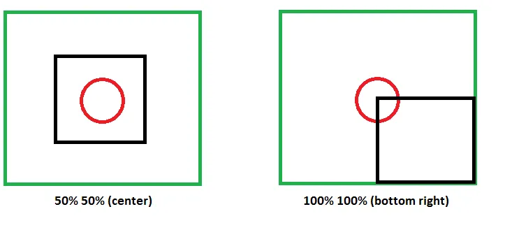
绿色框是我们的背景,大小是元素(黑色框)的两倍,红色圆圈是我们的渐变。通过调整背景位置,我们将渐变在视觉上定位为0 0。
对于任何,值,我们逻辑上有background-position:calc(100% - X) calc(100% - Y)
如果X、Y是像素值,我们还可以使用background-position: right -X bottom -Y (注意是-X而不是- X,我们使用负值)
例子:
使用像素值
.box {
  height:150px;
  width:150px;
  border:1px solid;
  display:inline-block;
}
<div class="box" style="background:radial-gradient(20% 100px at 20px 30px,red 30%,blue 60%);"></div>
<div class="box" style="background:radial-gradient(10% 100px,red 30%,blue 60%) right -20px bottom -30px/200% 200%;"></div>
<br>
<div class="box" style="background:radial-gradient(40% 40% at 40px 50px,yellow 30%,blue);"></div>
<div class="box" style="background:radial-gradient(40% 40%,yellow 15%,blue 50%) right -40px bottom -50px/200% 200%;"></div>
<div class="box" style="background:radial-gradient(20% 20%,yellow 30%,blue) right -40px bottom -50px/200% 200%;"></div>
使用百分比数值
.box {
  height:150px;
  width:150px;
  border:1px solid;
  display:inline-block;
}
<div class="box" style="background:radial-gradient(20% 100px at 50% 10%,red 30%,blue 60%);"></div>
<div class="box" style="background:radial-gradient(10% 100px,red 30%,blue 60%) calc(100% - 50%) calc(100% - 10%)/200% 200%;"></div>
<br>
<div class="box" style="background:radial-gradient(40% 40% at 30% 70%,yellow 30%,blue);"></div>
<div class="box" style="background:radial-gradient(40% 40%,yellow 15%,blue 50%) calc(100% - 30%) calc(100% - 70%)/200% 200%;"></div>
<div class="box" style="background:radial-gradient(20% 20%,yellow 30%,blue) calc(100% - 30%) calc(100% - 70%)/200% 200%;"></div>
所以如果我们想要从一个渐变色实现动画效果:
radial-gradient(Rh Rv at X Y, color1 p1, color2 p2)
到
radial-gradient(Rh Rv at X1 Y2, color1 p1, color2 p2)
我们以不同的方式编写它,并让background-position动画:
.box {
  height:150px;
  width:150px;
  border:1px solid;
  display:inline-block;
}
.first {
  background:radial-gradient(10% 100px,red 30%,blue 60%) calc(100% - 50%) calc(100% - 10%)/200% 200%;
  animation:change1 2s linear infinite alternate;
}
.second {
  background:radial-gradient(20% 20%,yellow 30%,blue)right -50px bottom 0/200% 200%;
  animation:change2 2s linear infinite alternate;
}

@keyframes change1 {
  to {
    background-position:calc(100% + 10%) calc(100% - 80%);
  }
}

@keyframes change2 {
  to {
    background-position:right -100px bottom -100px;
  }
}
<div class="box first" ></div>
<div class="box second"></div>
现在让我们考虑更棘手的情况,比如我们最初的例子,使用
farthest-side来定义尺寸。我们将采用相同的逻辑并进行转换。
radial-gradient(farthest-side at X Y, color1 p1, color2 p2);
TO
radial-gradient(farthest-side, color1 p1, color2 p2) Px Py/Sx Sy no-repeat;
我将为一个轴(X)进行解释,同样适用于其他轴。
farthest-side 定义半径为从渐变中心到渐变框最远侧的距离(由于我们没有定义任何大小,所以渐变框默认为元素本身)。 如果 X 是百分比值,则半径是 X 和 100% - X 之间的最大值,在转换后的渐变中,半径将为 50% ,因为我们在中心。 所以我们需要将第一个半径与 50%*Sx 匹配。
如果 X 是 50%,则 Sx 应该是 100%,如果 X 是 0 或 100%,则 Sx 应该是 200%。
公式为 Sx = max(X,100% - X)*2
由于渐变形状应该触及一侧,因此在这种情况下位置更容易确定
- 如果
X 在 [0 50%[ 内,则 Px 应为 100% (right)
- 如果
X 是 50%,则对于 Px 的任何值都可以使用,因为 Sx = 100%
- 如果
X 在 ]50% 100%] 内,则 Px 应为 0% (left)
相关问题:在 linear-gradient 上使用百分比值的 background-position
例子:
.box {
  height:150px;
  width:150px;
  border:1px solid;
  display:inline-block;
}
<div class="box" style="background:radial-gradient(farthest-side at 20% 60%, red 20%, blue 100%, yellow 100%)" ></div>
<div class="box" style="background:radial-gradient(farthest-side, red 20%, blue 100%, yellow 50%) 100% 0/calc(80%*2) calc(60%*2)"></div>
<br>
<div class="box" style='background:radial-gradient(farthest-side at 22% 100%,red 40%, blue 100%,yellow 100%)'></div>
<div class="box" style="background:radial-gradient(farthest-side,red 40%, blue 100%,yellow 100%) 100% 0/calc(78%*2) calc(100%*2)"></div>
对于farthest-corner,我们完全一样:
.box {
  height:150px;
  width:150px;
  border:1px solid;
  display:inline-block;
}
<div class="box" style="background:radial-gradient(farthest-corner at 20% 60%, red 20%, blue 50%, yellow 60%)" ></div>
<div class="box" style="background:radial-gradient(farthest-corner, red 20%, blue 50%, yellow 60%) 100% 0%/calc(80%*2) calc(60%*2)"></div>
<br>
<div class="box" style="background:radial-gradient(farthest-corner at 40% 100%, red 20%, blue 50%, yellow 60%)" ></div>
<div class="box" style="background:radial-gradient(farthest-corner, red 20%, blue 50%, yellow 60%) 100% 0%/calc(60%*2) calc(100%*2)"></div>
我们还可以将farthest-side(或farthest-corner)转换为Rh Rv,并进行之前的计算,但这对于动画不会有用,因为我们将拥有具有不同半径的两个渐变,而我们需要相同的渐变。
.box {
  height:150px;
  width:150px;
  border:1px solid;
  display:inline-block;
}
<div class="box" style="background:radial-gradient(farthest-side at 20% 60%, red 20%, blue 100%, yellow 100%)" ></div>
<div class="box" style="background:radial-gradient(80% 60% at 20% 60%, red 20%, blue 100%, yellow 100%)" ></div>
<div class="box" style="background:radial-gradient(80% 60%, red 10%, blue 50%, yellow 50%) 80% 40%/200% 200%"></div>
如果 X 是像素值,那么有两种情况:
- 元素具有固定宽度:在这种情况下,我们可以将像素值
X 转换为宽度的百分比,并使用与上述相同的逻辑。
- 元素具有可变宽度:在这种情况下,将梯度转换为百分比会很棘手(可能不可能),因为形状会根据宽度而改变。当
width-X > X 时,我们将具有可变半径,当 width-X < X 时,我们将具有固定半径。我认为我们无法使用 background-size 和 background-position 来表达这一点。例如:
body {
  margin:0;
  height:100vh;
  background:radial-gradient(farthest-side at 400px 200px,blue 40%,yellow 50%);
}
对于closest-side,将采用相同的逻辑来考虑 Sx=min(X,100% - X)*2 但我们应该添加no-repeat和background-color等于渐变中最后一个颜色,因为尺寸小于100%
.box {
  height:150px;
  width:150px;
  border:1px solid;
  display:inline-block;
}
<div class="box" style="background:radial-gradient(closest-side at 20% 60%, red 20%, blue 100%, yellow 100%)" ></div>
<div class="box" style="background:radial-gradient(closest-side, red 20%, blue 100%, yellow 100%) 0 100%/calc(20%*2) calc(40%*2)"></div>
<div class="box" style="background:radial-gradient(closest-side, red 20%, blue 100%, yellow 100%) 0 100%/calc(20%*2) calc(40%*2) no-repeat,yellow"></div>
<br>
<div class="box" style='background:radial-gradient(closest-side at 22% 10%,red 40%, blue 100%,yellow 100%)'></div>
<div class="box" style="background:radial-gradient(closest-side,red 40%, blue 100%,yellow 100%) 0 0/calc(22%*2) calc(10%*2)"></div>
<div class="box" style="background:radial-gradient(closest-side,red 40%, blue 100%,yellow 100%) 0 0/calc(22%*2) calc(10%*2) no-repeat,yellow"></div>
对于closest-corner,我们可以做同样的事情,但由于渐变可能会溢出渐变框,我们会遇到一些问题。
.box {
  height:150px;
  width:150px;
  border:1px solid;
  display:inline-block;
}
<div class="box" style="background:radial-gradient(closest-corner at 20% 60%, red 20%, blue 100%, yellow 100%)" ></div>
<div class="box" style="background:radial-gradient(closest-corner, red 20%, blue 100%, yellow 100%) 0 100%/calc(20%*2) calc(40%*2)"></div>
<div class="box" style="background:radial-gradient(closest-corner, red 20%, blue 100%, yellow 100%) 0 100%/calc(20%*2) calc(40%*2) no-repeat,yellow"></div>
为了改正这个问题,我们可以将颜色停止位置除以2,以确保整个渐变范围内都包含在内。然后,我们将尺寸扩大两倍并校正位置。
.box {
  height:150px;
  width:150px;
  border:1px solid;
  display:inline-block;
}
<div class="box" style="background:radial-gradient(closest-corner at 20% 60%, red 20%, blue 100%, yellow 100%)" ></div>
<div class="box" style="background:radial-gradient(closest-corner, red 10%, blue 50%, yellow 50%) -100% 33%/calc(20%*4) calc(40%*4)"></div>
<div class="box" style="background:radial-gradient(closest-corner, red 10%, blue 50%, yellow 50%) -100% 33%/calc(20%*4) calc(40%*4) no-repeat,yellow"></div>
<br>
<div class="box" style='background:radial-gradient(closest-corner at 22% 10%,red 40%, blue 100%,yellow 100%)'></div>
<div class="box" style="background:radial-gradient(closest-corner,red 20%, blue 50%,yellow 50%) -100% 0%/calc(22%*4) calc(10%*4)"></div>
<div class="box" style="background:radial-gradient(closest-corner,red 20%, blue 50%,yellow 50%) -164% -18%/calc(22%*4) calc(10%*4) no-repeat,yellow"></div>
即使没有动画,没有at X Y的渐变语法更受支持。一些浏览器如Safari不支持at。(如何在Safari中使用径向渐变?)