我有一个网站,我想改变单选按钮的圆点背景颜色。现在它似乎是透明的,所以会获取背景颜色。我尝试使用CSS并设置"background: white;"例如,但这在浏览器中没有效果。有什么酷炫的技巧可以使用来实现这个目标吗?
同样的问题也适用于复选框。
此技术使用与隐藏的input元素绑定的label元素,接收:checked状态将更改:before伪元素的外观:
/* COMMON RADIO AND CHECKBOX STYLES  */
input[type=radio],
input[type=checkbox]{
  /* Hide original inputs */
  visibility: hidden;
  position: absolute;
}
input[type=radio] + label:before,
input[type=checkbox] + label:before{
  height:12px;
  width:12px;
  margin-right: 2px;
  content: " ";
  display:inline-block;
  vertical-align: baseline;
  border:1px solid #777;
}
input[type=radio]:checked + label:before,
input[type=checkbox]:checked + label:before{
  background:gold;
}

/* CUSTOM RADIO AND CHECKBOX STYLES */
input[type=radio] + label:before{
  border-radius:50%;
}
input[type=checkbox] + label:before{
  border-radius:2px;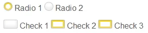
}<input type="radio" name="r" id="r1"><label for="r1">Radio 1</label>
<input type="radio" name="r" id="r2"><label for="r2">Radio 2</label>
<input type="checkbox" name="c1" id="c1"><label for="c1">Check 1</label>
<input type="checkbox" name="c2" id="c2"><label for="c2">check 2</label> 众所周知,您无法更改浏览器生成控件的所有细节。例如下拉选择框箭头的颜色或单选按钮的点等......
您可以创建自定义控件,使用一些库(如JQuery UI),或者......可能稍微调整一下CSS。
这是一个实验,通过使用:before伪元素来伪造单选按钮上的有色点:
input[type="radio"]:checked:before {
    content: "";
    display: block;
    position: relative;
    top: 3px;
    left: 3px;
    width: 6px;
    height: 6px;
    border-radius: 50%;
    background: red;
}
结果:

<div>
    Radio 1 -
    <input type="radio" name="radio" class="radio" value="1" />
    <span class="red fa fa-circle-o"></span>
</div>
<div>
    Radio 2 -
    <input type="radio" name="radio" class="radio" value="2" />
    <span class="blue fa fa-circle-o"></span>
</div>

$('span.fa').on('click', function() {
    $('span.fa').removeClass('fa fa-dot-circle-o').addClass('fa fa-circle-o');
    $(this).removeClass('fa-circle-o').addClass('fa-dot-circle-o');

    //Check corresponding hidden radio
    $(this).prev('input.radio').prop('checked', true);
});
使用CSS样式化复选框和单选按钮的非标签元素的首选方法是使用代表其当前状态(未选中、选中等)的图像替换它们。
请参阅Ryan Seddon的文章:http://www.thecssninja.com/css/custom-inputs-using-css
你可以仅使用 CSS 来样式化 Ionic 单选按钮。请查看这个 fiddle:
https://jsfiddle.net/sreekanthjayan/0d9vj86k/
     <div>
          <ion-radio class="radio radio-inline radio-gray" ng-model="choice" ng-value="'A'">iOS</ion-radio>
          <ion-radio class="radio radio-inline radio-teal" ng-model="choice" ng-value="'B'">Android</ion-radio>
          <ion-radio class="radio radio-inline radio-blue" ng-model="choice" ng-value="'C'">Windows Phone</ion-radio>
     </div>


.radio .radio-icon {
  visibility: visible !important;
}

.radio .radio-icon:before {
  content: "" !important;
  border: 2px solid black !important;
  width: 24px !important;
  height: 24px !important;
  border-radius: 50% !important;
  overflow: hidden !important;
}

.radio .radio-icon:after {
  content: "" !important;
  position: absolute !important;
  right: 20px !important;
  top: 22px !important;
  background: black !important;
  width: 12px !important;
  height: 12px !important;
  border-radius: 50% !important;
  overflow: hidden !important;
  transition: -webkit-transform .28s cubic-bezier(0.420, 0.000, 0.000, 1.650);
  transition: transform .28s cubic-bezier(0.420, 0.000, 0.000, 1.650);
  -webkit-transform: scale(0);
  transform: scale(0);
}

.radio.item-radio > input[type=radio]:checked ~ .radio-icon:after {
  -webkit-transform: scale(1);
  transform: scale(1);
}

.radio .item-content {
  background-color: #fff;
  margin: 0;
  padding-right: 50px;
  padding-left: 0px;
}

.radio.item-radio > input[type=radio]:checked ~ .item-content {
  background-color: #fff;
}

.radio-inline.item {
  display: inline-block;
  border: none;
  margin: 0;
  height: 50px;
}

.radio-blue .radio-icon:after {
  background: #2196F3 !important;
}

.radio-blue .radio-icon:before {
  border-color: #2196F3 !important;
}

.radio-teal .radio-icon:after {
  background: #009688 !important;
}

.radio-teal .radio-icon:before {
  border-color: #009688 !important;
}

.radio-gray .radio-icon:after {
  background: #B6B6B6 !important;
}

.radio-gray .radio-icon:before {
  border-color: #B6B6B6 !important;
}
有很多方法可以做到这一点,所有这些方法都涉及到摆脱DOM样式,因为没有这些“技巧”是不可能做到的。这里有一个示例来自Chris Coyier(只需阅读页面,跳过步骤1,简单准备图像和CSS即可)
/*
    Hide the original radios and checkboxes
    (but still accessible)

    :not(#foo) > is a rule filter to block browsers
                 that don't support that selector from
                 applying rules they shouldn't

*/
li:not(#foo) > fieldset > div > span > input[type='radio'],
li:not(#foo) > fieldset > div > span > input[type='checkbox'] {

    /* Hide the input, but have it still be clickable */
    opacity: 0;

    float: left;
    width: 18px;
}

li:not(#foo) > fieldset > div > span > input[type='radio'] + label,
li:not(#foo) > fieldset > div > span > input[type='checkbox'] + label {
    margin: 0;
    clear: none;

    /* Left padding makes room for image */
    padding: 5px 0 4px 24px;

    /* Make look clickable because they are */
    cursor: pointer;

    background: url(off.png) left center no-repeat;
}

/*
    Change from unchecked to checked graphic
*/
li:not(#foo) > fieldset > div > span > input[type='radio']:checked + label {
    background-image: url(radio.png);
}
li:not(#foo) > fieldset > div > span > input[type='checkbox']:checked + label {
    background-image: url(check.png);
}