我生成了一个条形图,如何在每个条形上显示其值?
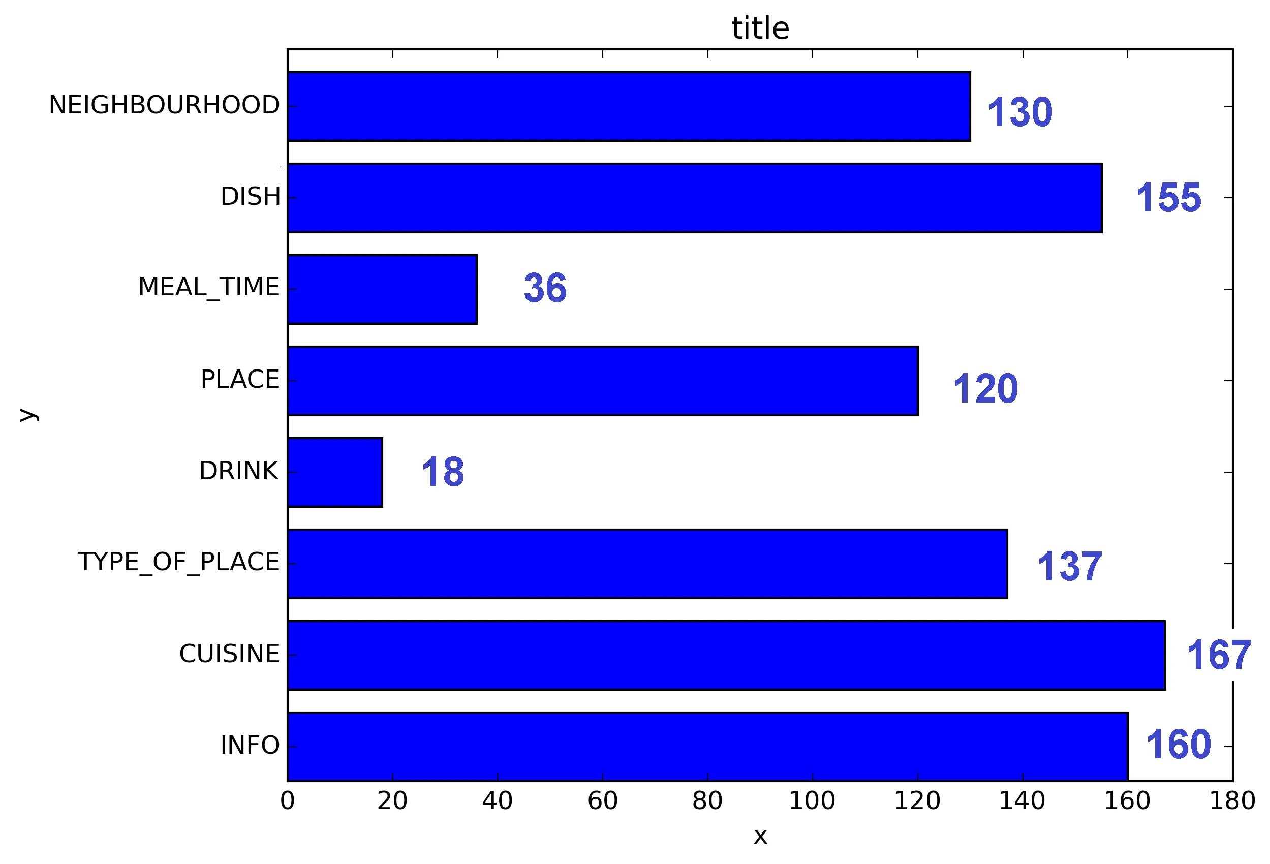
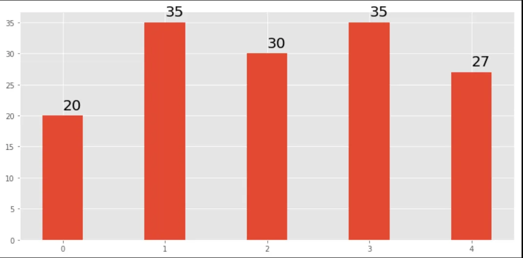
当前图表:
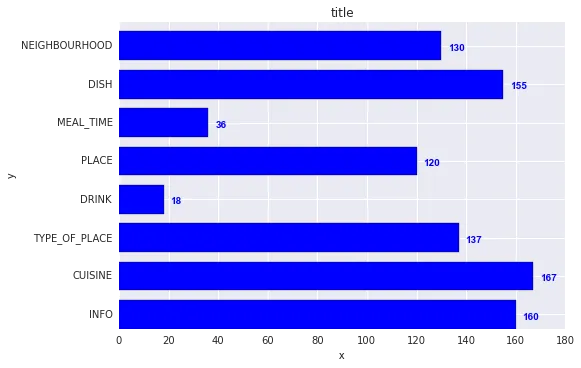
当前图表:

我想要得到的是:
我的代码:
import os
import numpy as np
import matplotlib.pyplot as plt

x = [u'INFO', u'CUISINE', u'TYPE_OF_PLACE', u'DRINK', u'PLACE', u'MEAL_TIME', u'DISH', u'NEIGHBOURHOOD']
y = [160, 167, 137, 18, 120, 36, 155, 130]

fig, ax = plt.subplots()
width = 0.75 # the width of the bars
ind = np.arange(len(y))  # the x locations for the groups
ax.barh(ind, y, width, color="blue")
ax.set_yticks(ind+width/2)
ax.set_yticklabels(x, minor=False)
plt.title('title')
plt.xlabel('x')
plt.ylabel('y')
#plt.show()
plt.savefig(os.path.join('test.png'), dpi=300, format='png', bbox_inches='tight') # use format='svg' or 'pdf' for vectorial pictures
plt.text(v, i, " "+str(v), color='blue', va='center', fontweight='bold')- João Cartuchoplt.show()的代码行。例如:df.plot(); plt.show()- Jairo Alvesax.text(v + (np.max(y) * 0.02), i, str(v), ha='left', va='center')。 - Marcel Motta