如何在CSS网格布局中跳过一列?

10

网格系统设计

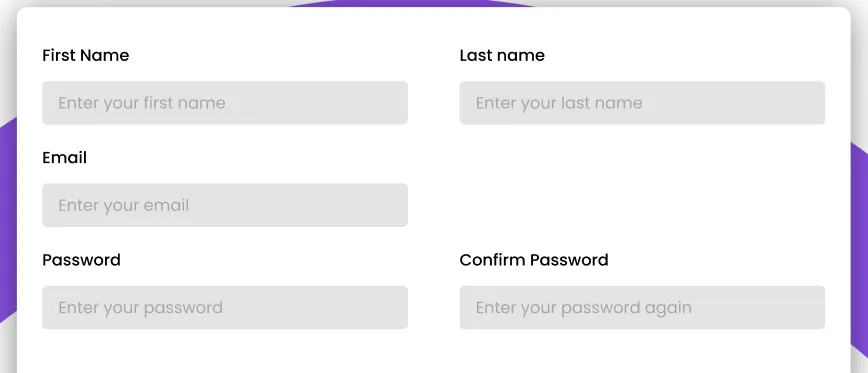
我需要保持中间的网格项目为空。我认为可以使用以下属性实现:grid-template-areas

grid-template-areas:
  "header . header"
  "main . ."
  "footer . footer";

但是这不幸地不能给出正确的显示。

所以我用了5个名为item-a到item-e的类,在CSS中设置了网格中的正确位置。然而,这种方法并不感觉很有效率。有人知道如何使它更加高效吗?

.content-container {
    width: 51.5em;
    height: 30em;
    padding: 2.125em 1.5em;
    display: grid;
    grid-template-columns: 45% auto 45%;
    grid-template-rows: auto;
  }

  .item-a {
    grid-column: 1;
    grid-row: 1 / 3;
  }

  .item-b {
    grid-column: 3;
    grid-row: 1 / 3;
  }

  .item-c {
    grid-column: 1;
    grid-row: 2 / 3;
  }

  .item-d {
    grid-column: 1;
    grid-row: 3 / 3;
  }

  .item-e {
    grid-column: 3;
    grid-row: 3 / 3;
  }
<div class="content-container">
  <div class="item-a">
    <label for="firstName" class="label">First Name</label>
    <input id="firstName" type="text" class="input" placeholder="Enter your first name">
  </div>
  <div class="item-b">
    <label for="lastName" class="label">Last Name</label>
    <input id="lastName" type="text" class="input" placeholder="Enter your last name">
  </div>
  <div class="item-c">
    <label for="email" class="label">Email</label>
    <input id="email" type="email" class="input" placeholder="Enter your email">
  </div>
  <div class="item-d">
    <label for="password" class="label">Password</label>
    <input id="password" type="password" class="input" placeholder="Enter your password">
  </div>
  <div class="item-e">
    <label for="passwordConfirmation" class="label">Confirm Password</label>
    <input id="passwordConfirmation" type="password" class="input" placeholder="Enter your password again">
  </div>
</div>

3个回答

14

你不需要那么多代码,可以像下面这样简化:

.content-container {
  max-width: 51.5em;
  height: 20em;
  padding: 2.125em 1.5em;
  display: grid;
  grid-template-columns: 1fr 1fr; /* define only 2 columns*/
  column-gap: 4em; /* control the gap between both columns*/
  border: 1px solid;
}

.item-d {
  grid-column: 1; /* move the passwer to the first column instead of the second one*/
}

input {
  display: block;
  width: 100%;
  box-sizing:border-box;
}
<div class="content-container">
  <div>
    <label for="firstName" class="label">First Name</label>
    <input id="firstName" type="text" class="input" placeholder="Enter your first name">
  </div>
  <div>
    <label for="lastName" class="label">Last Name</label>
    <input id="lastName" type="text" class="input" placeholder="Enter your last name">
  </div>
  <div>
    <label for="email" class="label">Email</label>
    <input id="email" type="email" class="input" placeholder="Enter your email">
  </div>
  <div class="item-d">
    <label for="password" class="label">Password</label>
    <input id="password" type="password" class="input" placeholder="Enter your password">
  </div>
  <div>
    <label for="passwordConfirmation" class="label">Confirm Password</label>
    <input id="passwordConfirmation" type="password" class="input" placeholder="Enter your password again">
  </div>
</div>

另一个简化:

.content-container {
  max-width: 51.5em;
  height: 20em;
  padding: 2.125em 1.5em;
  display: grid;
  column-gap: 4em;
  border:1px solid;
}

.content-container :nth-child(2) {
  grid-column: 2;
  grid-row:span 2;
}

input {
  display: block;
  width:100%;
  box-sizing:border-box;
}
<div class="content-container">
  <div>
    <label for="firstName" class="label">First Name</label>
    <input id="firstName" type="text" class="input" placeholder="Enter your first name">
  </div>
  <div>
    <label for="lastName" class="label">Last Name</label>
    <input id="lastName" type="text" class="input" placeholder="Enter your last name">
  </div>
  <div>
    <label for="email" class="label">Email</label>
    <input id="email" type="email" class="input" placeholder="Enter your email">
  </div>
  <div >
    <label for="password" class="label">Password</label>
    <input id="password" type="password" class="input" placeholder="Enter your password">
  </div>
  <div>
    <label for="passwordConfirmation" class="label">Confirm Password</label>
    <input id="passwordConfirmation" type="password" class="input" placeholder="Enter your password again">
  </div>
</div>


是否也有一种使用 grid-template-areas 属性来实现这个的方法? - Ezrab_
1
@Ezrab_ 是的,但对于这样简单的布局并不需要。自动定位将为您完成90%的工作,您只需要一个指令来移动一个元素。 - Temani Afif
谢谢!但我正在尝试通过以不同的方式创建相同的网格来学习网格的工作原理。这就是为什么我想知道怎样做。 - Ezrab_
2
@Ezrab_ 始终先让网格为您放置项目,然后在需要时进行调整。如果您首先自行放置所有元素,则会迷失方向,尤其是当布局很简单时,这样做效率不高。 - Temani Afif
1
如何为这些字段设置100%的宽度? - Bhavin Thummar

0

.content-container {
  display: grid;
  grid-template-columns: auto auto;
  grid-gap: 10px;
  background-color: #2196F3;
  padding: 10px;
}

.content-container > div {
  background-color: rgba(255, 255, 255, 0.8);
  text-align: center;
  padding: 20px 0;
  font-size: 30px;
}

.item-full{
    grid-column: 1/-1
}
<!DOCTYPE html>
<html>
<head>

</head>
<body>
<div class="content-container">
  <div>
    <label for="firstName" class="label">First Name</label>
    <input id="firstName" type="text" class="input" placeholder="Enter your first name">
  </div>
  <div>
    <label for="lastName" class="label">Last Name</label>
    <input id="lastName" type="text" class="input" placeholder="Enter your last name">
  </div>
  <div class="item-full">
    <label for="email" class="label">Email</label>
    <input id="email" type="email" class="input" placeholder="Enter your email">
  </div>
  <div class="item-d">
    <label for="password" class="label">Password</label>
    <input id="password" type="password" class="input" placeholder="Enter your password">
  </div>
  <div>
    <label for="passwordConfirmation" class="label">Confirm Password</label>
    <input id="passwordConfirmation" type="password" class="input" placeholder="Enter your password again">
  </div>
</div>

</body>
</html>

我有其他的解决方案,因为在那种情况下我们可以选择精确字段,并且该字段也具有完全尺寸。

<!DOCTYPE html>
<html>
<head>
<style>

.content-container {
  display: grid;
  grid-template-columns: auto auto;
  grid-gap: 10px;
  background-color: #2196F3;
  padding: 10px;
}

.content-container > div {
  background-color: rgba(255, 255, 255, 0.8);
  text-align: center;
  padding: 20px 0;
  font-size: 30px;
}

.item-full{
    grid-column: 1/-1
}
</style>
</head>
<body>
<div class="content-container">
  <div>
    <label for="firstName" class="label">First Name</label>
    <input id="firstName" type="text" class="input" placeholder="Enter your first name">
  </div>
  <div>
    <label for="lastName" class="label">Last Name</label>
    <input id="lastName" type="text" class="input" placeholder="Enter your last name">
  </div>
  <div class="item-full">
    <label for="email" class="label">Email</label>
    <input id="email" type="email" class="input" placeholder="Enter your email">
  </div>
  <div class="item-d">
    <label for="password" class="label">Password</label>
    <input id="password" type="password" class="input" placeholder="Enter your password">
  </div>
  <div>
    <label for="passwordConfirmation" class="label">Confirm Password</label>
    <input id="passwordConfirmation" type="password" class="input" placeholder="Enter your password again">
  </div>
</div>

</body>
</html>

0
虽然从技术上讲并不是“跳过”一个列,但你可以选择使用一个空元素,比如一个具有微小宽度/高度的
,作为一个占位符,以在保持网格流动的同时创建一个“空白”空间。

网页内容由stack overflow 提供, 点击上面的
可以查看英文原文,
原文链接