HTML/CSS 网格布局

3
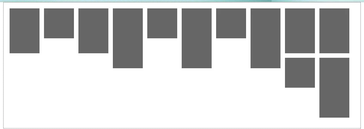
如何修改此网格布局,使第二行块紧挨着上面的对应块而不是形成一个全新的行? http://jsfiddle.net/AndyMP/wSvrN/
body {
    margin-left: 0px;
    margin-top: 0px;
    margin-right: 0px;
    margin-bottom: 0px;
}
#container {
    position: absolute;
    width: 60%;
    left: 50%;
    margin-left: -30%;
    border: 1px dotted #333;
    padding: 20px;
}
.box1 {
    position: relative;
    float: left;
    width: 100px;
    height: 150px;
    background: #666;
    margin: 0 15px 15px 0;
}
.box2 {
    position: relative;
    float: left;
    width: 100px;
    height: 200px;
    background: #666;
    margin: 0 15px 15px 0;
}
.box3 {
    position: relative;
    float: left;
    width: 100px;
    height: 100px;
    background: #666;
    margin: 0 15px 15px 0;
}

HTML

<div id="container">

    <div class="box1"></div>
    <div class="box3"></div>
    <div class="box1"></div>
    <div class="box2"></div>
    <div class="box3"></div>
    <div class="box2"></div>
    <div class="box3"></div>
    <div class="box2"></div>
    <div class="box1"></div>
    <div class="box1"></div>
    <div class="box3"></div>
    <div class="box2"></div>

</div>

我猜css中的“float”部分只能水平对齐而不能垂直对齐,但也许有人可以确认一下。 - Andy
我猜我需要使用像Masonry(http://masonry.desandro.com/)这样的插件,而仅仅使用普通的CSS是不可能的。 - Andy
3个回答

4

2
你是想这样做吗? http://jsfiddle.net/LtLrx/ CSS:
body {
    margin-left: 0px;
    margin-top: 0px;
    margin-right: 0px;
    margin-bottom: 0px;
}
#container {
    position: absolute;
    width: 60%;
    left: 50%;
    margin-left: -30%;
    border: 1px dotted #333;
    padding: 20px;
}
.contleft
{
    float: left;
    margin-right: 15px;
    width: 30%;
    position: relative;
    height: 100%;
}
.contmiddle
{
    float: left;
    margin-right: 15px;
    width: 30%;
    position: relative;
    height: 100%;
}
.contright
{
    float: left;
    width: 30%;
    position: relative;
    height: 100%;
}
.box1 {
    position: relative;
    float: left;
    width: 100px;
    height: 150px;
    background: #666;
    margin: 0 15px 15px 0;
}
.box2 {
    position: relative;
    float: left;
    width: 100px;
    height: 200px;
    background: #666;
    margin: 0 15px 15px 0;
}
.box3 {
    position: relative;
    float: left;
    width: 100px;
    height: 100px;
    background: #666;
    margin: 0 15px 15px 0;
}

HTML:

<div id="container">

    <div class="contleft">
        <div class="box1"></div>
        <div class="box2"></div>
        <div class="box3"></div>
        <div class="box1"></div>
    </div>
    <div class="contmiddle">
        <div class="box2"></div>
        <div class="box1"></div>
        <div class="box1"></div>
        <div class="box2"></div>
    </div>
    <div class="contright">
        <div class="box3"></div>
        <div class="box1"></div>
        <div class="box2"></div>
        <div class="box1"></div>
    </div>
</div>

1
它能够完成任务,但我避免使用列,因为这样我就必须手动将任何新的块分配到相应的列中。当添加新的DIV时,它不会自动对齐它们。 - Andy

1

我不太明白你想要什么。当我将那段代码放入测试文件中时,我的浏览器会显示以下内容:enter image description here

在我看来,最后两个块恰好位于同一列的其他块下面。

问题可能是您将容器的宽度指定为屏幕的百分比,而将块的宽度指定为绝对值。

请发表评论,以便我能更清楚地回答您的问题。这是我从您的问题中得出的所有信息。


1
我的意思是,一旦最后一个盒子右侧没有空间,就会创建一个新行,第一个盒子紧贴在第一个盒子下方(现在在其上方),下一个盒子紧贴在第二个盒子下方,以此类推。这可能是容器宽度的问题,但即使有固定的宽度,问题仍然存在http://jsfiddle.net/AndyMP/wSvrN/1/。 - Andy
我现在明白你的问题了。我已经编辑了这个fiddle,去掉了position和floating,但是并没有真正帮助到你。我想知道是否只用CSS就可以解决这个问题。如果我有任何发现,我会告诉你的。我的fiddle链接:http://jsfiddle.net/wSvrN/9/ - Hidde

网页内容由stack overflow 提供, 点击上面的
可以查看英文原文,
原文链接