我刚开始学习机器学习,想使用Python库Scikit并采用k最近邻方法建立一个小模型样例。
转换和适配数据很顺利,但我无法弄清楚如何绘制一个显示数据点及其“邻域”的图形。
我使用的数据集看起来像这样:
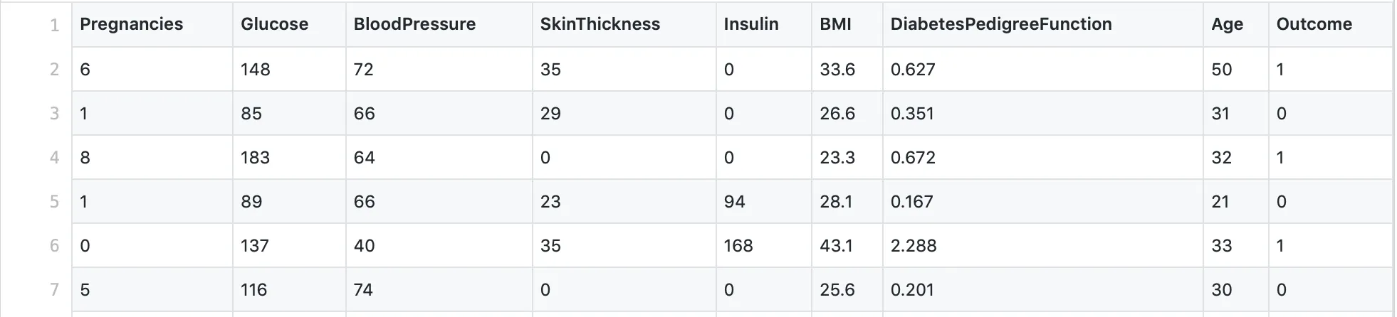 因此,有8个特征,再加上一个“结果”列。
据我所知,使用Scikit的kneighbors_graph方法,可以得到所有数据点的欧几里得距离数组。因此,我的第一次尝试是“简单地”绘制从该方法得到的矩阵。就像这样:
def kneighbors_graph(self):
    self.X_train = self.X_train.values[:10,] #trimming down the data to only 10 entries
    A = neighbors.kneighbors_graph(self.X_train, 9, 'distance')
    plt.spy(A)
    plt.show()
 因此,我尝试调整每个页面上都可以找到的有关Scikit的Iris_dataset示例。不幸的是,它只使用了两个特征,所以它并不完全符合我的要求,但我仍然想至少获得第一个输出:
 def plot_classification(self):
h = .02
n_neighbors = 9
self.X = self.X.values[:10, [1,4]] #trim values to 10 entries and only columns 2 and 5 (indices 1, 4)
self.y = self.y[:10, ] #trim outcome column, too
clf = neighbors.KNeighborsClassifier(n_neighbors, weights='distance')
clf.fit(self.X, self.y)
x_min, x_max = self.X[:, 0].min() - 1, self.X[:, 0].max() + 1
y_min, y_max = self.X[:, 1].min() - 1, self.X[:, 1].max() + 1
xx, yy = np.meshgrid(np.arange(x_min, x_max, h), np.arange(y_min, y_max, h))
Z = clf.predict(np.c_[xx.ravel(), yy.ravel()]) #no errors here, but it's not moving on until computer crashes
cmap_light = ListedColormap(['#FFAAAA', '#AAFFAA','#00AAFF'])
cmap_bold = ListedColormap(['#FF0000', '#00FF00','#00AAFF'])
Z = Z.reshape(xx.shape)
plt.figure()
plt.pcolormesh(xx, yy, Z, cmap=cmap_light)
plt.scatter(self.X[:, 0], self.X[:, 1], c=self.y, cmap=cmap_bold)
plt.xlim(xx.min(), xx.max())
plt.ylim(yy.min(), yy.max())
plt.title("Classification (k = %i)" % (n_neighbors))
然而,这段代码根本不起作用,我无法弄清楚原因。它永远不会终止,所以我没有任何错误可供处理。我的计算机在等待几分钟后就会崩溃。
代码正在努力处理的行是Z = clf.predict(np.c_[xx.ravel(), yy.ravel()]) 部分。
所以我的问题是:
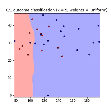
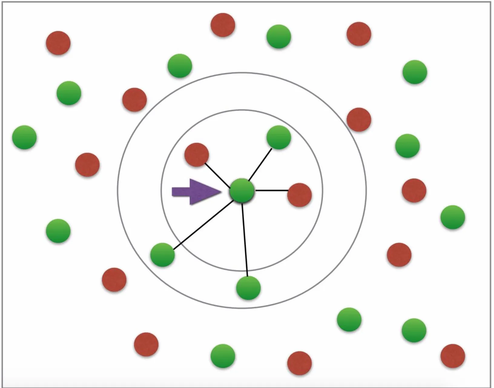
首先,我不明白为什么需要使用 fit 和 predict 来绘制邻居。欧几里得距离难道不足以绘制所需的图形吗?(所需的图形看起来有点像这样:为糖尿病或非糖尿病设有两种颜色;箭头等不必要;图片来源:这个教程)。
代码中的错误在哪里 / 为什么predict部分会崩溃?
是否有一种方法可以绘制具有所有特征的数据?我知道我不能有8个轴,但我希望欧几里得距离是使用我的全部8个特征计算的,而不仅仅是其中的两个(只用两个不太准确,对吗?)。
更新
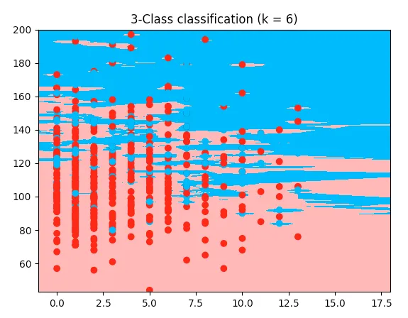
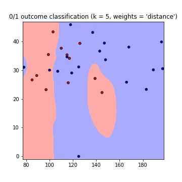
这里是一个可工作的例子,使用了鸢尾花代码,但使用了我的糖尿病数据集:
它使用了我的数据集的前两个特征。我能看到与我的代码唯一的区别是数组被切割 --> 这里取了前两个特征,而我想要的是第2和5个特征,所以我把它切割得不同。但我不明白为什么我的代码不起作用。所以这是工作代码;复制并粘贴它,它将在我之前提供的数据集上运行:
from sklearn.model_selection import train_test_split
import pandas as pd
import numpy as np
import matplotlib.pyplot as plt
from matplotlib.colors import ListedColormap
from sklearn import neighbors, datasets

diabetes = pd.read_csv('data/diabetes_data.csv')
columns_to_iterate = ['glucose', 'diastolic', 'triceps', 'insulin', 'bmi', 'dpf', 'age']
for column in columns_to_iterate:
    mean_value = diabetes[column].mean(skipna=True)
    diabetes = diabetes.replace({column: {0: mean_value}})
    diabetes[column] = diabetes[column].astype(np.float64)
X = diabetes.drop(columns=['diabetes'])
y = diabetes['diabetes'].values
X_train, X_test, y_train, y_test = train_test_split(X, y, test_size=0.2,
                                                                        random_state=1, stratify=y)
n_neighbors = 6

X = X.values[:, :2]
y = y
h = .02

cmap_light = ListedColormap(['#FFAAAA', '#AAFFAA', '#00AAFF'])
cmap_bold = ListedColormap(['#FF0000', '#00FF00', '#00AAFF'])

clf = neighbors.KNeighborsClassifier(n_neighbors, weights='distance')
clf.fit(X, y)

x_min, x_max = X[:, 0].min() - 1, X[:, 0].max() + 1
y_min, y_max = X[:, 1].min() - 1, X[:, 1].max() + 1
xx, yy = np.meshgrid(np.arange(x_min, x_max, h),
                     np.arange(y_min, y_max, h))

Z = clf.predict(np.c_[xx.ravel(), yy.ravel()])

Z = Z.reshape(xx.shape)
plt.figure()
plt.pcolormesh(xx, yy, Z, cmap=cmap_light)

plt.scatter(X[:, 0], X[:, 1], c=y, cmap=cmap_bold)
plt.xlim(xx.min(), xx.max())
plt.ylim(yy.min(), yy.max())
plt.title("3-Class classification (k = %i)" % (n_neighbors))
plt.show()