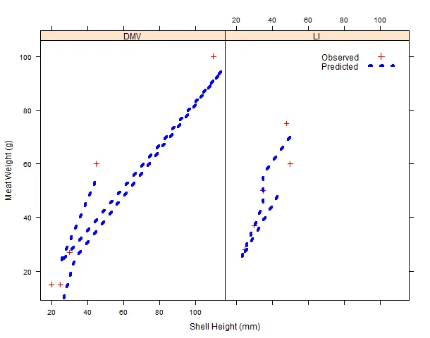
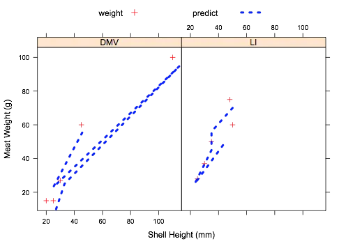
我使用了lattice和lattice extra来绘制五个不同区域的观测值和预测值。我使用xyplot来绘制观测值,然后使用lattice extra中的as.layer函数添加预测线。我想在图表中添加一个图例,但一直没有成功。
这里有两个示例数据集以及用于绘图的代码。
第一个示例数据集。我只包括了两个区域。
这里有两个示例数据集以及用于绘图的代码。
第一个示例数据集。我只包括了两个区域。
example1 <-
structure(list(model_predict = c(10, 25, 95, 23, 56, 70, 56,
45, 25, 50), Shell_Height = c(27, 33, 115, 25, 46, 50, 35, 35,
23, 45), SAMS_region_2015 = structure(c(1L, 1L, 1L, 1L, 1L, 2L,
2L, 2L, 2L, 2L), .Label = c("DMV", "LI"), class = "factor")), .Names = c("model_predict",
"Shell_Height", "SAMS_region_2015"), row.names = c(NA, -10L), class = "data.frame")
示例数据集2。仅包含两个区域。
example2 <-
structure(list(Meat_Weight = c(15, 27, 100, 15, 60, 75, 50, 37,
28, 60), Shell_Height = c(25, 30, 110, 20, 45, 48, 35, 30, 25,
50), SAMS_region_2015 = structure(c(1L, 1L, 1L, 1L, 1L, 2L, 2L,
2L, 2L, 2L), .Label = c("DMV", "LI"), class = "factor")), .Names = c("Meat_Weight",
"Shell_Height", "SAMS_region_2015"), row.names = c(NA, -10L), class = "data.frame")
绘图代码
library(lattice)
library(latticeExtra)

#observed vs predicted values by SAMS region

foo<-xyplot(Meat_Weight~Shell_Height|SAMS_region_2015,data=example2,
        ylab="Meat Weight (g)",xlab="Shell Height (mm)",type="p",
            col="red",pch=3)

#add layer of observed values

foo <- foo +
       as.layer(xyplot(model_predict~Shell_Height|SAMS_region_2015,
           type = "l", data = example1, col = "blue", lwd = 4, lty = 3))
我想为图表添加一个图例,包括文本“观察值”和“预测值”,以及在图中使用的不同变量的符号或线条和颜色。
R信息 sessionInfo() R版本3.2.1(2015-06-18) 平台:i386-w64-mingw32 / i386(32位) 运行环境:Windows 7 x64(构建7601)Service Pack 1
locale:
[1] LC_COLLATE=English_United States.1252
[2] LC_CTYPE=English_United States.1252
[3] LC_MONETARY=English_United States.1252
[4] LC_NUMERIC=C
[5] LC_TIME=English_United States.1252

attached base packages:
[1] grid      stats     graphics  grDevices utils     datasets
[7] methods   base

other attached packages:
 [1] latticeExtra_0.6-26 RColorBrewer_1.1-2  nlme_3.1-120
 [4] MASS_7.3-40         xlsx_0.5.7          xlsxjars_0.6.1
 [7] rJava_0.9-6         plyr_1.8.3          RODBC_1.3-12
[10] lattice_0.20-31

loaded via a namespace (and not attached):
[1] tools_3.2.1 Rcpp_0.11.6
非常感谢您的帮助。