我正在尝试将高斯过程回归的预测平均数据绘制成3D等高线图。我遵循了使用Matplotlib和extent从图像绘制3D等高线图和mplot3d示例代码:contour3d_demo3.py线程。以下是我的代码:
import numpy as np
from sklearn.gaussian_process import GaussianProcessRegressor
from sklearn.gaussian_process.kernels import RBF, ConstantKernel as C
import matplotlib.pyplot as plt
from mpl_toolkits.mplot3d import axes3d
from matplotlib import cm

x_train = np.array([[0,0],[2,2],[3,3]])
y_train = np.array([[200,321,417]])

xvalues = np.array([0,1,2,3])
yvalues = np.array([0,1,2,3])

a,b = np.meshgrid(xvalues,yvalues)
positions = np.vstack([a.ravel(), b.ravel()])
x_test = (np.array(positions)).T

kernel = C(1.0, (1e-3, 1e3)) * RBF(10)

gp = GaussianProcessRegressor(kernel=kernel)

gp.fit(x_train, y_train)

y_pred_test = gp.predict(x_test)

fig = plt.figure()
ax = fig.add_subplot(projection = '3d')
x=y=np.arange(0,3,1)
X, Y = np.meshgrid(x,y)
Z = y_pred_test
cset = ax.contour(X, Y, Z, cmap=cm.coolwarm)
ax.clabel(cset, fontsize=9, inline=1)
plt.show()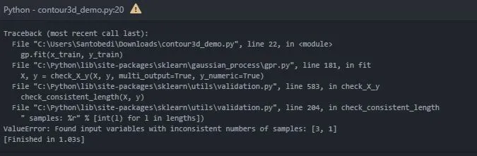
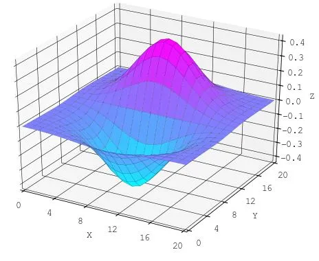
我希望将x轴和y轴作为二维平面,将预测值放在z轴上。 样例图 如下:
我的代码有什么问题?
谢谢!