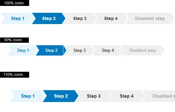
我使用了CSS三角形的方法来创建进度步骤:http://css-tricks.com/snippets/css/css-triangle/
问题是,当缩放浏览器(例如在chrome中缩放到90%和110%)时,三角形与它所连接的元素之间会有空白。您可以在这里查看示例:http://plnkr.co/edit/cPsvVIlKX2gQseONTixf?p=preview
.steps {
  list-style-type: none;
  padding: 0;
}
.steps li {
  display: inline-block;
  margin-bottom: 3px;
}
.steps li a, .steps li p {
  background: #e5f4fd;
  padding: 8px 20px;
  color: #0077bf;
  display: block;
  font-size: 14px;
  font-weight: bold;
  position: relative;
  text-indent: 12px;
}
.steps li a:hover, .steps li p:hover {
  text-decoration: none;
}
.steps li a:before, .steps li p:before {
  border-bottom: 18px solid transparent;
  border-left: 12px solid #fff;
  border-top: 18px solid transparent;
  content: "";
  height: 0;
  position: absolute;
  left: 0;
  top: 50%;
  width: 0;
  margin-top: -18px;
}
.steps li a:after, .steps li p:after {
  border-bottom: 18px solid transparent;
  border-left: 12px solid #e5f4fd;
  border-top: 18px solid transparent;
  content: "";
  height: 0;
  position: absolute;
  right: -12px;
  top: 50%;
  width: 0;
  margin-top: -18px;
  z-index: 1;
}
.steps li.active a, .steps li.active p {
  background: #0077bf;
  color: #fff;
}
.steps li.active a:after, .steps li.active p:after {
  border-left: 12px solid #0077bf;
}
.steps li.undone a, .steps li.undone p {
  background: #eee;
  color: #333;
}
.steps li.undone a:after, .steps li.undone p:after {
  border-left: 12px solid #eee;
}
.steps li.undone p {
  color: #aaa;
}
示例:
有什么解决方法吗?