显然,Gnuplot目前尚不支持饼图,但我们可以手动绘制。
首先,我们需要获取与数据文件中第二列相关的角度和百分比:
set datafile separator ','
stats 'file.csv' u 2 noout      # get STATS_sum (sum of column 2)

ang(x)=x*360.0/STATS_sum        # get angle (grades)
perc(x)=x*100.0/STATS_sum       # get percentage
然后配置画布:
set size square                 # square canvas
set xrange [-1:1.5]
set yrange [-1.25:1.25]
set style fill solid 1

unset border
unset tics
unset key
并绘制饼图:
Ai = 0.0; Bi = 0.0;
mid = 0.0;
i = 0; j = 0;
yi = 0.0; yi2 = 0.0;
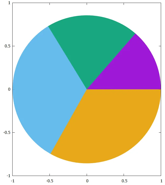
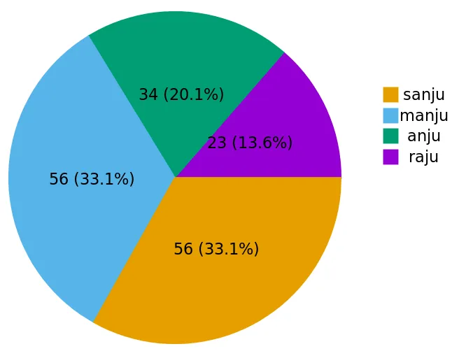
plot 'file.csv' u (0):(0):(1):(Ai):(Ai=Ai+ang($2)):(i=i+1) with circle linecolor var,\
'file.csv' u (1.5):(yi=yi+0.5/STATS_records):($1) w labels,\
'file.csv' u (1.3):(yi2=yi2+0.5/STATS_records):(j=j+1) w p pt 5 ps 2 linecolor var,\
'file.csv' u (mid=Bi+ang($2)*pi/360.0, Bi=2.0*mid-Bi, 0.5*cos(mid)):(0.5*sin(mid)):(sprintf('%.0f (%.1f\%)', $2, perc($2))) w labels
绘图命令中的第一行绘制了饼图,其中列 (0):(0):(1):(Ai):(Ai=Ai+ang($2)):(i=i+1) 包括:
- 第1-2列: 圆心的x和y坐标
- 第3列: 圆的半径
- 第4-5列: 区域的起始和结束角度
- 第6列: 区域的颜色
绘图命令的第二和第三行放置标签,最后一行将百分比放在每个区域的中间。
结果:
参考文献:(1) Gnuplot surprising (2) Gnuplot tricks
编辑:
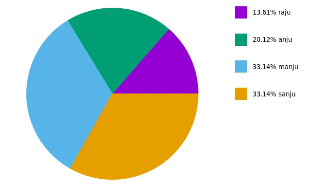
基于两个相关问题 (这里 和 这里),提出了一个新脚本:
filename = 'test.csv'
rowi = 1
rowf = 7
set datafile separator ','
stats filename u 2 every ::rowi::rowf noout prefix "A"
rowf = (rowf-rowi > A_records - 1 ? A_records + rowi - 1 : rowf)
angle(x)=x*360/A_sum
percentage(x)=x*100/A_sum
centerX=0
centerY=0
radius=1
yposmin = 0.0
yposmax = 0.95*radius
xpos = 1.5*radius
ypos(i) = yposmax - i*(yposmax-yposmin)/(1.0*rowf-rowi)
set style fill solid 1
unset key
unset tics
unset border
set size ratio -1
set xrange [-radius:2*radius]
set yrange [-radius:radius]
pos = 0
colour = 0
plot filename u (centerX):(centerY):(radius):(pos):(pos=pos+angle($2)):(colour=colour+1) every ::rowi::rowf w circle lc var,\
for [i=0:rowf-rowi] '+' u (xpos):(ypos(i)) w p pt 5 ps 4 lc i+1,\
for [i=0:rowf-rowi] filename u (xpos):(ypos(i)):(sprintf('%05.2f%% %s', percentage($2), stringcolumn(1))) every ::i+rowi::i+rowi w labels left offset 3,0
这段新代码的结果为: